Hello! I'm a senior UI designer at Pixonic, Alexey Morev. And in this article, we will focus on UI animations that each of us can see in games.
The game interface is a collection of elements that help the user interact and control the game: buttons, icons, progress bars, backgrounds, cards, pop-up windows. To make it easier to interact with the interface elements, they are animated.
I will tell you how such animations are created, in which programs they are made, what stages of animation development exist and why they are generally needed.
So, let's begin!
First of all, let's define what animation is and what kinds of it exist.
Simply put, animation is a sequence of frames that brings an image to life. It is divided into full (full animation) and simplified (limited animation). An example of full animation is any full-length animated film: Disney's Aladdin, The Jungle Book, The Little Mermaid, etc. Examples of simplified animation are most cartoons such as Rick and Morty, Gravity Falls, Extreme Space, and etc.
In the case of full animation, 24-25 frames are drawn per second of timing and small details of the character, environment, etc. are animated. In simplified animation, the number of frames per second is less, and some insignificant elements of the characters and environment may not animate at all and remain static. It should be noted that these principles must be followed in the creation of any animation, be it an interface or a cartoon.
Full and simplified animation using the example of The Simpsons cartoon
As you can see, in the full-length version of the splash screen, the animations are smoother and more detailed, while in the short-length opening one you can see how the number of frames is reduced and the details of the characters are not animated.
We figured out what animation is. Now it is logical to move on to the following questions: what type of animation to use in the UI? And is she even needed?
I'll answer the second one first. Do we need animation? Everything seems to be clear: the window has opened, the prize has been received, the button has been pressed. It's not so important to use any kind of animation, right?
Not certainly in that way. Thanks to animation, you can not only diversify the visual component of the game, but also help the user understand what is happening on the screen, where to click and what action to perform. This is one of the main reasons for using UI animation in games: to draw the player's attention to the elements that are most important at the moment.
The second reason is the ability of the animation to show the overall dynamics and style of play. UI animation should match the dynamics of the game. This contributes to an even greater immersion. Using animations that are too slow in a fast-paced game will annoy the players and affect the overall experience.
As for the type of animation used, it only depends on your resources and capabilities. If you and your team can afford the implementation of full animation, and the visual style of the game allows it, then it's better to do so: it will come out much juicier and more beautiful. In other cases, it is better to use simplified animation.
Let's use examples of the same popup to see how it looks with full, simplified and minimal animation.
Full animation
Simplified animation
Minimal animation
Who creates UI animation and how the development process works
Usually there are three people involved in the development of animation:
- a designer or artist creates an animation reference;
- the technical designer transfers this reference to the game engine;
- programmers make the animation appear at the right moment in accordance with a specific trigger.
Sometimes a studio hires an animator on purpose, but not often - usually a designer is enough.
Animation creation can be roughly divided into three stages: thinking, creating a reference, and implementing.
Stage one: idea
In order to organically fit the animation into what is happening on the screen, you need to determine what needs to be animated, as well as what will happen before and after the animation.
Let's walk through the process of creating an animation step by step using the example of the popup animation shown above.
At the beginning of the work, we will conduct a research game on similar topics and styles, then we will choose the most successful and interesting options that we will use as references. Thus, we save time, not reinventing the wheel from scratch, but starting from what has already been done before us. Then we describe in detail what should happen with the animation object. This is done primarily for yourself, so as not to forget anything important, as well as for further writing documentation.
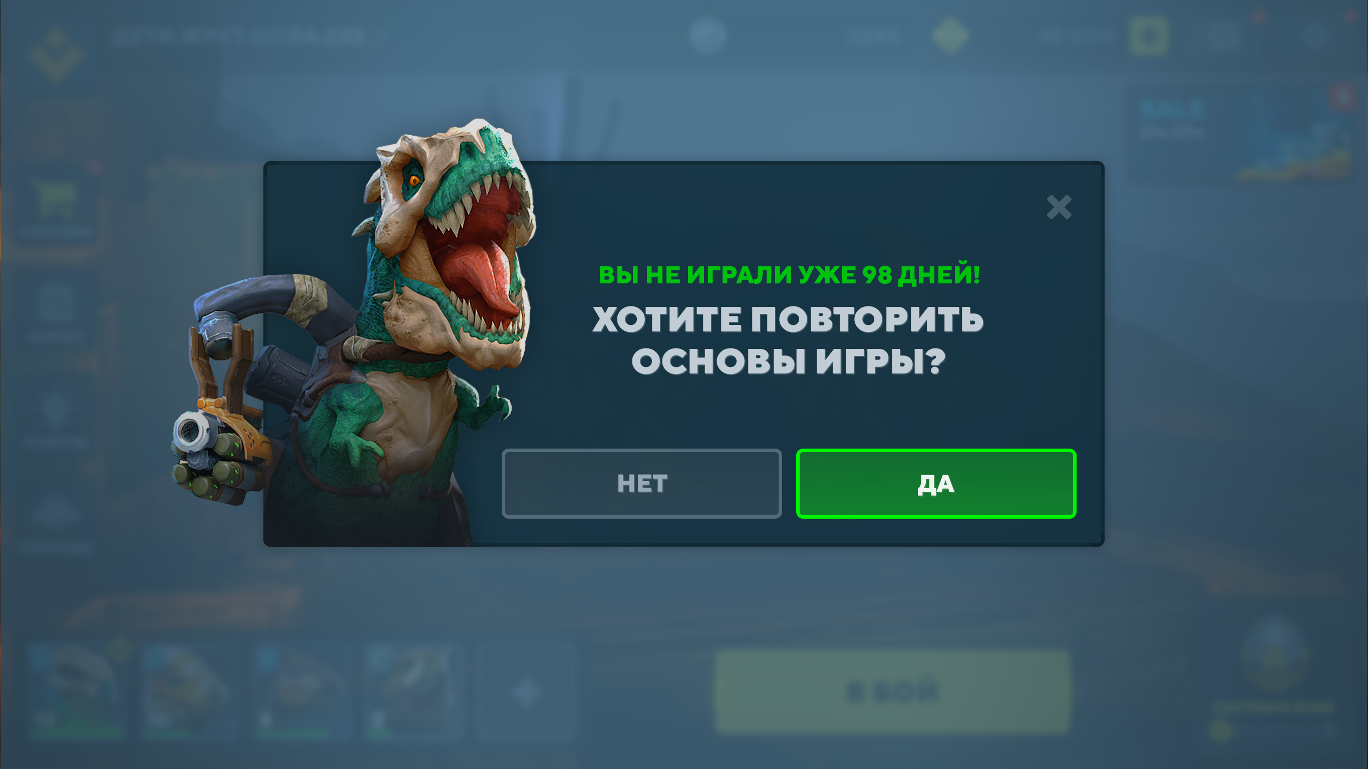
As an example, let's take the following popup and analyze the entire sequence of animation creation on it.

Let's briefly describe the idea:
- The appearance of a pop-up after a long absence of a player in the game;
- Make a smooth but fast enough animation;
- Use Full frame animation;
- Animate each element;
- Animate a dinosaur cannon;
- Add animated glow under the dinosaur.
When the goal becomes clear and clearly formulated, you can proceed to the second stage.
Second step: creating a reference
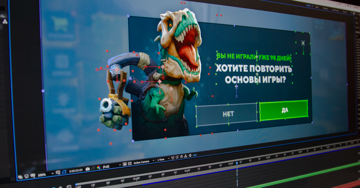
We create our own animation reference, which will be further demonstrated, refined and changed.
For this, programs such as Adobe Animate, After Effects, Spine, etc. At this stage, it does not matter for us in which program to animate (the exception may be Spine, since this editor has an export of animation to many engines), so we choose what will be more convenient and faster for us. You can even animate an element frame by frame in Photoshop, but this is already exotic. I prefer working in After Effects because it is the most flexible editor in terms of animations: you can implement almost any idea that comes to mind in it.

Do not forget to take into account the timings so that all UI elements behave adequately: without desynchronization, delays and in the correct sequence.
We must not forget about the duration of the animation itself. For example, if the appearance of a window takes more than one second, and in the game it appears quite often, the player will very quickly get tired of the drawn-out animation and be annoyed. At the same time, if the appearance of an element occurs quite rarely, and this event brings joy to the player (for example, receiving a chest, a prize or an achievement), you can make the animation of the appearance longer and more colorful.
Stage three: implementation
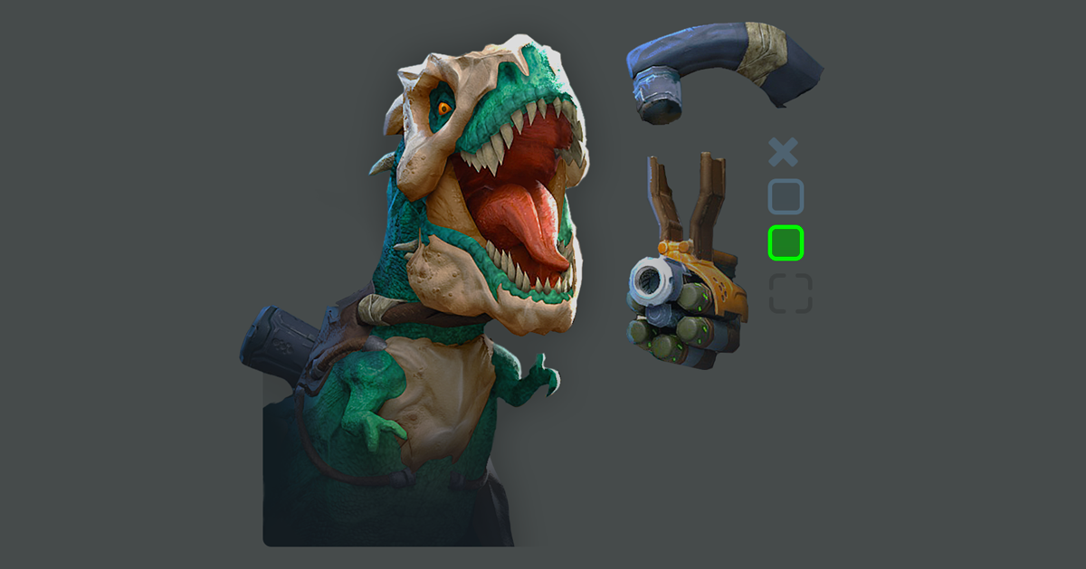
Here we optimize all the graphics used in the reference: slicing particles, glow, background, dinosaur and other little things - in other words, all visual effects.

An example of optimized slicing
Such slicing of elements is necessary to reduce the size of the final animation, because there are many other elements in the project, and every megabyte is important. If you do not optimize the sliced elements, then a situation may arise that your beautiful animation will slow down. After that, using the animator of the engine on which the game is developed, we repeat the same animation that was done at the reference stage.
Why can't you do everything on the engine at once? The answer is not obvious, but rather simple: when you create animation, for example, in After Effects, you only have the animation program and its functionality. There is no need to configure cameras in the game for them to display correctly in the UI. There is no need to optimize the graphics and divide everything into components: you can easily replace any element, or even completely rethink the animation, completely altering it. If you create everything at once on the game engine, you will waste a lot of time optimizing files, you will be technically squeezed and spend a lot of time slicing graphics for animation at the initial stage, although in the end it may turn out to be completely different.
Conclusion
Finally, I will summarize the material and give some short tips. When working with animation, think about it in advance, observe timings, use full animation whenever possible, and do not forget to look at animations from other projects for possible references.
If you enjoyed this article, the next article is planned for how you can use the principles of Disney animation in the UI. Learn more about the principles themselves here .