The main task of a load testing tool is to apply a given load to the system. But besides this there is one more, no less important task - to provide a report on the results of the submission of this load. Otherwise, we will conduct testing, but we will not be able to say anything about its result and will not be able to accurately determine from what moment the degradation of the system began.
The most popular testing tools at the moment are Gatling, MF LoadRunner, Apache JMeter. All of them have the ability to generate ready-made reports on the testing performed, as well as individual graphs or raw data, on the basis of which the report itself is built.

Before writing any report, you need to understand for whom we are writing it and what purpose we are pursuing. It makes no sense to add many graphs of application response time to the report for each operation if your goal is to determine if there are memory leaks, if unstable operation was fixed during a reliability test, or if you need to compare two releases against each other as part of regression testing. To answer these questions, you only need a couple of graphs, unless, of course, you have fixed the problems and do not want to understand them. Therefore, before creating a report, think about whether you really need to add all the graphs to it or only the most indicative ones and give an answer to the purpose of testing. Also, the set of graphs and their analysis for the report depend on the selected load model - closed or open,since different models will give different figures on the charts.
We at Tinkoff actively use the Gatling tool, therefore, using its example, we will tell you how to create a report of your dreams and where to look when analyzing it. I also want to note right away that almost all the charts described in the article can be obtained online using a bundle of your tool with Grafana. It is the most convenient tool for creating reports on the fly using a pre-configured dashboard. Moreover, it allows you to more quickly create almost any graph based on the data you send. There are already ready-made dashboards for almost all load testing tools. Graphs for other tools - MF LoadRunner and Apache JMeter - will also be given, their analysis is built by analogy with Gatling.
Basic metrics
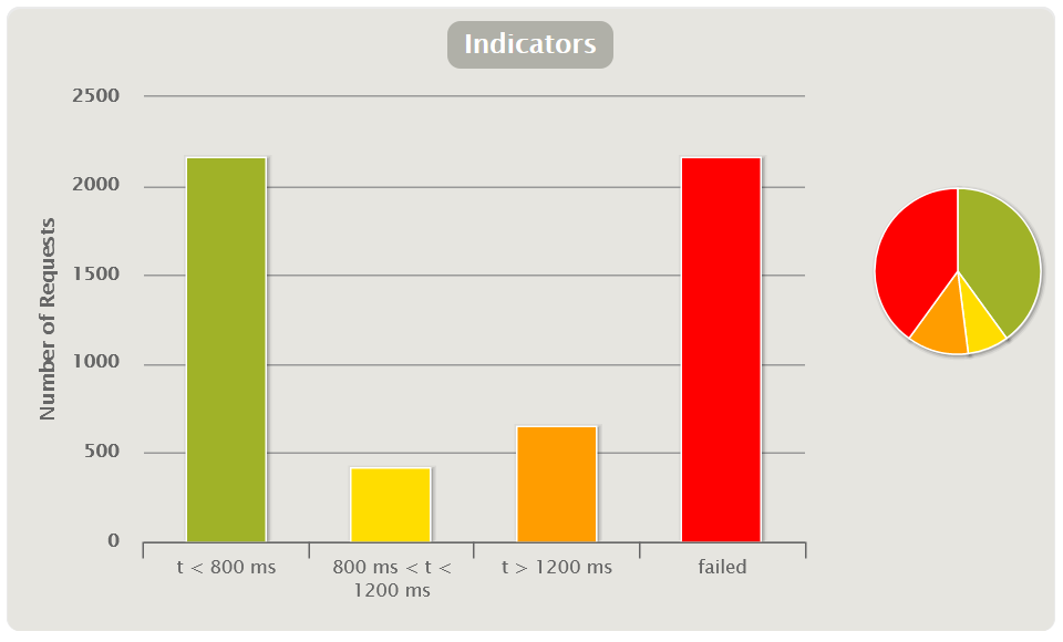
Indicators
Shows the quantitative and percentage distribution of the request response time by group. Charts of this type are convenient to use to give a quick preliminary assessment of the test results without a deeper analysis of the rest of the charts.
Group-to-group thresholds are predefined based on peer review or SLA (non-functional requirements). For example, there may be three groups:
- excellent - response time less than 50 seconds;
- medium - more than 50, but less than 100 seconds;
- terrible - over 100 seconds.
In Gatling, you yourself can configure the thresholds for moving from group to group and their number in the gatling.conf file. It is better to build charts of this type based on the methodology. APDEX (Application Performance Index)
You can also add an indicator with the number / percentage of failed requests.
The APDEX method allows you to use indicators in regression testing to compare releases: this way you can immediately see how much worse or better the release has become in general. Unfortunately, this graph is not out of the box in MF LoadRunner and Apache JMeter, but it is easy to create it using the Grafana dashboard.
Response time table
By default, Gatling builds a table based on percentiles, average and maximum response times, and errors. It tracks going beyond the SLA (excess of non-functional requirements). Typically, SLAs indicate the percentiles 95, 99 and the percentage of errors. Thus, the table allows you to get a quick assessment of the test results.
If you group queries as transactions, you can see in the table both the score for individual queries and the score for the entire group and transaction at once.
| HTML Gatling Report | 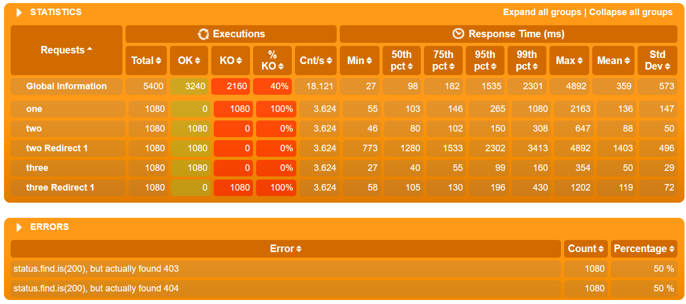 |
| MF LoadRunner also creates the table itself in the Analysis Summary Report block and is called Transaction Summary | 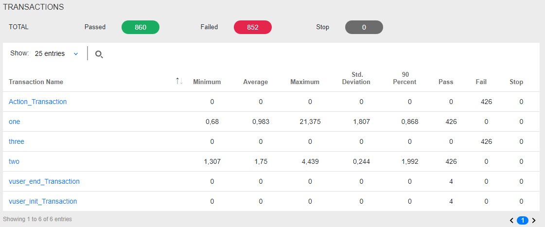 |
| In Apache JMeter, this data can be found in the Aggregate Report | 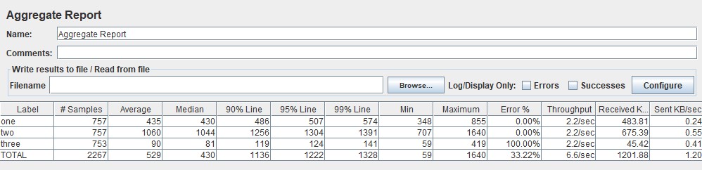 |
Virtual Users Chart
Usually measured in pieces and shows how users enter the application, thereby illustrating the real load profile. It should be noted right away that for MF LoadRunner and Gatling these graphs show the number of Virtual Users, and for Apache JMeter - the number of Threads.
The graph is used to control the correctness of the load application. It is necessary that your design scenario corresponds to what you submitted to the system in reality. For example, if you see large upward deviations from the planned scenario on the chart, it means that something went wrong: an error in the calculation, more copies of the load tool were launched than needed, and so on. Perhaps there is no point in analyzing further graphs, since you submitted 100 more users than you planned, and the system was originally designed to work with only 10 users.
This graph is divided into two types:
- Active Users displays how many threads are currently active per second. When threads start and stop, especially in an open load model, this rate will fluctuate throughout the test.
- Total VUsers shows how many threads have started and stopped since the beginning of testing in total. Convenient for a closed load model in which threads do not die.
The graph view also depends on the load model:
- Closed model - users must log into the system according to the planned load profile. If the graph shows dips or peaks, this indicates that the load did not go according to the calculated or planned scenario, and requires further study.
- — , . , . , , / . , — .
| HTML Gatling Report | 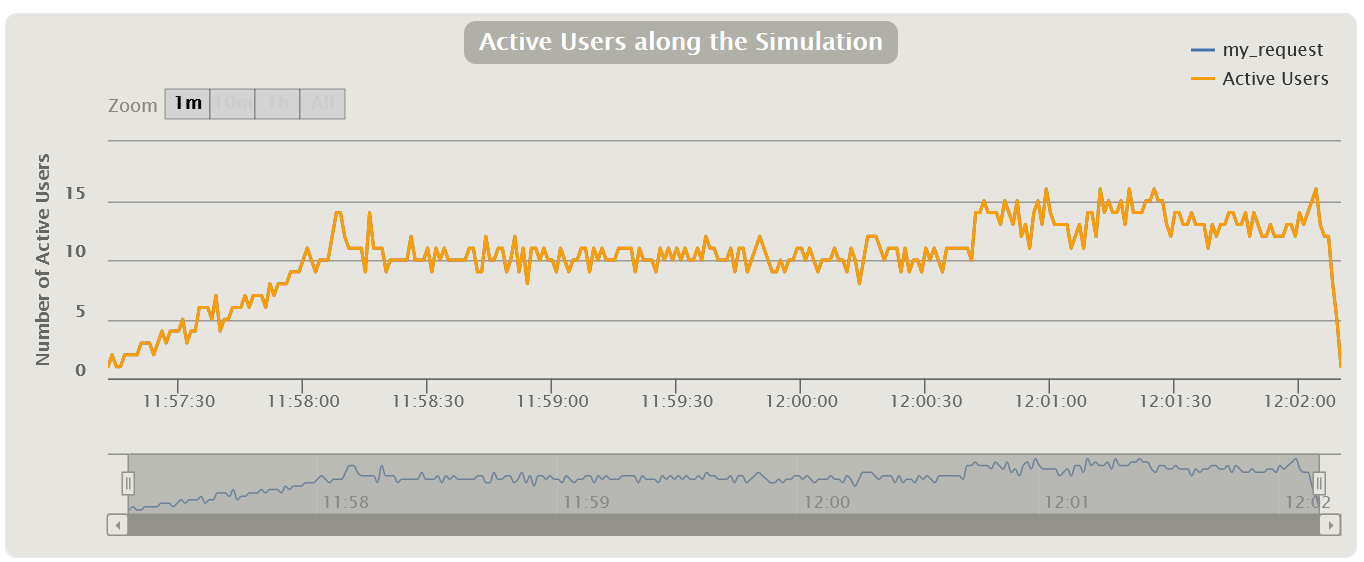 |
| MF LoadRunner Running Vusers |  |
| Apache JMeter Active Threads Over Time , JMeter-Plugins.org | 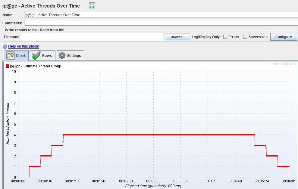 |
Response Time
Most often measured in milliseconds - it shows the response time to requests to the application. The response time should not exceed the SLA. This graph is the main tool for finding points of degradation during load testing.
If peaks are visible on the graph, it means that at that moment the application did not respond for some reason - this may be a starting point for further research. The response time should be uniform, without peaks for all operations throughout the load step, and also correlate with load entrainment. Gatling does not include a graph of "net" (average, not aggregated) response time, unlike other tools.
In addition to the graph of the response time of each request, it is also convenient to display a line with the total response time (Total Response Time). By overlaying the applied load (VU / RPS) plot, you can track the correlation with increasing response time from increasing applied load (VU / RPS). Apache JMeter calls this graph Response Times vs Threads.
Next, there will be graphs, on which there can be many lines, each of which displays its own scenario or request. If you have a complex test with many operations and a non-linear profile, we recommend that you only show the most representative queries or groups of queries in the report. Alternatively, you can only reflect requests that exceed the SLA / SLO, so as not to clutter up the schedule and report.
| In MF LoadRunner, the graph is called Average Transaction Response Time and shows the average time for transactions | 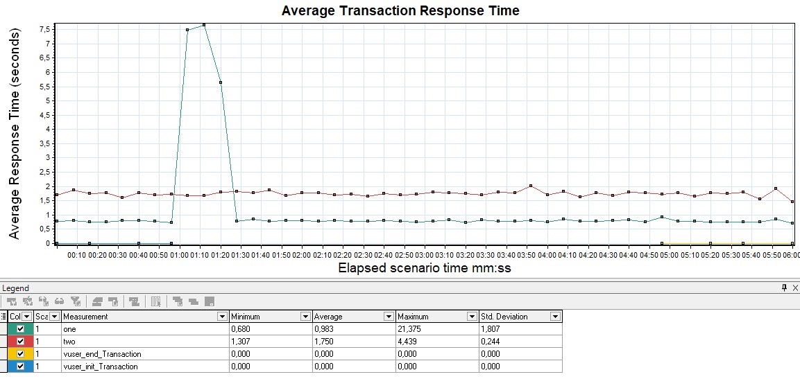 |
| For Apache JMeter, the graph exists in two versions in an advanced package from the JMeter-Plugins.org site and is called the Response Times Over Time and, by default, the Response Time Graph. More visual and convenient, in my opinion, is the first option | 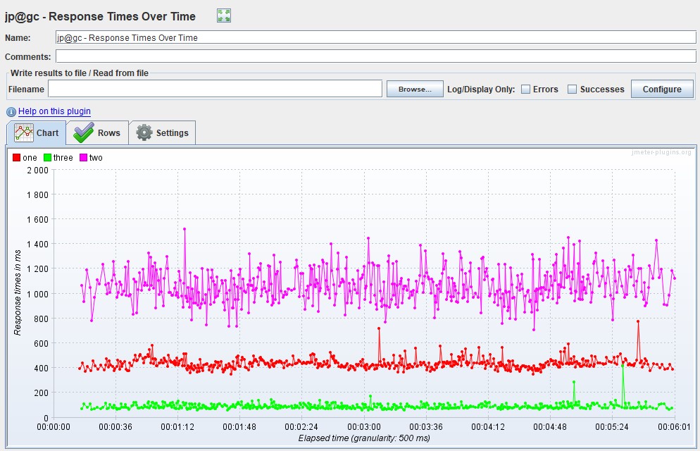
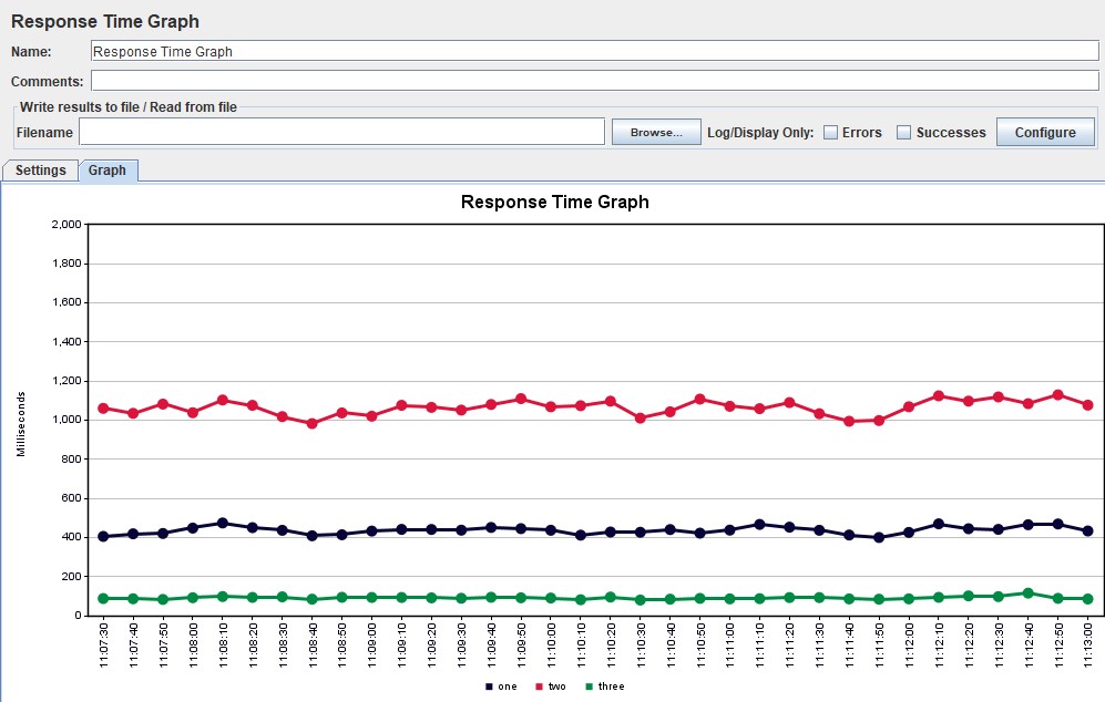 |
Graph variations
A modification is possible in which the response time percentiles are applied and a line of average response time for all requests is added. Using percentiles here will be more correct, since the average response time is very sensitive to sharp peaks.
In performance testing, the 95th and 99th percentiles are most often used for clarity. However, if you do look at the average response time, you should consider the standard deviation (root mean square).
| HTML Gatling Report | 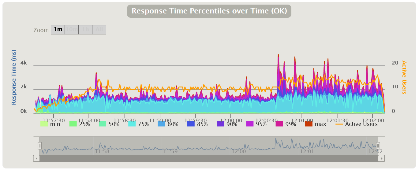 |
| For MF LoadRunner, the graph will be called Transaction Response Time (Percentile) | 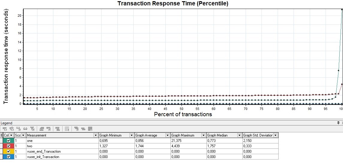 |
| You can also get Apache JMeter percentiles using the Response Times Percentiles graph from the same extended set | 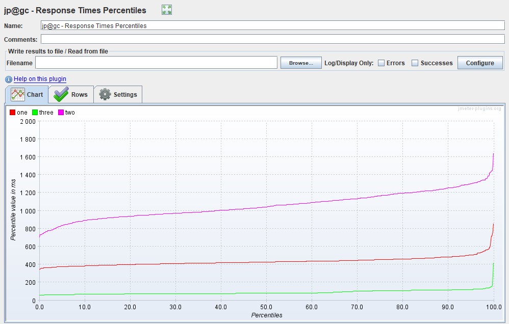 |
Distribution of Response Time
There are also excellent graphs showing the dependence of the distribution of time on the number of requests.
This kind of charts is somewhat similar to indicators, but shows a more complete picture of the distribution of time, without clipping by percentiles or other aggregates. Using the chart, you can more clearly define the boundaries for groups of indicators. MF LoadRunner has no such schedule.
| HTML Gatling Report for each request | 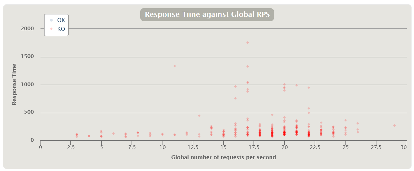 |
| There is another option for distributing the query execution time from the number of queries in terms of successful and erroneous queries for the entire test | 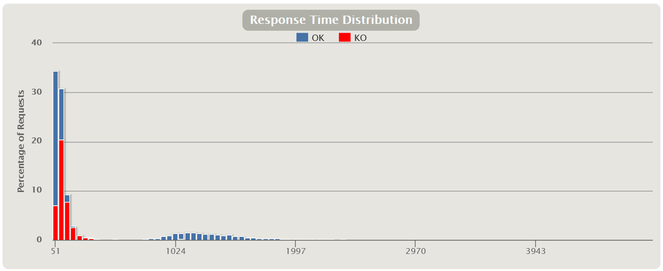 |
| MF LoadRunner Transaction Response Time (Distribution) | 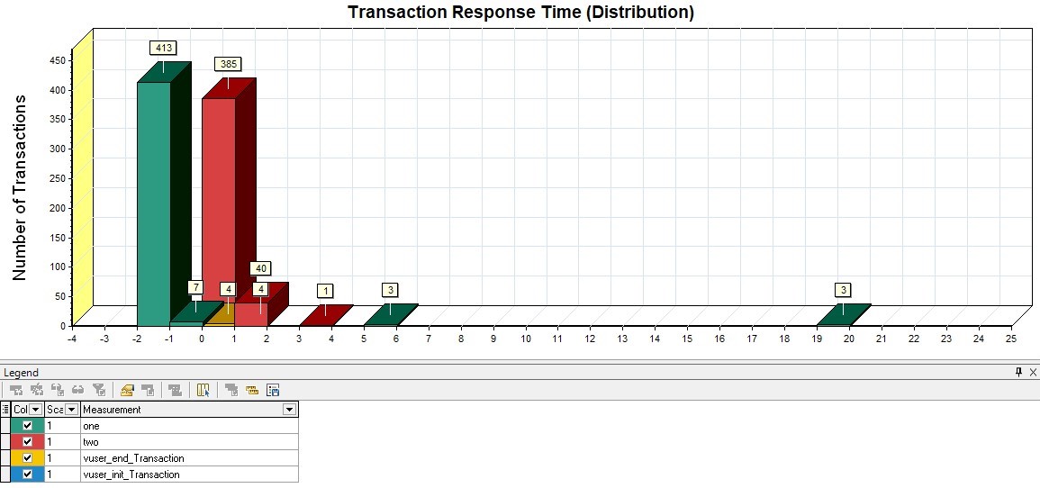 |
| Apache JMeter Response Times Distribution | 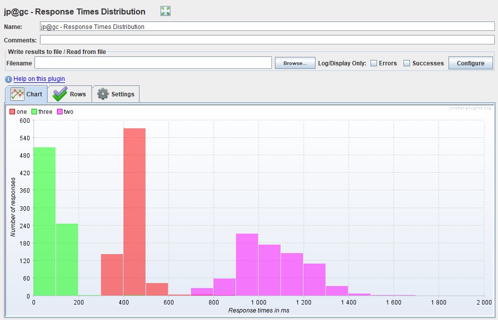 |
Latency
From this metric, an additional parameter Latency (milliseconds) can also be distinguished - the latency time (most often this is understood as Network Latency). This parameter shows the time between the end of the request sending until the first response packet is received from the system.
Using this parameter, you can also measure the latency at the network level if the parameter grows. It is desirable that it tends to zero. This and the next type of graph are mainly used for deep analysis and finding performance problems. This graph is not out of the box in Gatling. In MF LoadRunner, this graph is called Average Latency Graph in the Network Virtualization Graphs block if you have installed monitoring agents.
| In Apache JMeter, this graph is only present in the extended set and is called Response Latencies Over Time |  |
Bandwidth
Similar to the metric above, you can select the Bandwidth parameter (kilobits per second) - the channel bandwidth. It shows the maximum amount of data that can be transferred per unit of time.
By changing this parameter on the load tool, you can simulate different sources of connections to the application: 4G mobile or wired network. The free version of Gatling does not have this graph, it is only available in the paid version of Gatling FrontLine. This graph is out of the box only in MF LoadRunner, it is located in the same block as Latency, and is called Average Bandwidth Utilization Graph.
Request Per Second chart
Measured in pieces per second - shows the number of requests entering the system in 1 second.
The graph shows how many requests your system can handle under load, and it is also the main graph for building the report. It also tracks going beyond the SLA, since with an increase in the load when passing the degradation point or local extrema, a failure can be observed, and then a sharp increase. Most often this is due to the fact that when the application begins to degrade, requests also begin to accumulate at the entrance to the application (a queue appears), then the application gives them some kind of response or requests fall by timeout, which causes a sharp increase in the graph - because the answer was received
- VU, RPS/TPS , .
- Response Time, , .
| HTML Gatling Report | 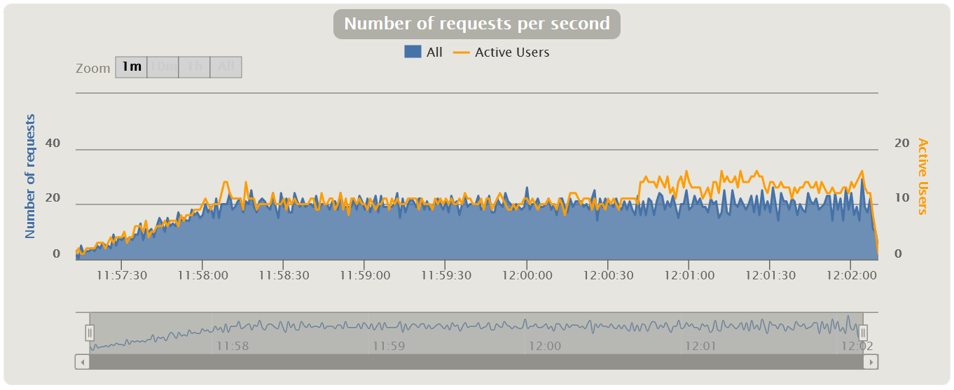 |
| MF LoadRunner Hits per Second | 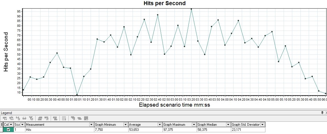 |
| Apache JMeter Hits per Second | 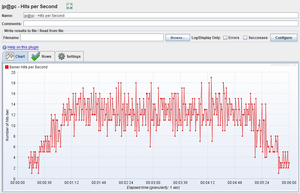 |
TPS
It is measured in pieces per second and shows the number of transactions (there can be many requests within a transaction) in 1 second.
For example, the transaction "entering your personal account" includes the following requests: opening the main page, entering a login, password, pressing the "send" button, redirecting to the welcome page - per unit of time. In Gatling, a graph can only be obtained using Grafana, since for groups in the HTML report, graphs are built only by response time.
| MF LoadRunner - Transactions per Second | 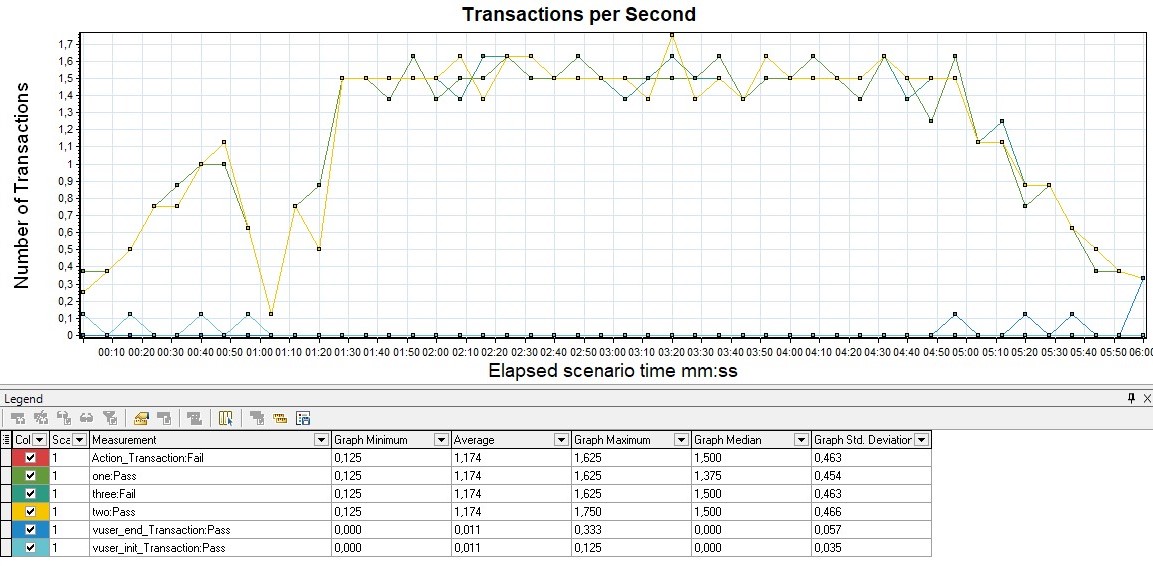 |
| For Apache JMeter Advanced Package - Transactions per Second | 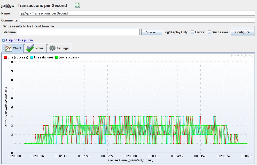 |
Errors Chart
Usually measured in rate (pieces per second) - the graph shows the increase in the number of erroneous requests. It is also convenient to measure the value as a percentage of the total number of requests. This graph tracks SLA out-of-bounds by the number or percentage of errors.
If you overlay the Response Time graph, you can see how an increase in errors affects an increase in application response time.
Gatling by default does not have a separate graph showing only errors. In Gatling, it is combined with the VU graph and immediately shows how an increase in load affects an increase in the number of errors, and helps to detect the threshold from which the SLA is exceeded or errors appear at all. Apache JMeter also does not have a separate schedule, it is combined with the graphs of the number of transactions.
| HTML Gatling Report | 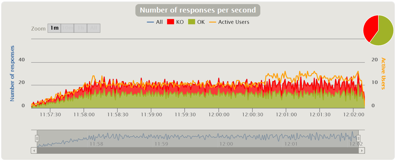 |
| In MF LoadRunner, this graph is called Errors per Second | 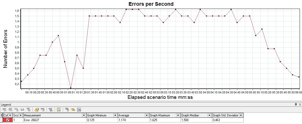 |
HTTP responses status
It is also possible to plot the distribution of the number of errors by application response codes on a graph - it is convenient to use for classifying errors.
For example, if you got 100% on the previous graph, you start to analyze which 50x errors are due to the server not responding, or 403 errors due to the wrong pool and users cannot log in, if, for example, you are using HTTP protocol.
Initially, the free version of Gatling does not have this chart, it is only available in the paid version of Gatling FrontLine. For the graph to appear in the free version, you need to reconfigure the logback.xml so that the logs are collected in the graylog, and already in it to build the desired graph.
| In MF LoadRunner, this graph is called HTTP Responses per Second | 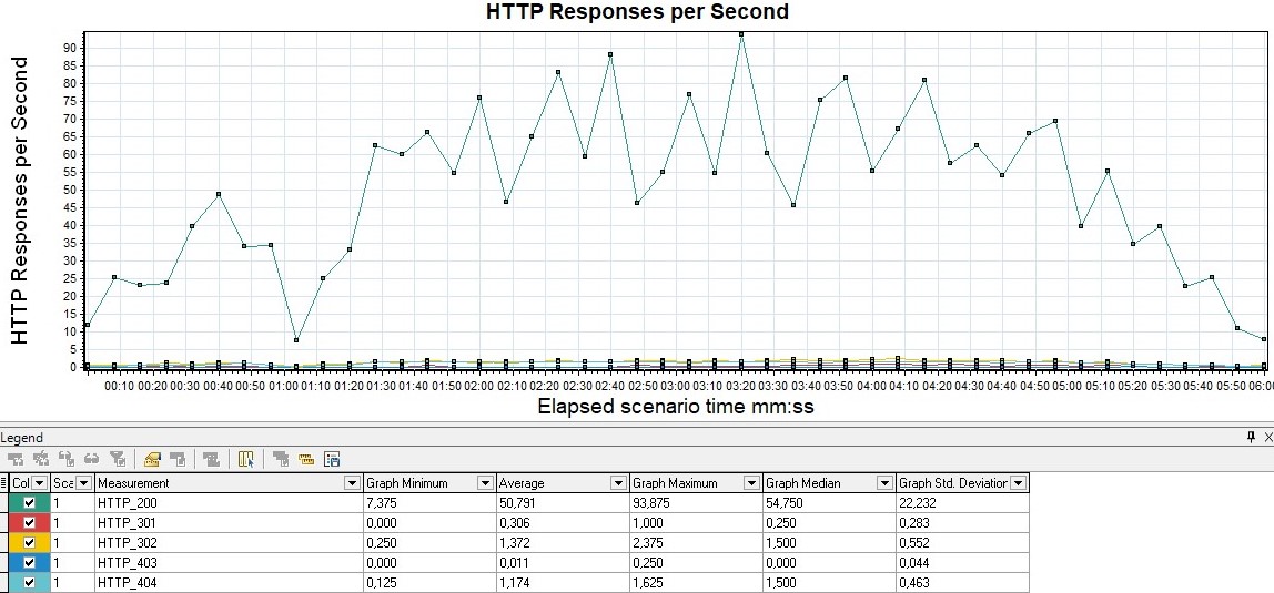 |
| Apache JMeter calls this graph Response Codes per Second from the advanced package | 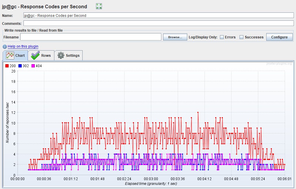 |
Throughput graph
It is usually measured in bits per second. The graph shows the throughput of the application, namely how much data was sent and processed by the application per unit of time.
It is usually used for deep analysis of application problem. Gatling only contains this graph in FrontLine, it is not in the free version.
| This graph is available out of the box in MF LoadRunner, it's called Throughput | 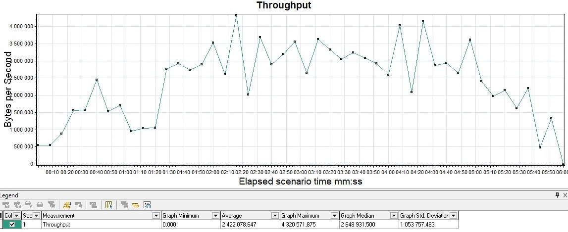 |
| In Apache JMeter, the graph is called Bytes Throughput Over Time from the advanced package | 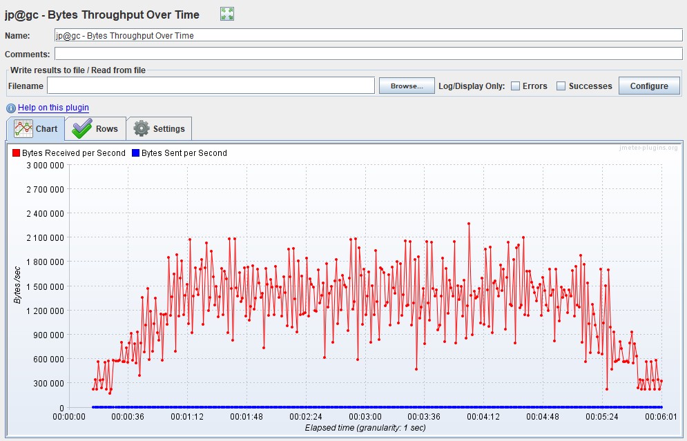 |
Possible modifications
- Response Time, , (Throughput). Response Time, Throughput , : - .
- Bandwidth, , .
- VU, , , . .
Most of the graphs can be obtained using the HTML Based Gatling Reports after the test, or by configuring the Graphite-InfluxDB-Grafana monitoring bundle . For display, you can use a ready-made dashboard from the dashboard library https://grafana.com/grafana/dashboards/9935 .
When analyzing and compiling your dashboards for Gatling, keep in mind that the results in InfluxDB are stored aggregated and are suitable only for preliminary evaluation of NT results. It is recommended that after the test, re-load the simulation.log into the database and build a final report on it and search for system performance problems.
Matrix description of metrics
Everything that we described above is presented in the form of a small tablet summarizing all this knowledge.
| A type | VU | Response time | Requests | Errors | Throughput |
|---|---|---|---|---|---|
| VU | , | RPS/TPS/HITS , | , VU . , | , , . | |
| Response Time | , . | , | , | (Throughput). Response Time, Throughput , : - | |
| Requests | , , . . | , . SLA | . . , | ||
| Errors | , | , | |||
| Throughput | , |