What is Grid?
A Grid is an overlapping set of horizontal and vertical lines - one set defines columns and the other defines rows. Items can be placed in the grid, according to rows and columns.
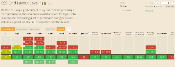
Browser support
Browser support reaches 94% in 2020
Grid container
We create a grid container by declaring display: grid or display: inline-grid on the element. Once we do this, all of the direct children of this element become grid items .
<body>
 <div class="row">
  <div class="row__item header">
   <h1>Header</h1>
  </div>
  <div class="row__item nav">
   <h1>Navbar</h1>
  </div>
  <div class="row__item article">
   <h1>Article</h1>
  </div>
  <div class="row__item ads">
   <h1>Ads</h1>
  </div>
 </div>
</body>
.row {
display: grid;
margin: auto;
grid-template-rows: 60px 1fr ;
grid-template-columns: 20% 1fr 15%;
grid-gap: 10px;
width: 1000px;
height: 1000px;
justify-items: center;
justify-content: space-between;
grid-template-areas:
"header header header"
"nav article ads";
}grid-template-rows is a CSS property that defines the line names and sizing path of the grid rows function.
The CSS property
grid-rowdetermines which line in the grid layout the element will start from, how many lines the element will occupy, or on which line the element will end in the grid layout. This is a shorthand property for the grid-row-start and grid-row-end properties .
The CSS property
grid-gapis a shorthand property for grid-row-gapand grid-column-gapthat defines the gutters between the rows and columns of the grid.
The property
grid-template-areasdefines the grid template by referring to the area names, which are set using the grid-area property .
Repeating an area name causes the content to span those cells. A dot means an empty cell. The syntax itself provides a visualization of the grid structure.
Using the property,
grid-areawe can assign each of these areas its own name. Naming areas does not create any layout yet, however we now have named areas that we can use in it.
.header{
grid-area: header;
}
.nav{
grid-area: nav;
}
.article{
grid-area: article;
}
.ads{
grid-area: ads;
}
Create a site template with CSS Grid:

Changing the template
You can change the template simply by reallocating the grid areas in
grid-template-areas.
So if we change to this:
grid-template-areas:
 "nav header header"
 "nav article ads";
}
Then, as a result, we get the following template:

Grids with media queries
One of the strengths of grids is that you can create a completely different template in seconds.
This makes CSS Grid ideal for media queries. We can simply reassign the values in ASCII graphics and wrap the result in the final media query.
@media all and (max-width: 575px) {
.row {
grid-template-areas:
"header"
"article"
"ads"
"nav";
grid-template-rows: 80px 1fr 70px 1fr ;
grid-template-columns: 1fr;
}
}
As a result, we get:

Thus, the whole point is to reassign the values in the property
grid-template-areas.
Conclusion
In this article, we've covered just the tip of the CSS Grid Layout iceberg. Sometimes it's hard to believe what kind of things CSS Grid can do. This is a break in all patterns. And I love it.
I advise you to pay attention to this specification and spend some of your time studying it. Believe me, in the future it will definitely come in handy and it doesn't matter if you write in React, Angular, Vue (insert your own). Grid's are here for a long time.