
CSS and JavaScript work well together, each of which has its own strengths, but I am confident that the more CSS is used to control the look and feel of interfaces, the more resilient and reliable web applications will be. The point here is as follows:
- CSS, by its very nature, is a failure-resistant technology. This means that when a CSS parser encounters a property it doesn't understand, it simply ignores it and moves on. In other words, using CSS, the programmer applies styles and expects them to work.
- JavaScript is not a fault-tolerant technology. A single syntax error in the JS code can break the entire application. That is, when managing the styling of sites using JS, it is absolutely necessary to check the functionality of the corresponding structures.
There are many other considerations to consider when answering the question of when to use CSS over JS .
CSS gives us new ways to design fantastic solutions that are much easier than the corresponding JS solutions and are easier to create. This refers to many of the features of CSS: transitions, custom properties, animations, filters, math.
In this post, I'll cover some of the cool features of CSS (some of which are very recent) that you may not know about yet. Namely, we will talk about smooth scrolling, about a property
position: sticky, and about other possibilities, for the implementation of which it was previously required to write many lines of ingenious JS code.
1. Smooth scrolling
In the past, equipping a page with smooth scrolling required several lines of JS code. And now this task can be solved exclusively by means of CSS. Well, isn't that wonderful? Now you can take advantage of smooth scrolling by using the CSS property
scroll-behavior.
This is how it looks:
html {
  scroll-behavior: smooth;
}
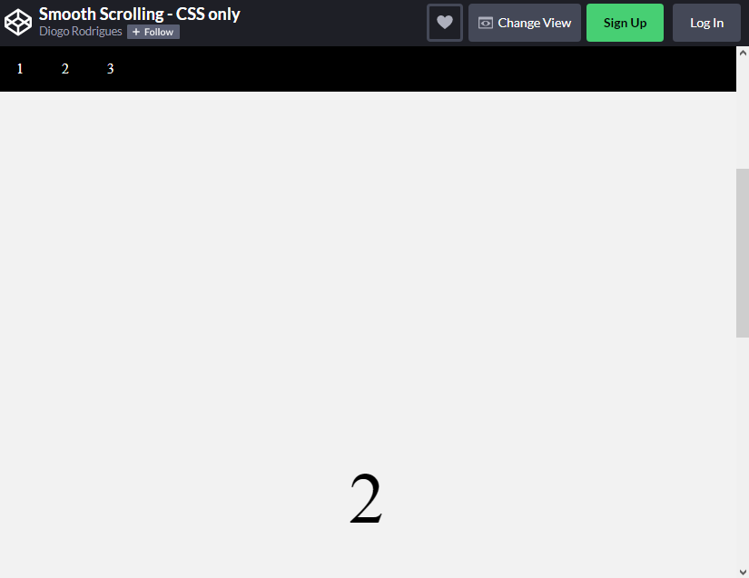
Implementing smooth scrolling
→ Here's an example on CodePen
At the time of this writing, this property
scroll-behavioris only supported in Chrome and Firefox. It is not yet supported by Edge, IE and Safari (desktop and mobile). Details on support for this property can be found on Can I Use .
2. Pinning elements
Pinning elements is one of my favorite CSS features. The point is that the corresponding elements do not disappear from the viewport when scrolling through the pages. Now to fix the elements on the page do not need to resort to
offsetToand window.scrollYin JS. These days, you can just take advantage of the CSS property position: sticky:
header {
  position: sticky;
  top: 0;
}
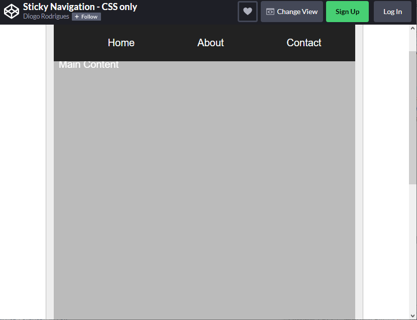
The navigation block "rests" on the upper border of the viewport and does not disappear when scrolling the page
→ Here is a CodePen project that shows an example of using the property.
position: sticky
In order to use this property correctly, you need to take into account the peculiarities of its effect on elements. When applied, the structure of the HTML page plays a role. By the way, it is precisely in the fact that these features are not taken into account, and the reason is that this property sometimes does not work.
Let's take a look at the following HTML code:
<main class="container">
  <nav class="nav">
    <ul>
      <li>Home</li>
      <li>About</li>
      <li>Contact</li>
    </ul>
  </nav>
  <div class="main-content">Main Content</div>
  <footer class="footer">Footer</footer>
</main>
The menu (the item
navfrom this example) can only be fixed in the area that is overlapped by its parent item ( mainin our example). As a result, when using a property position: sticky, two main classes of elements can be distinguished:
- Dockable element: This is the element to which we apply the property
position: sticky(navin our case). This element will move within the parent element until it reaches the given position. For example - it can betop: 0px. - Dockable container: This is the HTML element that contains the dockable element. This is the area within which the docked item can move. This "container" defines the boundaries within which the dockable item can exist.
Using this feature can significantly improve the usability of the site. This is especially true for those projects whose users have to frequently scroll through the pages.
This feature has almost 100% browser support .
3. Cropping text
CSS gives us two wonderful properties:
text-overflowand line-clamp. They allow you to trim text, carefully handle words, and at the same time save us from the need to use JavaScript or some other complex methods to solve such problems. Both properties are not new, but extremely useful.
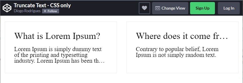
Cropping texts
→ Here's an example on CodePen
Let's talk more about properties
text-overflowandline-clamp.
▍Text-overflow property
This property controls how text is displayed in situations where it should be truncated if it does not fit on one line. An example of such a situation is shown in the above figure, in the header of the card. Here you can use the construction
text-overflow: ellipsis, which will lead to the fact that the Unicode character ( …) will be added to the end of the trimmed text .
In order for the property to
text-overflow: ellipsisdo its job, it is necessary to use the same properties white-space: nowrapand overflow: hidden.
.card-title {
  overflow: hidden;
  white-space: nowrap;
  text-overflow: ellipsis;
}
This feature is almost fully supported in all modern browsers.
▍The line-clamp property
This property comes to our aid in cases where we need to work not with one-line, but with multi-line text (an example of such text is the contents of the card from the above figure). Although this is part of the CSS Overflow Module Level 3 standard , which now has the status of "Working Draft", this property is already supported by about 95% of browsers, albeit with a prefix
-webkit-. Before using it, it is important to take into account that it does not provide the ability to control the number of characters displayed. But it's incredibly useful anyway.
To use it, we need to use the old flexbox implementation, using the
display: -webkit-boxand properties -webkit-box-orient: vertical. This is how it looks:
.card-description {
  overflow: hidden;
  display: -webkit-box;
  -webkit-box-orient: vertical;
  -webkit-line-clamp: 3;
}
4. Custom CSS Properties: CSS Variables
In the JavaScript world, CSS preprocessors (like Sass, Less, and Stylus) are very useful and popular technologies. Preprocessors extend the capabilities of CSS, allowing you to use, for example, variables and functions. But modern web designers have access to powerful standard CSS features known as custom CSS properties or CSS variables.
CSS Variables help keep applications consistent and help implement DRY. They facilitate the development and maintenance of application themes. These capabilities are one of the main reasons for the success of preprocessors. You can read more about this here .
Using standard CSS features means you no longer need preprocessors to create variables. Variables, like other standard CSS features we love, work in a cascading fashion.
It is very easy to create CSS variables. Namely, to declare a variable, it is enough to put two dashes (
--) in front of its name. After that, where the value of the variable is needed, the function is called var(), passing it the previously created variable as an argument. As you can see, everything is very simple.
:root {
  --base: #ffc600;
  --spacing: 10px;
  --blur: 10px;
}

img {
  padding: var(--spacing);
  background: var(--base);
  -webkit-filter: blur(var(--blur));
  filter: blur(var(--blur));
}

.hl {
  color: var(--base);
}
CSS Variables can be manipulated from JavaScript.
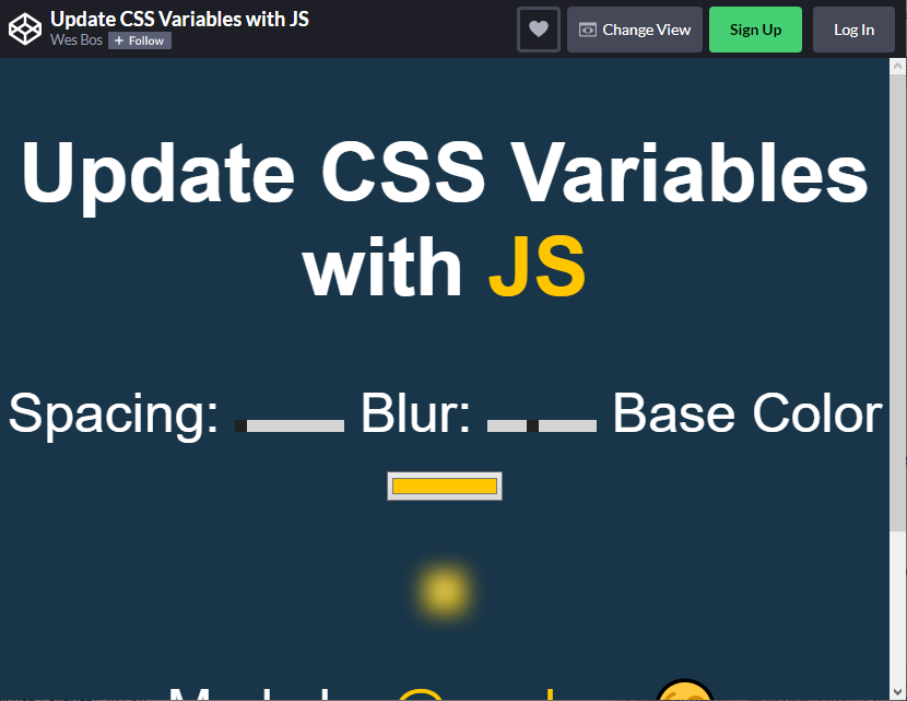
Using CSS-variables
→ Here is an example on CodePen, which shows the use of CSS-variables and management of the JS-code
5. Providing support for the dark theme
Since Apple introduced the dark theme for macOS last year, and because CSS gave us the ability to detect uses of the theme using a media query, many large web projects (like Twitter and Google Maps) have adopted the theme. ( here is a list of projects that support the dark theme).
The dark theme is not just a way to decorate web pages. It can really help some people surf the Internet.
Here are some quotes.
And then there are people who, for objective reasons, need dark mode. They use this mode as one of the tools for people with disabilities. For example, we are talking about people with low vision.
Thomas Steiner, Customer Solutions Engineer, Google, Germany.
Molly has Usher syndrome. Because of this, she does not hear anything, and the field of view of one of her eyes is limited to 5 degrees. (…) Viewing pages in dark mode will be within her power. This mode can be useful for other people as well, expanding the possibilities of using the Internet for those who have a headache, or for those who have to sit at a computer in a poorly lit room. If, when developing something, focus only on some special users, it will be useful not only for them.
Charles Reynolds , Designer, UK Government.
Also made of materialYou can learn from Thomas Steiner how the use of dark mode helps to save energy: “(…) as you know, using dark mode on AMOLED displays saves a lot of energy. Android research, targeting popular Google apps like YouTube, has shown energy savings of up to 60% in some cases. ”
A new CSS feature that lets us know if a user has a dark theme enabled is represented by a media function
prefers-color-scheme. It is already compatible with Chrome, Firefox, Safari and Opera.
When combined with CSS Variables, it is very easy for a web developer to make it easy for his visitors to take advantage of the dynamic light and dark modes.
:root {
  --color: #222;
  --background: #eee;
  --text: 'default';
}

body {
  color: var(--color);
  background: var(--background);
}

body:after {
  content: var(--text);
  display: block;
  text-align: center;
  font-size: 3rem;
}

@media (prefers-color-scheme: light) {
  :root {
    --color: #222;
    --background: #eee;
    --text: 'light';
  }
}

@media (prefers-color-scheme: dark) {
  :root {
    --color: #eee;
    --background: #222;
    --text: 'dark';
  }
}
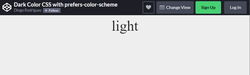
Automatic detection of the theme used by the device
→ In this CodePen project, the page design depends on which theme the viewer is using
6. Directive supports
For a long time, web developers have had to resort to third-party solutions (like the Modernizr JS tool ) to find out if certain CSS features are supported by the current browser. For example, by configuring an element property
-webkit-line-clamp, you can check if the property is supported in the browser, and if not, you can use some fallback.
After the directive appeared in CSS
@supports, it became possible to check the capabilities of browsers directly from the CSS code.
The directive is
@supportsvery similar to media queries. It supports various combinations expressions constructed using conditional statements AND, ORand NOT:
@supports (-webkit-line-clamp: 2) {
    .el {
        ...
    }
}
This checks if the browser supports the property
-webkit-line-clamp. If so, that is, if the condition turns out to be true, the style declared inside the directive will be applied @supports. All modern browsers support
this feature .
Outcome
In this post, I have covered some of the useful features of CSS. If you can do something without using JS, but only using CSS, then do so.
The modern world of the front-end is changing rapidly, we constantly have new opportunities at our disposal that help us do our business faster and better. Experimenting with CSS and learning new things is not only very rewarding, but also extremely interesting. I advise you to try something new that you learned about today.
Do you know of any recent CSS features that allow you to solve the same problems that you previously solved only using JavaScript?
