In 2005, the GNOME developers set out to take 10% of the global desktop computer market by 2010. 15 years have passed. The share of Linux desktops on board balances around 2%. Will anything change after a few new releases? And in general, what is special about them?
The GNOME desktop environment has undergone many changes since its first release in March 1999. Since then, the open source project has consistently released updates twice a year. So now users know ahead of time when to expect new features.
The last release of GNOME 3.36 came out in March, and the developers are now planning the next release in September. I spoke with Emmanuele Bassi to find out what deserves special attention in the current version of GNOME - and most importantly, what's new in future releases.
Emmanuele has been working with the GNOME team for over 15 years. He first worked on a project that allowed developers to use the GNOME libraries with other programming languages, and then moved on to the development team for GTK, a cross-platform widget for developing GNOME applications. In 2018, GNOME hired Emmanuele into the GTK Core group, where he is working on the GTK library and GNOME application development platform.
GNOME 3.36 was released in March 2020. What features should we be aware of?
Emmanuele Bassi:[First of all, I'd like to point out that] GNOME has been following a clear release schedule for 18 years. The next version of GNOME is not released when some features are ready, but according to the plan. This makes it easier to work on releases. In GNOME, we don't wait for the next fat feature to be ready. Instead, we just release a new release every six months. We always fix bugs, add new features, and polish everything up.
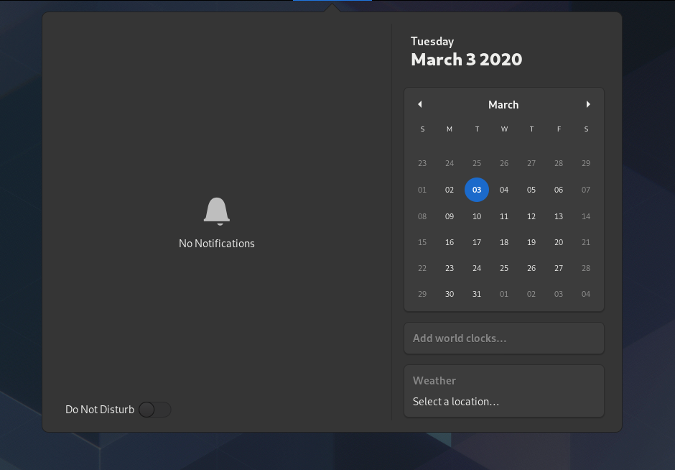
In this release, we have verified that all functions are convenient and enjoyable to use. There are many usability improvements in GNOME 3.36. For example, I like the ability to turn off notifications. This feature was available in a very old version of GNOME, but was removed some time ago because it was not very reliable. But we brought it back because this feature is very useful and important for many people.
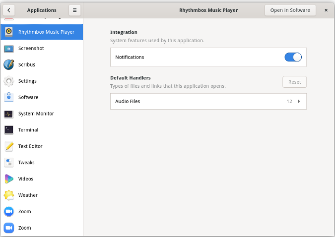
You can turn notifications on and off for all apps at once, or customize them for each app you use. You can find this feature in the GNOME Settings, in the Applications menu.

We've also improved the GNOME lock screen. He's been at work for ages, but now he's ready. When the lock screen is shown, the background of the current work area is blurred, but running applications are still not visible. We've been working on this and related task over the last three or four iterations and have overcome many challenges to make it work well.
Another thing that we thought was important in terms of user interaction is access to all Extensions. In the past, extensions were accessible through the GNOME Software Center, but not everyone knew about it. Now we have moved extension management into a separate application.

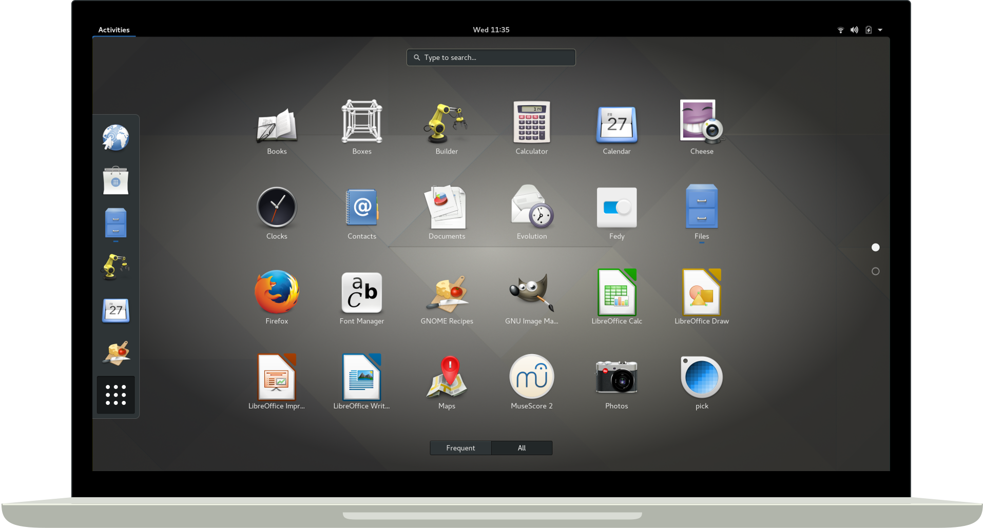
And the GNOME shell itself has been tweaked a bit too. For example, folders in Launcher are a great new feature. It's really easy to create your own application groups or folders in the launcher. Many users have asked for this for a long time. Folders were actually added in an earlier version of GNOME, but [the feature] needed some work to make it really cool. And I hope you enjoy it in GNOME 3.36.
The folders are now more visible and they look great. GNOME will suggest a name for your folder itself, but it is very easy to rename it if you wish.
What GNOME features are underrated or overlooked so far?
E.B .:I don't know if there are other really important features in GNOME 3.36. If you are using GNOME heavily, then the most important thing you should appreciate is the improved user interface. We are also talking about the most "tactful" [and friendly] interaction with the user. The system shouldn't give you any trouble.
[I also remembered that] we simplified the work with the password input field. Previously, everything had to be done through the menu, which you had to find somehow, but now everything is at hand.

This is especially true if you use long and complex passwords like me. In any situation where you are entering a password, you can click the little icon to make sure you entered it correctly.
EB: More and more applications in GNOME are now responsive to resizing. In response to these changes, the user interface is rebuilt. The Settings app is a good example in this sense. If you make its window too narrow, it will display the interface elements differently. We've been working on this because of the need for responsiveness, with companies like Purism using GNOME on different screen sizes (including phones) and in different form factors.
You won't notice some of the changes until you start actively using the GNOME desktop. There are many great features that allow you to customize GNOME to your liking.

You are not only a developer, but also a GNOME user. Please tell me which GNOME features do you find most useful in your day-to-day work?
EB: I use keyboard navigation a lot. I use the keyboard all the time: I live with my hands on the keyboard. Using the mouse too often, I can even get RSI (muscle pain or injury due to repetitive fast movements). Being able to use only the keyboard is great.
An advanced hotkey system is one of the strengths and part of the GNOME culture. Our design is developing in the same direction, which is based on the paradigm of using "hot" keys. So this is the main part of the design language, not an additional feature that will ever be removed.
Also, I need to open multiple windows on the screen and arrange them in space. I usually place two windows side by side. I also use multiple workspaces. I tried to manage my workspaces back in the 1990s using different virtual desktops. But I always had extra virtual desktops that just dangled around. In GNOME, it's easy enough to create a new workspace whenever you need it. And it just as easily disappears when the need for it disappears.
What's interesting to expect from GNOME 3.37 and GNOME 3.38 scheduled for September 2020?
E.B .:Change is happening all the time. For example, we are currently working on the application grid and its settings. Right now, apps are sorted by name and alphabetical, but soon you'll be able to drag and drop and arrange them at will. This concludes the massive changes we've been working on for five years or more. Our goal is to make GNOME less authoritarian and more user-centered.
We've also worked on GNOME Shell. The developers want to do some tests with Overview. Today, you have a panel on the left, a panel on the right, and windows in the center. We will try to remove the dashboard, because in our opinion it is useless. But you can still get it back and customize it. This is a kind of nod to mobile-first. But on a desktop computer, you are in landscape mode and you have a lot of screen space. And there is less space on a mobile device, so we are experimenting with new ways of displaying content. Some of them will appear in GNOME 3.38, but this is a very long-running story, so let's not guess.
More options will appear in GNOME Settings. GNOME 3.38 introduces a multitasking panel. Some of the new settings are already implemented in the GNOME Tweaks application, and some of them will migrate from Tweaks to the main Settings application. For example, the ability to turn off the hot corner - some people don't like this feature. We'll give you the ability to customize a user interface with multiple screens by placing a separate workspace on each one. Many of these settings are not available right now, so we are moving them from GNOME Tweaks.
[In closing, I would like to point out that] each of us has done a tremendous amount of work to make GNOME better, including for people on more limited systems like the Raspberry Pi. All in all, we have worked and are continuing to work hard to improve GNOME [and make it friendlier].
Advertising
Need a Remote Desktop Server ? You can install absolutely any operating system with us. Our epic servers with modern and powerful AMD processors are perfect. A wide range of configurations with daily pay.
