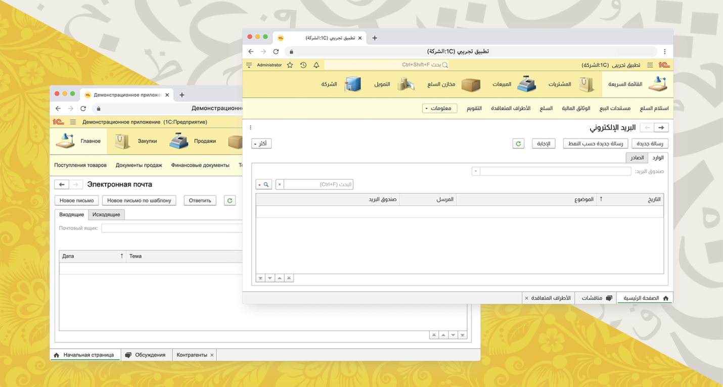
One of the features of the Arabic language is that the text in it is written and read from right to left. The UI for the Arabic language should be mirrored horizontally (but not everything and not always - there are subtleties), open the context menu to the left of the cursor, etc.
Under the cut - about how we supported RTL (right-to-left) in the web client of the 1C: Enterprise platform, and also one of the hypotheses explaining why the Arab world writes from right to left.
A bit of history
We are used to writing from left to right. This direction of writing is largely generated by the fact that when writing text on paper, right-handers (and according to statistics, about 85% of them) see what has already been written - the writing (right) hand does not cover the written text. Lefties have to suffer.
One of the hypotheses "why the Arabic language is written from right to left" sounds like this. The languages from which Arabic originates originated in those days when there was no paper and its analogues (papyrus, parchment, etc.). There was only one way to record information - to carve letters in stone. And how will it be more convenient for right-handers to wield a hammer and a chisel? Of course, holding a chisel in his left hand and knocking on it with a hammer clamped in his right. And in this case it is more convenient to write from right to left.
Well, now - about how we dealt with this legacy of centuries.
How did we get started on the task?
None of the platform developers spoke Arabic and had no experience in developing RTL interfaces. We have shoveled a lot of articles on the topic of RTL (I especially want to thank the 2GIS company for the work done and carefully worked out articles: article 1 , article 2 ). As we studied the material, we realized that we couldn't do without a native speaker. Therefore, simultaneously with the search for translators into Arabic, we began to look for an employee - a native speaker of the Arabic language, who would have the experience we needed, could advise us on the Arabic specifics of interfaces. After reviewing several candidates, we found such a person and got down to work.
Let's play with fonts
By default, we use the platform font Arial, 10pt. The developer of a specific configuration can change the font for most interface elements, but, as practice shows, this is rarely done. Those. in most cases, users of 1C programs see inscriptions written by Arial on their screens.
Arial displays 21 languages well (including Chinese and Vietnamese). But, as it turned out thanks to our Arabic colleague, the Arabic text rendered with this font is very small and difficult to read:
100%:

Arab users tend to work in an increased DPI - 125%, 150%. The situation improves in this DPI, but Arial is still difficult to read due to the nature of the font.
125%:

150%:

We looked at several options for solving this problem:
- Arial , , ( ).
- Arial 11pt RTL-.
- Arial , LTR- Arial.
When choosing a solution, we had to take into account that the Arial 10pt font has been used in the 1C: Enterprise platform for a very long time, on the platform we and our partners have created more than 1300 edition solutions, and in all of them the Arial 10pt font showed itself well on all supported OS (Windows, Linux and macOS of various versions), as well as in browsers. Changing the font and / or its size would mean massive testing of the user interface, and much of these tests cannot be automated. Changing the font would also mean changing the familiar interface of programs for current users.
Moreover, we were unable to find a universal font that would represent all languages well, including Arabic. For example, the Segoe UI font renders Arabic well even at 10pt, but does not support Chinese, and is also not supported on some OS. Tahoma is good at rendering Arabic text at 10pt, but has problems with Linux support and "too bold" Latin / Cyrillic for bold (Arabic bold looks good). Etc.
Increasing the default font size to 11pt in the RTL interface would mean a serious amount of UI testing - we have to make sure that everything is rendered correctly, all the labels are placed in the designated space, etc. And even at 11pt, Arial does not display Arabic characters perfectly.
As a result, the third way turned out to be optimal in terms of labor costs and the achieved effect: we continue to use Arial for all characters except Arabic. And for Arabic characters, we use a well-suited font for this - Almarai . To do this, add to the CSS:
@font-face {
  font-family: 'Almarai';
  font-style: normal;
  font-weight: 400;
  font-display: swap;
  src: local('Almarai'),
       local('Almarai-Regular'),
       url(https://fonts.gstatic.com/s/almarai/v2/tsstApxBaigK_hnnQ1iFo0C3.woff2)
            format('woff2');
  unicode-range:
       U+0600-06FF, U+200C-200E, U+2010-2011, U+204F, U+2E41, U+FB50-FDFF, U+FE80-FEFC;
}
and then wherever you need to use the default font, set the font in this way:
font-family: 'Almarai', Arial, sans-serif;The beauty of this approach is that if there is not a single character in the interface that falls within the unicode-range, then that font won't even load. But as soon as such a symbol appears, the browser will download the font itself (or use its local version) and display the symbol in the desired font.
"Flip" interface
As you might expect, the HTML layout of the web client was not ready for a flip. After taking the first step, setting the dir = ”rtl” attribute on the root element and adding the html [dir = rtl] {text-align: right;} style , we started the painstaking work. In the course of this work, we have developed a number of practices that we want to share here.
Symmetry
Let's look at the example of buttons. Buttons in the platform can contain a picture, text and a drop-down list marker. And all this in any composition at the discretion of developers of application solutions based on the platform.
The "before RTL" column graphically represents the initial padding of button elements. The dependence of the amount of indents on the presence of elements in the button, as well as on the sequence of their arrangement, is obvious. If there is a picture, then the text does not need a left indent, if the image is on the right, then the image has a negative shift, if there is a marker in the drop-down list, the container with the text has more indent on the right, if the marker is immediately after the image, it still has an indent on the right. Too many ifs, except for a text-only button with symmetrical padding. Symmetrical! If you distribute the indents symmetrically, then there is nothing to flip. This became the main idea.
The "after RTL" column shows the new symmetric indents on the same buttons. It remains to solve the nuance with the indentation between the picture and the list marker. I wanted a universal solution for any orientation. The triangle itself is drawn with the top border on the pseudo-element, and it needs an indent only if it is after the picture. Under this condition, another pseudo-element is added with the width to the required indent. The triangle and padding will themselves swap when the orientation is changed.

Note. All the examples below are by default for the LTR interface. To see what the example looks like in the RTL interface, change dir = "ltr" to dir = "rtl".
<!DOCTYPE html>
<html dir="ltr">
<head>
<style>
.button {
    display: inline-flex;
    align-items: center;
    border: 1px solid #A0A0A0;
    border-radius: 3px;
    height: 26px;
    padding: 0 8px;
}
.buttonImg {
    background: #A0A0A0;
    width: 16px;
    height: 16px;
}
.buttonBox {
    margin: 0 8px;
}
.buttonDrop {
    display: flex;
}
.buttonDrop:after {
    content: '';
    display: block;
    border-width: 3px 3px 0;
    border-style: solid;
    border-left-color: transparent;
    border-right-color: transparent;
}
.buttonImg + .buttonDrop::before {
    content: '';
    display: block;
    width: 8px;
    overflow: hidden;
}
</style>
</head>
<body>
<a class="button">
    <span class="buttonImg"></span>
    <span class="buttonBox"></span>
    <span class="buttonDrop"></span>
</a>
<a class="button">
    <span class="buttonImg"></span>
    <span class="buttonDrop"></span>
</a>
</body>
</html>
We try to avoid unnecessary elements, pseudo-elements and wrappers. But, making a choice in this case between increasing the conditions in CSS and adding a pseudo-element, the solution with a pseudo-element won because of its versatility. There are not many such buttons on the form, so the performance when adding elements will not suffer even in Internet Explorer.
The principle of symmetry has also proven useful in scrolling through our panels. To move the content horizontally, we previously applied a single margin-left property : -Npx; ...
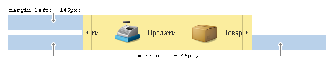
The value is now set to symmetric margin: 0 -Npx; , i.e. for left and right at once, and where to move - the browser itself knows, depending on the specified direction.
Atomic classes
One of the capabilities of our platform is the ability to dynamically change content and its location on the form "on the fly" according to the taste of each user. A common case of changes is the horizontal alignment of text: left, right, or center. This is achieved by simply aligning text-align with the appropriate value. A reversal for RTL would mean expanding the conditions in scripts and styles for each control and for each case of its positioning. The minimum solution cost 4 lines:
.taStart {
    text-align: left;
}
html[dir=rtl] .taStart {
    text-align: right;
}
.taEnd {
    text-align: right;
}
html[dir=rtl] .taEnd {
    text-align: left;
}
Thus, in the necessary places, the class is installed with the necessary alignment and its easy replacement, if necessary. It remains only to replace the alignment setting with style = "text-align: ..." with the appropriate class.
The same principle is used to set another type of alignment - float .
.floatStart {
    float: left;
}
html[dir=rtl] .floatStart {
    float: right;
}
.floatEnd {
    float: right;
}
html[dir=rtl] .floatEnd {
    float: left;
}
And, as without it, a class for mirroring, for example, icons, which is also installed in any containers that need mirroring in the RTL interface.
html[dir=rtl] .rtlScale {
    transform: scaleX(-1);
}
Antiscale
Having dealt with the "simple" linear elements, it's time to move on to the "complex" ones. There are also some in our platform, for example, toggle switches. They can be of different geometric shapes. The browser coped with the arrangement of the elements, the indents in our toggle switches are initially symmetrical. So what's the problem? The problem is in the rounding of the frames.
The rounding of the frames is calculated for each toggle switch element, depending on its position. "Left-top", "right-top", "right-top and right-bottom" - the variations are different.
You can flip the entire container with the toggle switch, but what about the text that also flips? We called this technique "anti-scale" . Add the atomic class rtlScale to the container that needs to be mirrored, and add the transform inheritance property to its child element : inherit; ... In the LTR interface, this method will be ignored, but for the RTL interface, the text, flipped twice, will be displayed as needed.

<!DOCTYPE html>
<html dir="ltr">
<head>
<style>
html[dir=rtl] .rtlScale {
    transform: scaleX(-1);
}
.tumbler {
    display: inline-flex;
    border-radius: 4px 0 0 4px;
    border: 1px solid #A0A0A0;
    padding: 4px 8px;
}
.tumblerBox {
    transform: inherit;
}
</style>
</head>
<body>
<div class="tumbler rtlScale">
    <div class="tumblerBox"> </div>
</div>
</body>
</html>
Flexbox
Of course, unfortunately, we did not come up with this amazing technology, but with great pleasure we used its capabilities for our purposes. For example, in the section panel. The scroll buttons of this panel do not take up space; they appear on top of the panel when it is possible to scroll in one direction or another. Quite a logical implementation of position: absolute; right / left: 0; turned out to be not universal, so we abandoned it. As a result, the universal solution began to look like this: set the parent container of the scroll button to zero width so that it does not take up space, and the orientation of the scroll button located at the end was changed through flex-direction: row-reverse; ...

Thus, the button at the end of the line is pressed against the end of the line of the zero-width container and is displayed "back" over the panel.
<!DOCTYPE html>
<html dir="ltr">
<head>
<style>
.panel {
    display: inline-flex;
    background: #fbed9e;
    height: 64px;
    width: 250px;
}
.content {
    width: 100%;
}
.scroll {
    display: flex;
    position: relative;
    width: 0;
}
.scrollBack {
    order: -1;
}
.scrollNext {
    flex-direction: row-reverse;
}
.scroll div {
    display: flex;
    flex: 0 0 auto;
    justify-content: center;
    align-items: center;
    background: rgba(255,255,255,0.5);
    width: 75px;
}
</style>
</head>
<body>
<div class="panel">
    <div class="content"> </div>
    <div class="scroll scrollBack">
        <div></div>
    </div>
    <div class="scroll scrollNext">
        <div></div>
    </div>
</div>
</body>
</html>
By the way, the zero-width idea turned out to be useful for solving other problems as well. Drop-down elements (context menus, drop-down lists, etc.) are widely used in the platform. Positioning calculation is complex and subtle, hence mirroring requires even more complexity and subtlety.

The solution is to put the dropdown in a zero-sized container (called an anchor). The anchor is positioned absolutely at the required point of the interface, and its content with its starting edge is pressed against the starting edge of the anchor, positioning the content in the desired direction.
<!DOCTYPE html>
<html dir="ltr">
<head>
<style>
.anchor {
border: 1px solid red;
position: absolute;
width: 100px;
height: 50px;
max-width: 0;
max-height: 0;
top: 25%;
left: 50%;
}
.anchorContent {
background: #FFF;
border: 1px solid #A0A0A0;
width: inherit;
height: inherit;
padding: 4px 8px;
}
</style>
</head>
<body>
<div class="anchor">
<div class="anchorContent"> </div>
</div>
</body>
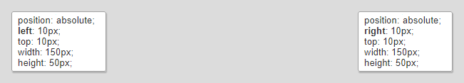
</html>Absolutely positioned elements
Where absolute positioning of elements cannot be avoided ( style = ”position: absolute;” or style = ”position: fixed;” ), dir = ”rtl” is powerless. An approach comes to the rescue when the horizontal coordinate is applied not to the left style , but to the right one .
Moreover, if in JS, when calculating coordinates, there is an appeal to the scrollLeft and offsetLeft properties of elements, then in the RTL interface, using these properties directly can lead to unexpected consequences. You need to calculate the value of these properties in a different way. The implementation of this functionality in the Google Closure Library, which we use in the web client, has proven itself well: see.https://github.com/google/closure-library/blob/master/closure/goog/style/bidi.js .
Eventually
We did it! We turned over and saved our source code in a single version for LTR and RTL interfaces. The need has not arisen yet, but if desired, we can display two forms of different directions simultaneously on one page. And by the way, using our techniques, we ended up with the final CSS file 25% lighter.
We also supported RTL in a thin (native) 1C client that works on Windows, Linux and macOS, but this is a topic for a separate article.