
Various visualization options will help us with this :
Reduced text view
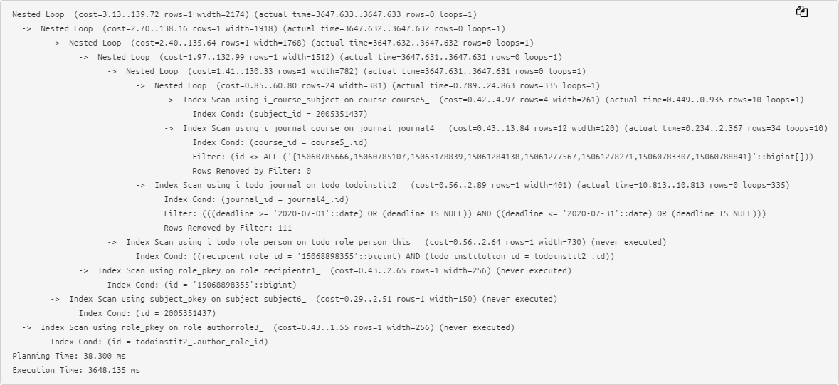
The original text of a rather simple plan already causes problems when analyzing:
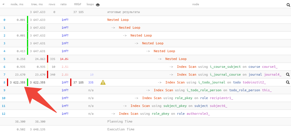
Therefore, we prefer the abbreviated form, when key information about the execution time and used buffers of each node is taken out to the left and right , and it is very easy to notice the maxima:
Pie chart
But sometimes even just to understand “where it hurts the most” is not easy, especially if it contains several tens of nodes and even the shortened form of the plan takes 2-3 screens.
In this case, the usual pie chart will come to the rescue:
Immediately, offhand, you can see the approximate share of resource consumption by each of the nodes. When we hover over it, on the left in the text view, we will see an icon for the selected node.
Tile
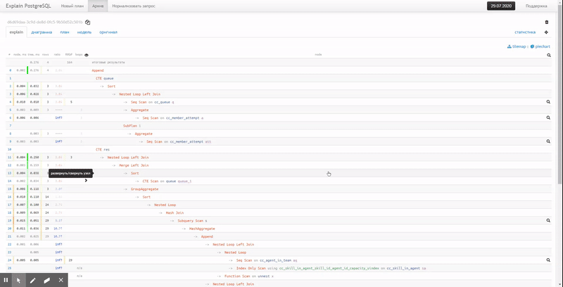
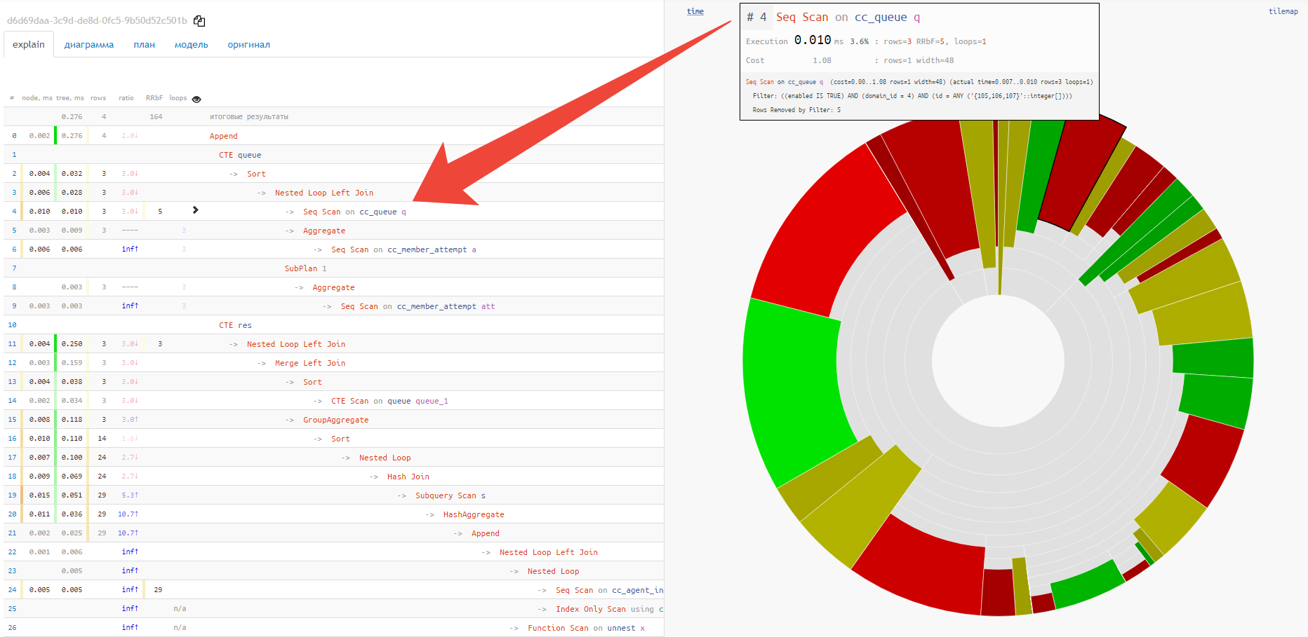
Alas, piechart does not show the relationship between different nodes and the "hottest" points. For this, the "tile" option is much better suited:
Execution diagram
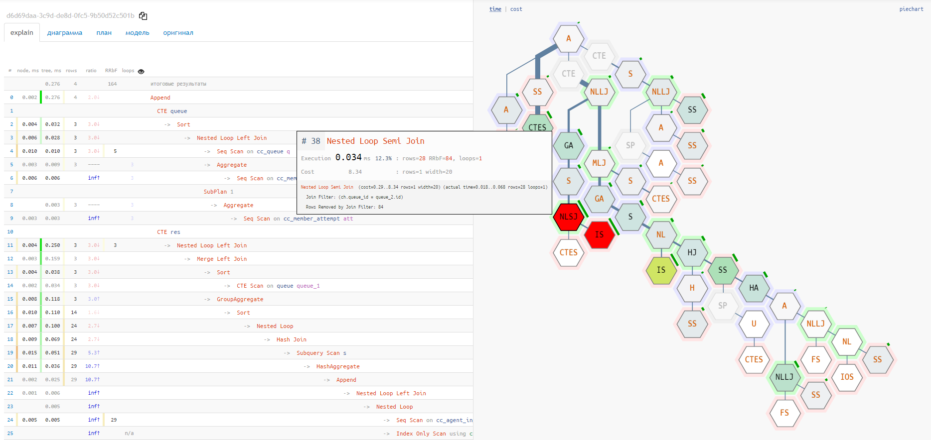
But both of these options do not show the full chain of service nodes attachments
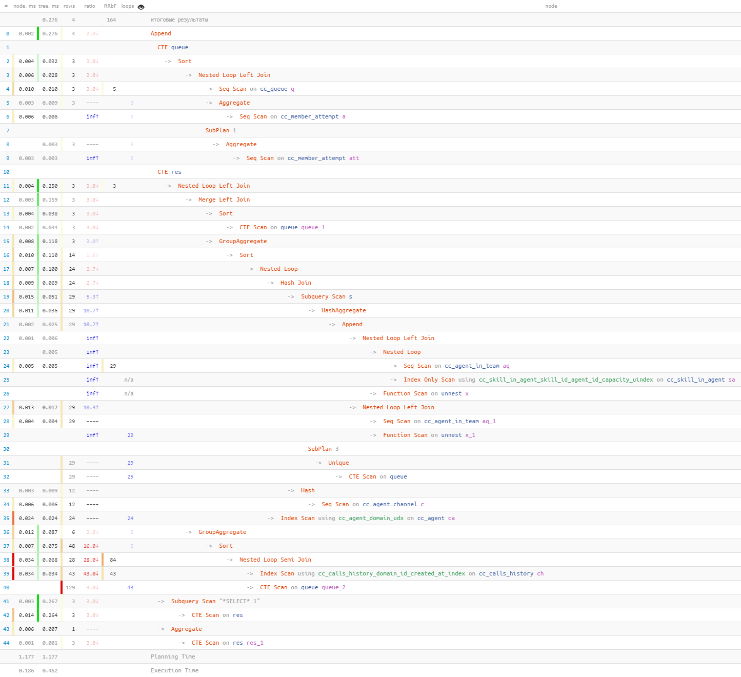
CTE/InitPlain/SubPlan - it can only be seen in the real execution diagram:

More metrics needed!
If you shoot the plan of the actual execution of the query as
EXPLAIN (ANALYZE), you will see only the elapsed time there . But very often this is not enough for correct conclusions!
For example, by executing a query on a "cold" cache, you will get (but you will not see!) The time of receiving data from the media, and not at all the work of the query itself.
Therefore, a couple of recommendations:
- Use to see the volume of data pages being subtracted. This value is practically not subject to fluctuations from the load of the server itself and can be used as a metric for optimization.
EXPLAIN (ANALYZE, BUFFERS) - Use
track_io_timingto understand exactly how long it took to work with the carrier .
And now, if your plan contains not only time , but also
buffersor i/o timings, then on each of the diagram options you can switch to the analysis mode for these metrics. Sometimes you can immediately see, for example, that more than half of all readings fell on a single problem node:

Previous articles on the topic:
- Understanding PostgreSQL query plans even more conveniently
- Recipes for ailing SQL queries
- What EXPLAIN is silent about, and how to get him to talk