backgroundis one of the most commonly used properties. But the web development community is not yet very aware of the possibilities that multiple backgrounds provide. Here, I'm going to talk seriously about what multiple backgrounds can do and how to use the standard CSS mechanisms to their fullest.
In this article, I will talk about the property in detail
background-image, give illustrative examples of sharing multiple background images of an element, and consider the strengths of this approach. There will be many illustrations here.
If you are not familiar with the CSS property , it will be good if you, before reading the material, take a look at this MDN documentation page dedicated to this property.

background
Introduction
A CSS property
backgroundis a shorthand property that allows you to set the following common element properties:
- background-clip
- background-color
- background-image
- background-origin
- background-position
- background-repeat
- background-size
- background-attachment
Here we will focus on the properties
background-image, background-positionand background-size.
Consider the following example:
.element {
  background: url(cool.jpg) top left/50px 50px no-repeat;
}
The starting position of the background image is at the top-left corner of the element. The image size is
50px * 50px. When setting a property, backgroundit is important to remember the order of the properties that define the position and size of the background image.
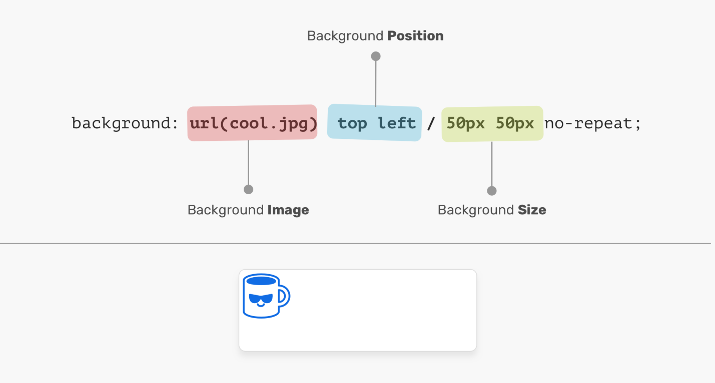
Image path, position, and size
In the previous figure, values related to setting a property
background-positionare followed by property valuesbackground-size. If we put these values in a different order, we end up with incorrectly styled CSS. For example - like this:
.element {
  /* :  CSS */
  background: url(cool.jpg) 50px 50px/top left no-repeat;
}
Background image position
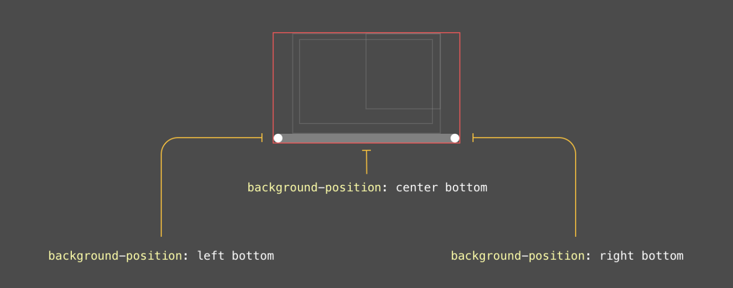
To set the area of the background, the original position of the background image, use the property
background-origin. I love the flexibility that property provides background-position. It allows you to position the background of elements in different ways:
- Keywords (
top,right,bottom,left,center). - Percentage values. For example:
50%. - Values specifying certain distances. For example:
20px 2.5rem. - Values representing the padding from the edges of the element. For example:
top 20px left 10px.

Coordinate System The origin of the coordinate
system used when positioning background images is in the upper left corner of the element. The initial value of the property
background-positionis0% 0%.
It's worth noting that value
top leftis the same as valueleft top. The browser is smart enough to figure out how much of this value is on the X-axis and how much on the Y-axis.
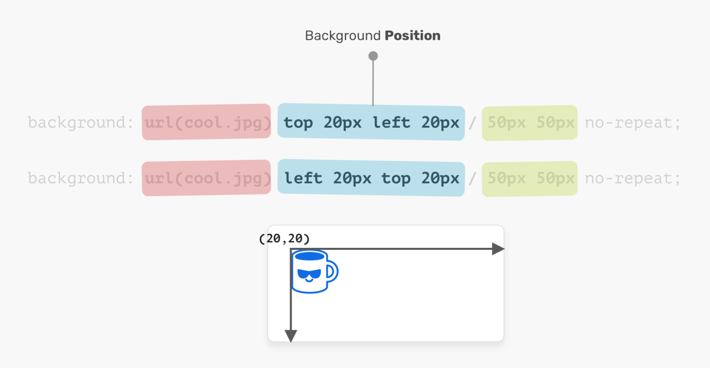
Top left and left top are the same.
.element {
  background: url(cool.jpg) top left/50px 50px no-repeat;
  /*  -   ,    */
  background: url(cool.jpg) left top/50px 50px no-repeat;
}
Background Image Size
The name of the property that sets the size of the background image
background-sizeuniquely indicates the role of this property. The size of a background image is its width and height. When setting this property, keep in mind that the first value is the width and the second is the height.
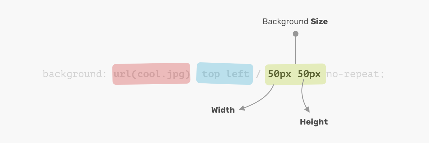
Width comes first, then height
If the width and height of the background image are the same, this means that we don't need to specify two values for
background-size. In such a situation, one value is sufficient.
Here, by the way, it would be useful to mention that the CSS specification says the following about this: "If only one value is specified, then it is assumed that the second value is auto." But this mechanism is not implemented in browsers, although this may change in the future. I thank Ilya Streltsyn for drawing my attention to this detail.
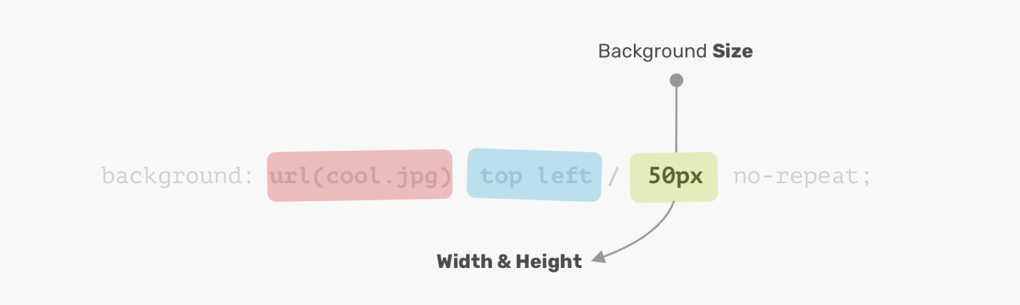
One value sets both the width and the height
Now that we have covered the basics of using a property
background, let's talk about how to work with multiple backgrounds.
Multiple background
A property
backgroundcan describe one background layer, so far we have seen just such descriptions, or - several layers, the properties of which are separated by a comma. If several background images are the same size, one of them completely overlaps the others.
.element {
  background: url(cool.jpg) top left/50px 50px no-repeat,
    url(cool.jpg) center/50px 50px no-repeat;
}
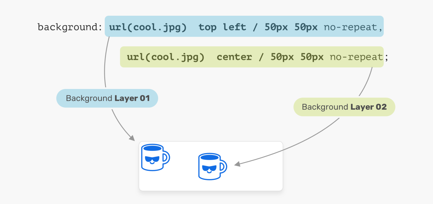
Using Multiple Background Images
In the above illustration, an element has two layers of background images. Each of these images are positioned differently. This is the simplest example of using multiple backgrounds. Now let's look at a more advanced example.
How to stack background images on top of each other
When equipping an element with multiple background images, if one of them occupies the entire width and height of the parent element, the order in which the backgrounds are stacked becomes important. Deciding in what order the backgrounds to stack on top of each other can be tricky. Consider the following example.
.hero {
  min-height: 350px;
  background: url('table.jpg') center/cover no-repeat,
    url('konafa.svg') center/50px no-repeat;
}
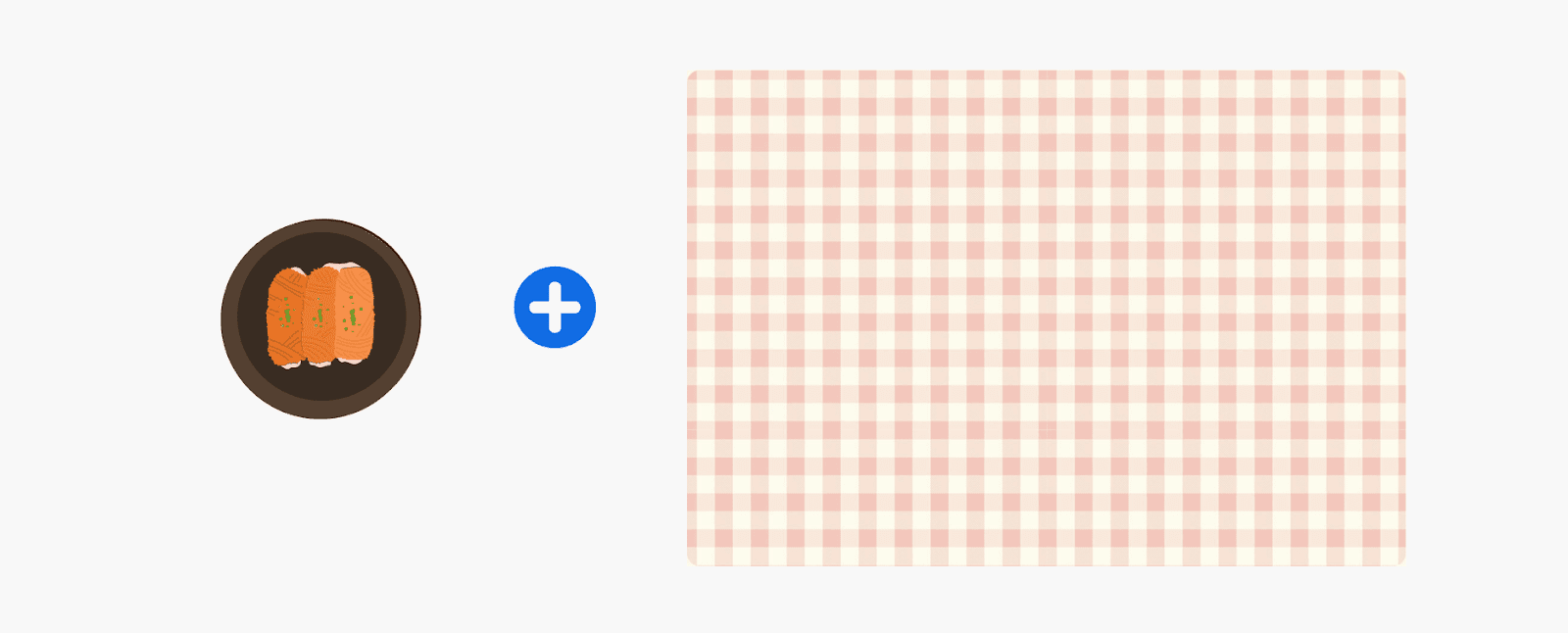
Here we have a table image (
table.jpg) and a plate image ( konafa.svg). Which of these background images do you think will be displayed first? An image of a table or an image of a plate?
Element with two background images The
correct answer to this question is to have the table image first. In CSS, the background described first is overlaid on the second background, the second background is overlaid on the third, and so on. Changing the description order of backgrounds affects their display in the element.
.hero {
  background: url('konafa.svg') center/50px no-repeat,
  url('table.jpg') center/cover no-repeat;
}
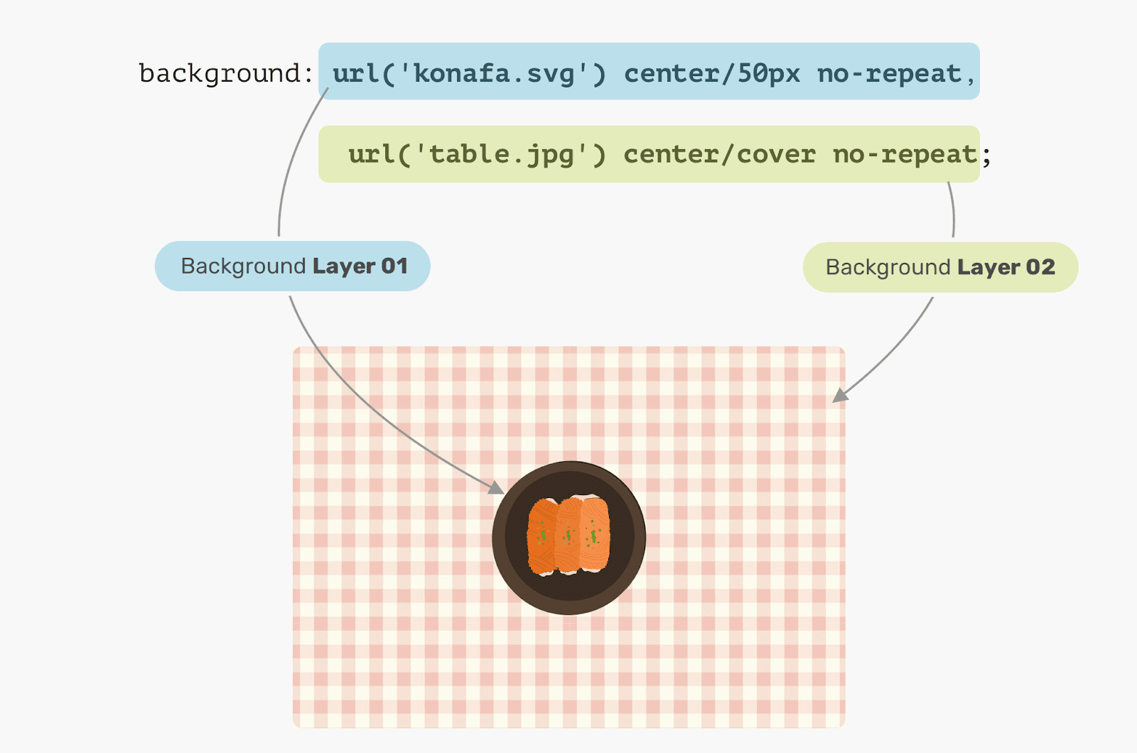
The first background is superimposed on the second.
As you can see, the background specified by the first is above the background specified by the second.
Solid colors
Suppose we want to create a solid background using the CSS background tools for an element. How to do it? This is, thanks to CSS Gradients, an easy task. The point is that if you use a function
linear-gradientwith the same stop colors, it will result in a solid color.
.hero {
  background: linear-gradient(#3c88Ec, #3c88Ec)
}

Background Created With Linear-Gradient And Same Stop Colors
Here's a simple example of using a gradient to set up a background, but gradients can actually be used to create very interesting and useful effects.
Use cases and practical examples
▍Dark background image
Often, to make the text of the top section of a page easier to read, the background image of that section needs to be darkened. It's easy to do this with two background images.
.hero {
  background: linear-gradient(rgba(0, 0, 0, 0.15), rgba(0, 0, 0, 0.15)),
    url("landscape.jpg") center/cover;
}

Darkened background image
More interestingly, the same method can be used to tint the background image of elements.
.hero {
  background: linear-gradient(135deg, rgba(177, 234, 77, 0.25), rgba(69, 149, 34, 0.25),
    url("landscape.jpg") center/cover;
}

Tinted background
▍Drawing with CSS
The possibilities for using CSS gradients for painting are truly endless. In particular, we are talking about gradients described using functions
linear-gradient, radial-gradientand others. In this simple example, we'll figure out how to draw a laptop using gradients.

Laptop Image
Let's break down this image and think about what gradients we need.

Plastic display frame, LCD display, reflection, rounded edges of the case, case
Note that when the laptop is “disassembled”, it is much easier to figure out what gradients are needed in order to draw it using the technique of applying multiple backgrounds. You may have noticed that I used a couple of circles to act as the rounded corners of the laptop case. The point is that there is no standard way to create gradients with rounded corners.
Now let's start drawing. First, let's define each of the gradients as a CSS variable and size the corresponding elements. I like using CSS Variables because it can reduce the complexity of the code, make the code cleaner and easier to read. After the gradients are described, you can move on to positioning them.
:root {
  --case: linear-gradient(#222, #222);
  --case-size: 152px 103px;

  --display: linear-gradient(#fff, #fff);
  --display-size: 137px 87px;

  --reflection: linear-gradient(205deg, #fff, rgba(255, 255, 255, 0));
  --reflection-size: 78px 78px;

  --body: linear-gradient(#888, #888);
  --body-size: 182px 9px;

  --circle: radial-gradient(9px 9px at 5px 5.5px, #888 50%, transparent 50%);
  --circle-size: 10px 10px;
}
So, we have described the gradients and set their sizes. Now let's think about their positioning. The solution to this problem will be facilitated by the schematic diagram of the laptop below.

Schematic illustration of a laptop
Implementation of the reflection of light from the laptop display frame
As already mentioned, the background layer, which should be above all other layers, must be defined first. In our case, the first gradient will be the one that simulates the reflection of light from the laptop display frame.

Reflection of light from the laptop display frame
LCD display
The laptop display is aligned to the center of the X-axis, and the Y-axis is offset in
6pixels from the origin.

Laptop display
Display frame
The frame is below the display, it is centered on the X axis, and on the Y axis it is offset
0pxfrom the origin.

Display frame
Laptop case
And this is the most interesting element. To begin with, we must take into account that the element representing the laptop case is a rectangle, and the fact that the case has rounded edges. This is achieved by using a pair of circles.
Laptop case
The finished drawing
:root {
  --case: linear-gradient(#222, #222);
  --case-size: 152px 103px;
  --case-pos: center 0;

  --display: linear-gradient(#fff, #fff);
  --display-size: 137px 87px;
  --display-pos: center 6px;

  --reflection: linear-gradient(205deg, #fff, rgba(255, 255, 255, 0));
  --reflection-size: 78px 78px;
  --reflection-pos: top right;

  --body: linear-gradient(#888, #888);
  --body-size: 182px 9px;
  --body-pos: center bottom;

  --circle: radial-gradient(9px 9px at 5px 5.5px, #888 50%, transparent 50%);
  --circle-size: 10px 10px;
  --circle-left-pos: left bottom;
  --circle-right-pos: right bottom;
}

.cool {
  width: 190px;
  height: 112px;

  background-image: var(--reflection), var(--display), var(--case), var(--circle), var(--circle), var(--body);

  background-size: var(--reflection-size), var(--display-size), var(--case-size), var(--circle-size), var(--circle-size), var(--body-size);

  background-position: var(--reflection-pos), var(--display-pos), var(--case-pos), var(--circle-left-pos), var(--circle-right-pos), var(--body-pos);

  background-repeat: no-repeat;

  /*outline: solid 1px;*/
}
Here is a CodePen project you can experiment with.
▍Mixing multiple backgrounds
The ability to use different modes of mixing backgrounds, superimposed on each other, opens up a wide scope for achieving various effects. The simplest way to use this technique is to desaturate images. Imagine you have a colored background image in CSS that you want to desaturate, black and white.

Color image and black auxiliary layer
Notice that the following CSS snippet uses the property
background-blend-mode: color. It is this that allows you to achieve the desired effect.
.hero {
  background: linear-gradient(#000, #000),
  url("landscape.jpg") center/cover;
  background-blend-mode: color;
}
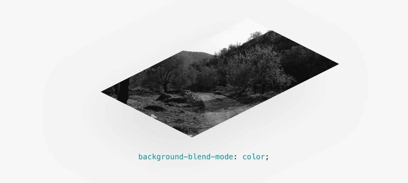
Desaturated Image
Are you using multiple backgrounds in CSS?
