
Default platform colors
When you don't set styles or colors, your UI will default to the theme that is native to the platform the application is running on. For example, here's what this new Blank App template looks like on iOS:
<StackLayout>
            <Frame BackgroundColor="#2196F3" Padding="36,48,36,36" CornerRadius="0">
                <Label Text="Welcome to Xamarin.Forms!" HorizontalTextAlignment="Center" TextColor="White" FontSize="36" />
            </Frame>
            <Label Text="Start developing now" FontSize="Title" Padding="30,10,30,10" />
            <Label Text="Make changes to your XAML file and save to see your UI update in the running app with XAML Hot Reload. Give it a try!" FontSize="16" Padding="30,0,30,0" />
            <Label FontSize="16" Padding="30,24,30,0">
                <Label.FormattedText>
                    <FormattedString>
                        <FormattedString.Spans>
                            <Span Text="Learn more at " />
                            <Span Text="https://aka.ms/xamarin-quickstart" FontAttributes="Bold" />
                        </FormattedString.Spans>
                    </FormattedString>
                </Label.FormattedText>
            </Label>
        </StackLayout>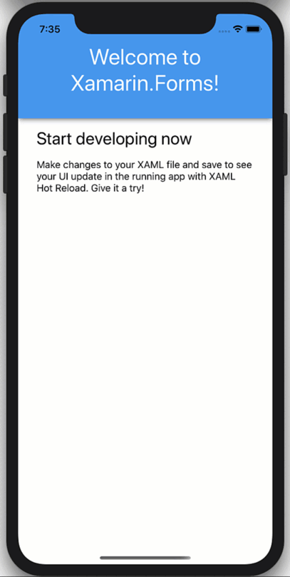
When you switch the iOS simulator between dark and light modes (CMD + SHFT + A), you can see the background of the ContentPage change from white to black and the text from black to white. These are the default platform colors. Compare this to the heading, which remains blue, and the heading text, which remains white. These are the explicit colors set in the code.
Taking control of black
To now control the colors for the dark and light title and text, you can replace the static colors with the AppThemeBinding, which will react at runtime to your OS theme settings. First enable this feature by adding a flag to your App.xaml.cs:
public App()
{
    Device.SetFlags(new string[]{ "AppTheme_Experimental" });

    InitializeComponent();
}
Header only update, it looks like this:
<Frame BackgroundColor="{AppThemeBinding Dark=#2196F3, Light=#2196F3}" Padding="36,48,36,36" CornerRadius="0">
                <Label Text="Welcome to Xamarin.Forms!" HorizontalTextAlignment="Center" TextColor="{AppThemeBinding Dark=DarkBlue, Light=White}" FontSize="36" />
            </Frame>
You can of course change the styles like here:
<ContentPage.Resources>
    <Style x:Key="HeaderBg" TargetType="Frame">
        <Setter Property="BackgroundColor" Value="{AppThemeBinding Dark=#1d1d1d, Light=#2196F3}"/>
        <Setter Property="Padding" Value="36,48,36,36"/>
        <Setter Property="CornerRadius" Value="0"/>
    </Style>

    <Style x:Key="HeaderTitle" TargetType="Label">
        <Setter Property="TextColor" Value="{AppThemeBinding Dark=#F1F1F1, Light=White}"/>
        <Setter Property="HorizontalTextAlignment" Value="Center"/>
        <Setter Property="FontSize" Value="36"/>
    </Style>
</ContentPage.Resources>

<Frame Style="{StaticResource HeaderBg}">
    <Label
        Style="{StaticResource HeaderTitle}"
        Text="Welcome to Xamarin.Forms!" />
</Frame>
And if you want to use predefined color styles it might look like this:
<Color x:Key="Background_Dark">#1d1d1d</Color>
<Color x:Key="Background_Light">#1d1d1d</Color>
<Style x:Key="HeaderBg" TargetType="Frame">
    <Setter Property="BackgroundColor" Value="{AppThemeBinding Dark={StaticResource Background_Dark}, Light={StaticResource Background_Light}}"/>
Giving the user a choice
Sometimes you might want to give the user control over the theme rather than relying on the OS theme. To do this, you only need to provide a way to install App.Current.UserAppTheme like this:
App.Current.UserAppTheme = OSAppTheme.Dark;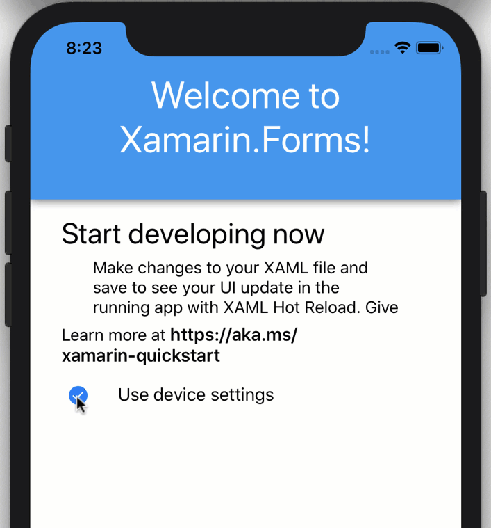
Then, to reset the app so that it automatically responds to OS theme changes, you can set it to "Unspecified":
App.Current.UserAppTheme = OSAppTheme.Unspecified;Now create the experience described above and add three checkboxes to your interface: default, dark, and light.
<StackLayout Orientation="Horizontal" Spacing="10">
    <CheckBox IsChecked="{Binding UseDeviceThemeSettings}" VerticalOptions="Center" />
    <Label Text="Use device settings"
            VerticalOptions="Center"/>
</StackLayout>

<StackLayout
    IsVisible="{Binding UseDeviceThemeSettings, Converter={StaticResource InvertedBoolConverter}}"
    Orientation="Horizontal"
    Spacing="10">
    <CheckBox IsChecked="{Binding UseDarkMode}" VerticalOptions="Center"/>
    <Label Text="Dark Theme"
            VerticalOptions="Center"/>
</StackLayout>

<StackLayout
    IsVisible="{Binding UseDeviceThemeSettings, Converter={StaticResource InvertedBoolConverter}}"
    Orientation="Horizontal"
    Spacing="10">
    <CheckBox IsChecked="{Binding UseLightMode}" VerticalOptions="Center"/>
    <Label Text="Light Theme"
            VerticalOptions="Center"/>
</StackLayout>
Then add public properties to the BindingContext for the page, in which case the page handles its own state.
public MainPage()
{
    BindingContext = this;
    InitializeComponent();
}

private bool _useDarkMode;
public bool UseDarkMode {
    get {
        return _useDarkMode;
    }
    set {
        _useDarkMode = value;
        if(_useDarkMode)
        {
            UseLightMode = UseDeviceThemeSettings = false;
            App.Current.UserAppTheme = OSAppTheme.Dark;
        }

    }
}

private bool _useLightMode;
public bool UseLightMode
{
    get
    {
        return _useLightMode;
    }
    set
    {
        _useLightMode = value;
        if (_useLightMode)
        {
            UseDarkMode = UseDeviceThemeSettings = false;
            App.Current.UserAppTheme = OSAppTheme.Light;
        }
    }
}

private bool _useDeviceThemeSettings = true;
public bool UseDeviceThemeSettings
{
    get
    {
        return _useDeviceThemeSettings;
    }
    set
    {
        _useDeviceThemeSettings = value;
        if(_useDeviceThemeSettings)
        {
            App.Current.UserAppTheme = OSAppTheme.Unspecified;
        }
    }

}
The above code switches between dark and light according to user preference in the application, and then switches between user preference and OS theme preference.
Wrapper!
This new AppThemeBinding light and dark mode helper, together with UserAppTheme, makes it easy to work with dark modes in your Xamarin.Forms applications. This works not only for colors, but also for images and other resources. As shown earlier, it even works with the new forms and paths added in Xamarin.Forms 4.7!
For more information on app themes, check out the documentation on system theme changes. If you want to go even further than dark and light themes, then try using dynamic resources and even loading themes at runtime to create themes in your applications.