styleand binding classes to the elements.

→ Vue.js beginners lesson 1: instance Vue
→ Vue.js for beginners, lesson 2: binding attributes
→ Vue.js beginners lesson 3: conditional rendering
→ Vue.js beginners lesson 4: lists rendering
→ Vue .js for beginners lesson 5: event processing
→ Vue.js beginners lesson 6: binding classes and styles
→ Vue.js beginners lesson 7: calculated properties
→ Vue.js beginners lesson 8: components
The purpose of the lesson
The first goal of this lesson is to use a color that matches product variations to customize the properties of
background-coloritems <div>that display information about those variations. Since the product variants correspond to the colors greenand blue, we need one element to <div>have a green background color, and the other blue.
The second goal is to disable, by some condition, unnecessary controls using class binding.
Initial code
This is what the code in now looks like
index.html:
<div id="app">
  <div class="product">
    <div class="product-image">
      <img :src="image" />
    </div>

    <div class="product-info">
      <h1>{{ product }}</h1>
      <p v-if="inStock">In stock</p>
      <p v-else>Out of Stock</p>

      <ul>
        <li v-for="detail in details">{{ detail }}</li>
      </ul>
      <div v-for="variant in variants" :key="variant.variantId">
        <p @mouseover="updateProduct(variant.variantImage)">
          {{ variant.variantColor }}
        </p>
      </div>

      <button v-on:click="addToCart">Add to cart</button>

      <div class="cart">
        <p>Cart({{ cart }})</p>
      </div>

    </div>
  </div>
</div>
Here's what's in now
main.js:
var app = new Vue({
    el: '#app',
    data: {
        product: "Socks",
        image: "./assets/vmSocks-green.jpg",
        inStock: true,
        details: ['80% cotton', '20% polyester', 'Gender-neutral'],
        variants: [
          {
            variantId: 2234,
            variantColor: "green",
            variantImage: "./assets/vmSocks-green.jpg"
          },
          {
            variantId: 2235,
            variantColor: "blue",
            variantImage: "./assets/vmSocks-blue.jpg"
          }
        ],
        cart: 0
    },
    methods: {
      addToCart() {
        this.cart += 1
      },
      updateProduct(variantImage) {
        this.image = variantImage
      }
    }
})
Task
In the previous tutorial, we created an event handler that changes the product image based on which element
<p>was hovered over. Instead of displaying the name of a color in an element <p>, we would like to use that color to set the property of the background-colorcorresponding element <div>. With this approach, instead of hovering the mouse over the texts, we will be able to hover it over the colored squares, which will lead to the display of the product image on the page, the color of which corresponds to the color shown in the square.
Decision
First, let's add a
<div>class to an element color-boxthat sets its width, height, and outer top padding. Since we, even after doing this, continue to display the <div>words greenand in the elements blue, we can take the names of the colors stored in the objects describing product variants and use these names when binding the style to the attribute style. This is how it looks:
<div
  class="color-box"
  v-for="variant in variants"
  :key="variant.variantId"
  :style="{ backgroundColor:variant.variantColor }"
>
  <p @mouseover="updateProduct(variant.variantImage)">
    {{ variant.variantColor }}
  </p>
</div>
Notice the second and fifth lines of this code. Here we add a
<div>class to the element color-boxand bind the inline style to it. The inline style is used here to dynamically set the properties of the background-colorelements <div>. The background color of the elements is taken from variant.variantColor.

Stylized elements
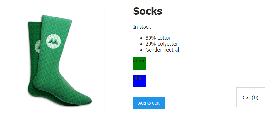
<div>and labels displayed on them
Now that the element is
<div>styled usingvariantColor, we no longer need to display the name of the color in it. Therefore, we can get rid of the tag<p>and move the construct@mouseover=«updateProduct(variant.variantImage)»into the element itself<div>.
This is what the code will look like after making the above changes:
<div
  class="color-box"
  v-for="variant in variants"
  :key="variant.variantId"
  :style="{ backgroundColor:variant.variantColor }"
  @mouseover="updateProduct(variant.variantImage)"
>
</div>

Stylized elements
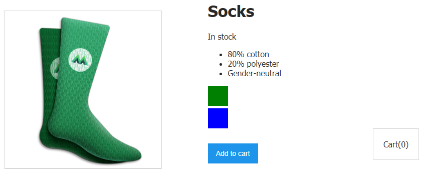
<div>without text
Now, when you hover the mouse over the blue square on the page, an image of blue socks is displayed. And when you hover the mouse over the green square - the image of green socks. Beauty!
With style bindings in mind, let's talk about class bindings.
Task
Our data now contains the following:
inStock: true,
When the property
inStocktakes on a value false, we need to prevent website visitors from clicking on the button Add to Cart, since there is no product in stock, which means it cannot be added to the cart. Luckily for us, there is a special HTML attribute named after disabledwhich you can disable the button.
If we recall the material of the second lesson , it turns out that we can use the attribute binding technique to add an attribute to an element
disabledwhen it inStockequals false, or rather, when this value is not true ( !inStock). Let's rewrite the button code:
<button
  v-on:click="addToCart"
  :disabled="!inStock"
>
  Add to cart
</button>
Now, if it is
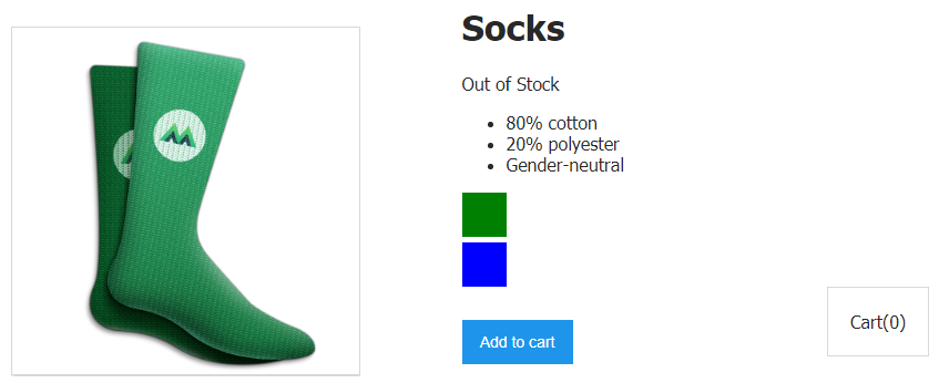
inStockwritten false, the button will not work. But its appearance will not change. In other words, the button will still look like it can be clicked, even though there is actually no point in clicking on it.

A disabled button looks the same as a normal button, but there is no point in clicking on it
Decision
Here we will proceed by acting according to the same scheme as we did when binding
inStockto an attribute disabled. Namely, we will bind the class disabledButtonto our button in cases where it inStockstores false. With this approach, if the button is pointless to click, then it will look accordingly.
<button
  v-on:click="addToCart"
  :disabled="!inStock"
  :class="{ disabledButton: !inStock }"
>
  Add to cart
</button>

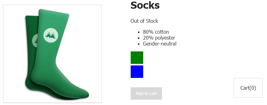
The disabled button looks as it should.
As you can see, now the button turns gray if it
inStockequalsfalse.
Let's take a look at what's going on here.
Take a look at this line:
:class="{ disabledButton: !inStock }"
Here we use the shorthand for the
v-bind( :) directive to organize data binding to the classbutton attribute . In curly braces, we determine the presence of the class disabledButtonbased on the truth of the property inStock.
In other words, when there is no product in stock (
!inStock), a class is added to the button disabledButton. Since this class sets the background color of the button to gray, the button becomes gray.
Wonderful! We've just combined our new knowledge of class binding with knowledge of attribute binding, and were able to disable the button and make it gray if
inStockequals false.
additional information
You can bind an object of classes or an array of classes to an element:
<div :class="classObject"></div>
<div :class="[activeClass, errorClass]"></div>
Workshop
When the
inStockvalue is written in false, you need to bind to the tag <p>that displays the text Out of Stock, a class that adds style to the element text-decoration: line-through, strikethrough text.
→ Here is a template that you can use to solve this problem.
→ Here is the solution to the problem.
Outcome
Here are the most important things we learned today:
- Data can be bound to an attribute of elements
style. - Data can be bound to an attribute of elements
class. - When organizing class binding, you can use expressions, the calculation of which determines whether the corresponding class will be bound to an element.
You have completed most of this course. Please share your impressions.
→ Vue.js beginners lesson 1: instance Vue
→ Vue.js for beginners, lesson 2: binding attributes
→ Vue.js beginners lesson 3: conditional rendering
→ Vue.js beginners lesson 4: lists rendering
→ Vue .js for beginners lesson 5: event processing
→ Vue.js beginners lesson 6: binding classes and styles
→ Vue.js beginners lesson 7: calculated properties
→ Vue.js beginners lesson 8: components
