It's back in 1999 when we were writing
<font size="4" color="#000000">and so on, and DHTML was trendy .
When CSS came along, my approach to learning was no different. But I really wish I took the time to learn CSS properly - and missed out on a lot of fundamental concepts.
Here are some things I didn't know but would like to know earlier.
Block, inline and inline-block
Although I knew about these properties, I did not fully understand them for a long time.
In short:
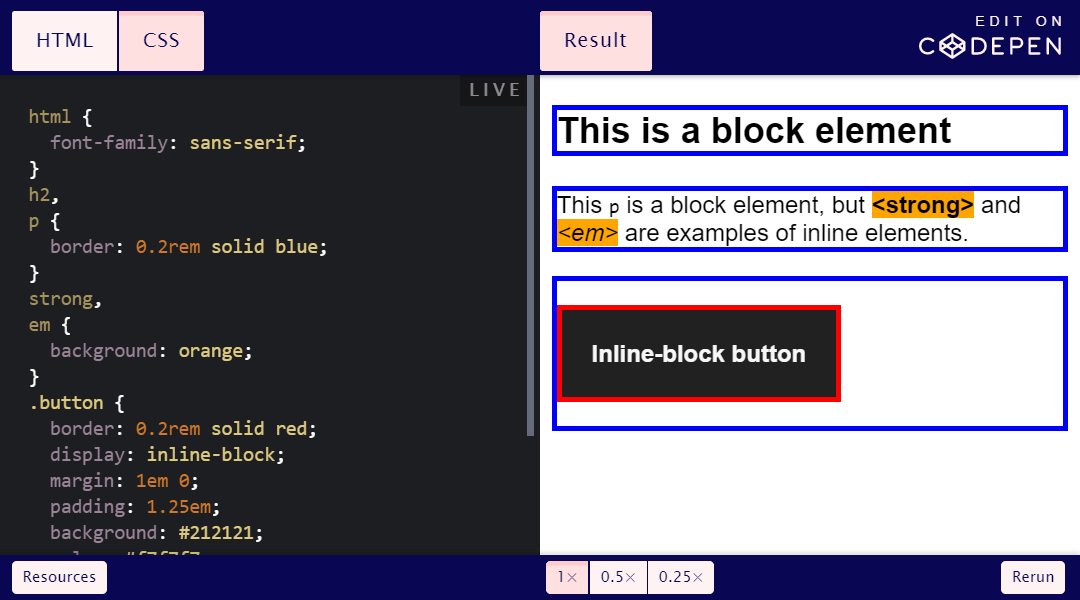
- block elements
blockexpand horizontally to occupy an entire line (like a header). We can apply vertical padding to them.
- inline elements
inlineexpand horizontally just enough to accommodate content (such as elementsstrongorem). We cannot apply vertical padding to them , and they usually need to be placed inside a block element.
- inline block elements
inline-blockare similar to inline elements, but you can apply vertical padding to them (which makes them useful for objects such as buttons).
In the example below, block elements have a blue outline, inline elements have an orange background, and an inline block element has a red outline.
Images are inline
That the images are
inlinethe default is not a problem, but it can be confusing when trying to arrange them or add vertical padding.
If your set doesn't have this, I suggest adding the following rule:
img {
    display: block;
}
This will make their behavior much more predictable. You might also want to add
max-width: 100%;so they don't burst out of their container.
How height and width are calculated
By default, the width / height of the box is calculated by adding:
- Content area
- Fill area
- Border area
Usually there are no problems with the height of the element: we don't worry too much about how the content is reflected vertically. Problems arise when trying to calculate the width of an element, especially if there are multiple elements in a row.
If we have the following CSS:
.some-class {
    width: 50%;
    padding: 2em;
    border: 0.1rem;
}
The total calculated width
.some-classwill be:
50% + 4em + 0.2 rem
This is due to a property named
box-sizingwith a default value content-box. This value means that the property widthis applied to the content area: everything else is added on top.
We can change this for all elements with the following rule:
* {
    box-sizing: border-box;
}
Going back to our example, the width of the element will now be calculated from the border, so that the total width of our element is 50%.
What happens to the border and padding? These properties / values still apply, but they do not affect the overall width of the element: they are within a defined area.
Check out the Codepen to see it in action:

Padding
We did not discuss margin here, because padding is the space between elements , so it is never part of this calculation.
Padding and padding are not the same
If an element has no background or border, it might appear that padding and padding are the same. This is not true!
marginIs the space between elements
paddingIs the space inside the element
This makes padding useful for elements that have a background. We often don't want the content to be close to the edge of the element's container, but rather
paddingallows it to do so.
Absorbing padding
This has been annoying for CSS newbies for a long time. Rachel Andrew describes this property as follows:
« , . , , ».
If we have two block elements with
margin-bottom: 1emon one element and margin-top: 1.5 emon the element immediately below it, the total space between the two elements will be equal 1.5 em.
This can be seen here:
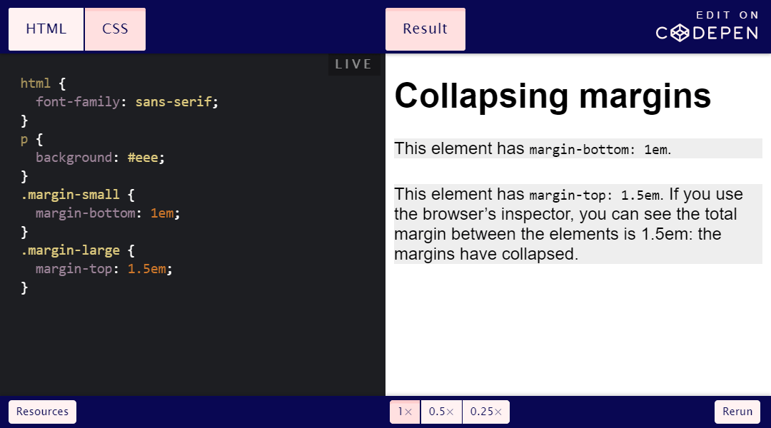
When two paddings meet, the larger padding absorbs the smaller padding. If they have the same value, they absorb each other.
Indentation calculations are immediately easier. It can also change our approach to managing indentation, and it is at this stage that the Lobotomised Owl selector and similar techniques can be useful .
Note: padding is not absorbed when the parent is set to
display: gridor display: flex.
Browsers have a default stylesheet
CSS stands for Cascading Style Sheets. Therefore, it should come as no surprise that waterfall is one of the fundamental concepts of CSS.
While we may know how our own style sheets interact with each other, we must remember that there is always a default browser style sheet. It is loaded before any custom style sheets, making it easy to re-declare existing values.
The declared styles differ depending on the browser, but they are the reason why by default:
- Headers have different sizes
- Text black
- Lists are marked with dots
- Elements can have any property
display(for example,blockorinline)
And many other things.
Even if there is only one style sheet on the site, that style sheet will always be combined with the browser's default styles.
Use relative units everywhere
It's
pxtempting to use pixels ( ) because they're easy to understand: declare a font size of 24px and the text will be 24px. But this does not guarantee the convenience of users, especially those who resize content at the browser level or zoom in.
I started using for a long time to determine the font size
em(and later rem). It took much longer to reliably master emand remindentation, margins, spacing between letters and boundaries.
Understanding the difference between
emand remis critical to manage relative units. For example, we can use emfor queries @mediaand vertical padding, but remfor consistent border widths.
It takes some effort to adjust thinking to fully transition to relative units, but it's worth it.
The :: before and :: after pseudo-elements need content
Pseudo-elements
::beforeand ::afterrequire a mandatory specification of the property content, even if it remains empty:
.some-class::before {
    content: '';
}
If it is missing, the pseudo-element will not be displayed .
Unit ch
A unit
ch(character) is useful, in particular, for setting the width of an element approximately by the number of characters in a line of text.
Why about? Technically, it
ch doesn't count the actual number of characters in a string .
The unit
chis based on the character width 0. Eric Meyer wrote about this :
"1ch is usually wider than the average symbol, usually about 20-30%."
If you use it to control the size of paragraphs and the like, there is a difference to keep in mind.
Normal flow
I have heard this term many times, but did not fully understand it for a long time. "Normal flow" means that the elements are displayed on the page as they appear in the source code.
For example, if we write:
<h2>Heading</h2>
<p>Paragraph text.</p>
We expect to
<h2>Heading</h2>appear before or above <p>Paragraph text.</p>. This is a normal flow .
If an item is taken out of the normal flow , it will not appear at that location. Floating and absolutely positioned elements are a good example.
State decoration: focus
I first learned about pseudo selectors
:hover, :focusand :activein the context of styling links. At that time, all examples of their use looked something like this:
a {
    color: black;
}
a:hover,
a:focus,
a:active {
    color: red;
}
However, it is better to arrange the states differently
:focus .
:focusIs the state where the user clicks or swipes over the focused elements on the page (for example, links). When the user clicks on it [tab], they don't know where the focus will be.
In addition, if the user focuses on an element that has already been hovered, he will not know where the focus is.
For all these reasons, it is best to style
:focusdifferently than :hoverand :active. For instance:
a:hover,
a:active {
    /* styles */
}
a:focus {
    /* styles */
}
: nth-child ()
Look at this code :
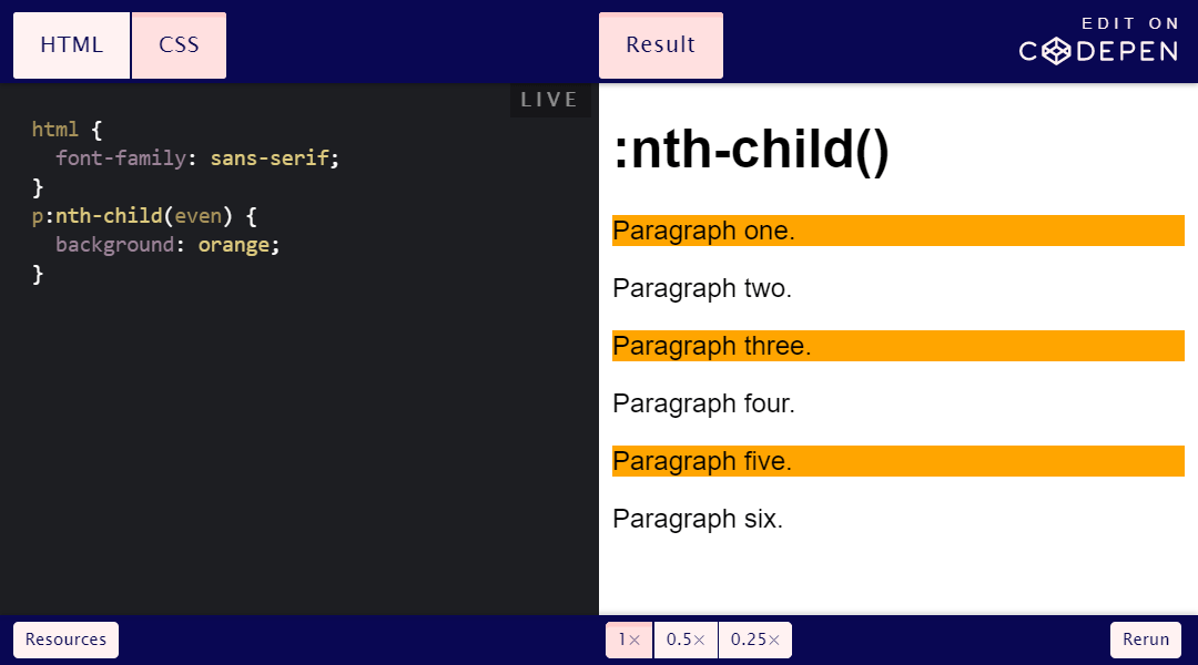
See the odd lines in the background? Although the selector
p:nth-child(even)assumes selection of even lines.
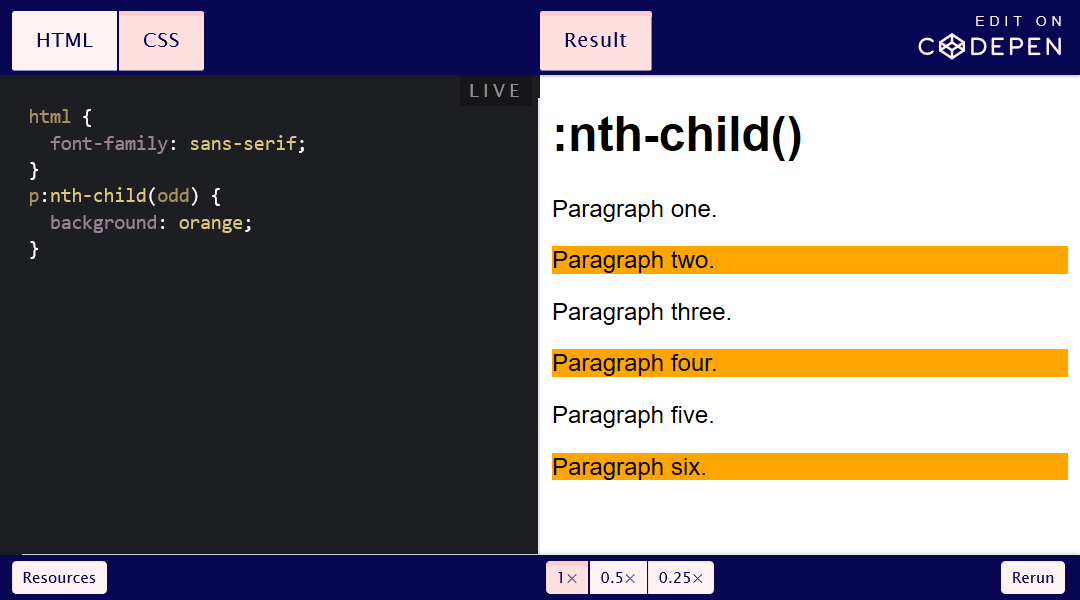
However, the selector
:nth-child()counts all siblings . Specifying an element in a selector (for example, p:nth-child()) does not cause the selector to start from the first element of that type.
Instead, specifying an element in a selector means that the rule will only apply to that type of element. If we switch our example to odd elements
p:nth-child(odd), we will see that:
h1does not stand out, although it is an odd sibling
- Items
pthat meet the criteria are marked (paragraphs two, four, six)
Let's go back to the first example. Let's say we want to highlight even elements in the background
p. In this case, we'd better use a different pseudo selector altogether. p:nth-of-type(even)
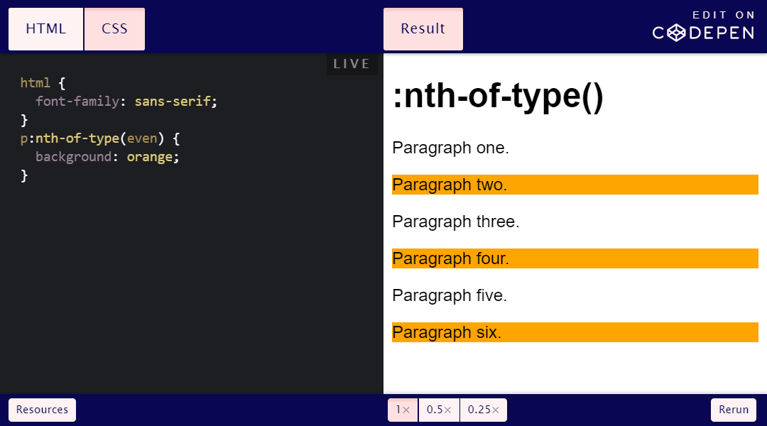
This is the key difference between
:nth-child()and :nth-of-type(). There is a subtle difference here, but it will avoid some confusion.
In conclusion
It's easy to master the basics of CSS, but understanding how and why things work the way they do is critical .
If I spent more time in my youth on this, I could write code faster that would be more efficient and stable.
See also:
- “ Old and new CSS. History of Web Design "
- “ CSS Developers - Why The World Needs Them? "
- " The state of CSS "