
Patterns and best practices
Design and Anatomy of a Push Notification 2020
Analysis of the structure of push notifications from different platforms, browsers and programs from Lee Munroe. A bonus is the template in Figma .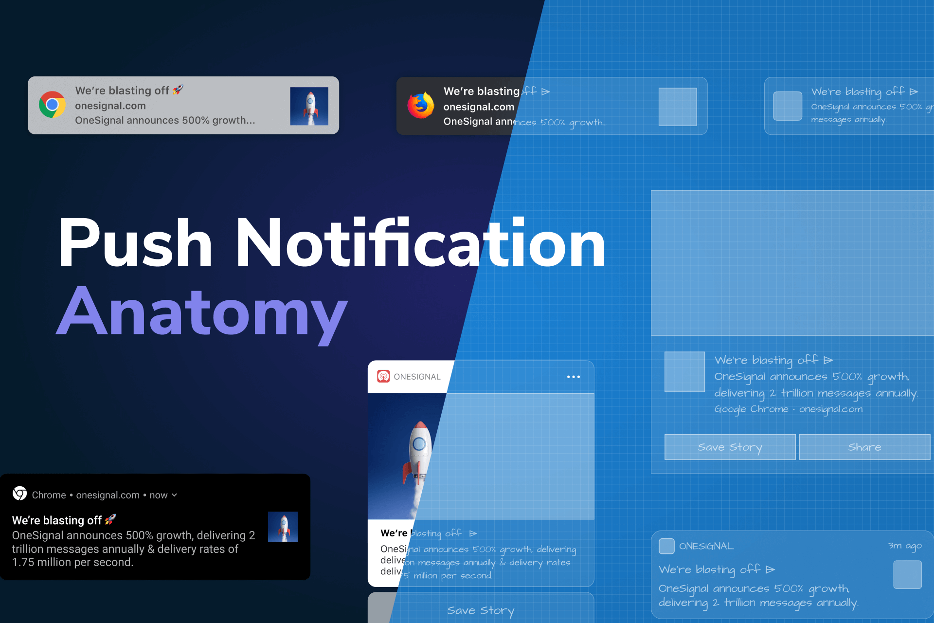
Communicating Changes Throughout the Buyer's Journey - A COVID-19 Case Study
Kim Flaherty of the Nielsen / Norman Group gave an overview of how to inform online stores about the coronavirus situation. Extended delivery times and other restrictions.
Selection controls - UI component series
Detailed analysis of the states of form elements for selection (checkboxes, radio windows, toggle switches, chips) from Taras Bakushevich.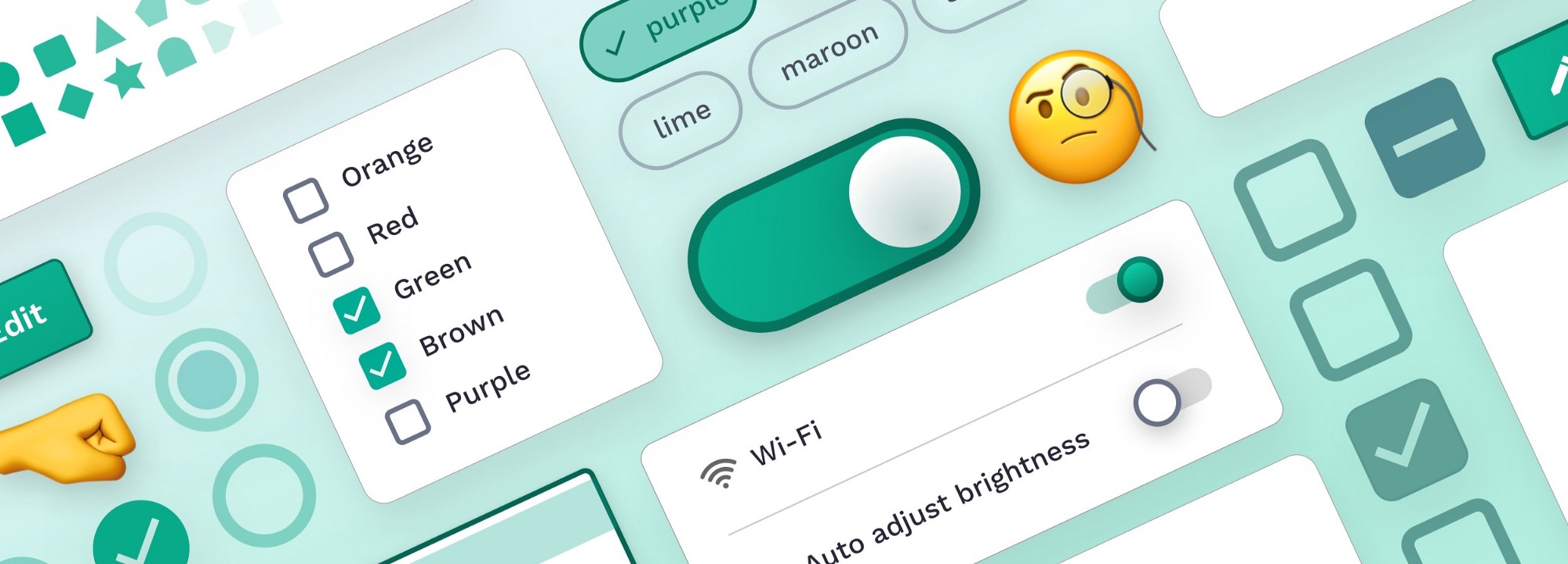
Mobile-App Onboarding - An Analysis of Components and Techniques
Alita Joyce of the Nielsen / Norman Group describes patterns for meeting a new user in mobile applications. However, she advises avoiding them whenever possible.
3 Pitfalls to Avoid if Implementing “Quick Views”
Baymard's Rebecca Hugo describes a problem with a quick view pop-up layer for a product card, which is designed to save the user from going to a full page. But there are a lot of problems with him.Avoid PDF for On-Screen Reading
Jakob Nielsen and Anna Kaley of the Nielsen / Norman Group provide tips for submitting PDFs to websites. They advise to avoid reading information on the site from such documents, leaving them only in case of printing or forwarding. Aarron Walter - Designing for Emotion
The second edition of the book has been published. Added chapters on privacy, inclusion and security.Emojis in Email Subject Lines - Advantage or Impediment?
Kim Flaherty of the Nielsen / Norman Group talks about UX research on how the emoji in the title of mailing letters engages users. Things like this are best verified by A / B testing, but the notes are helpful.Inspired Design Decisions With Giovanni Pintori - Publicity Becomes An Art Form
Andy Clarke continues a series of experiments with interesting magazine layout on the web. In the tenth issue, he analyzes the works of Giovanni Pintori.How we conducted accessibility testing at Alfa Digital
Maria Simonova talks about accessibility support in Alfa-Bank's mobile app for iOS.5 'Credit Card Form' Implementations That Make 'LL Bean' Best-in-Class
Rebecca Hugo from the Baymard Institute analyzes good and bad examples of credit card payment forms in online stores.Design systems and guidelines
How to understand your Design System's health, and eventually, its success
The coolest article by Christos Kastritis about the launch of the Deliveroo design system. Strath session for starting work, a set of health indicators, calculating ROI for different sections ( template ).
Dark theme
Supporting Dark Mode in Your Website
Instructions for introducing a dark theme on a personal website from Jecelyn Yeen.TV channel Friday
The Friday TV channel made a dark theme for the night air. After 23:00 bright and loud promo videos will be replaced by a quiet, calm identity with fairy tales and poems.Rostelecom Key
Designers of Redmadrobot talk about creating a dark theme for the Rostelecom Key application. True, only the design part, no design system in the code.WWDC 2020
Apple showed off new versions of the platforms at its annual conference, which, like everything else this year, took place online. Traditionally, I highlighted updates that concern interface designers:
iOS 14

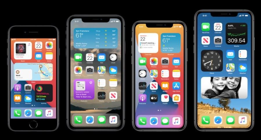
Home screen widgets . Now, just like on Android, it's easy to get littered. A long-standing law says: 95% of users do not customize the interface (and rarely change the settings preset by device manufacturers). Figma guidelines and template ( another one ).
 Siri does not cover the screen, but shows the corporate abstract sign at the bottom and a plate with the result at the top.
  Calls also do not cover the screen, but are shown as a bar at the top.
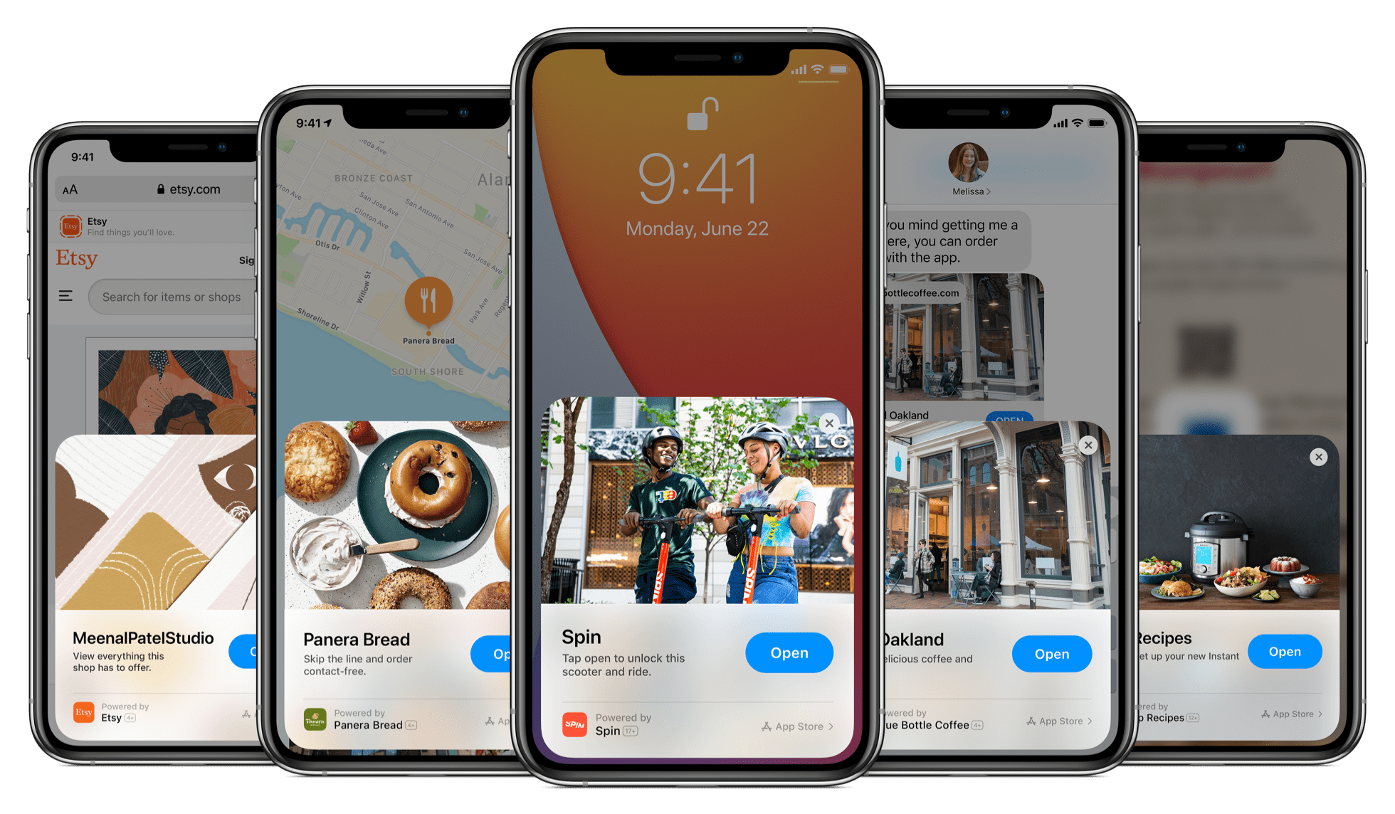
 Mini versions of sites and applications without installation by QR code or NFC. Assumes assistance in simple actions such as crediting points in the loyalty program of a coffee shop, where you are too lazy to install the application. True, this only works with its own QR code format, which means it is unlikely to receive normal coverage. Guidelines .
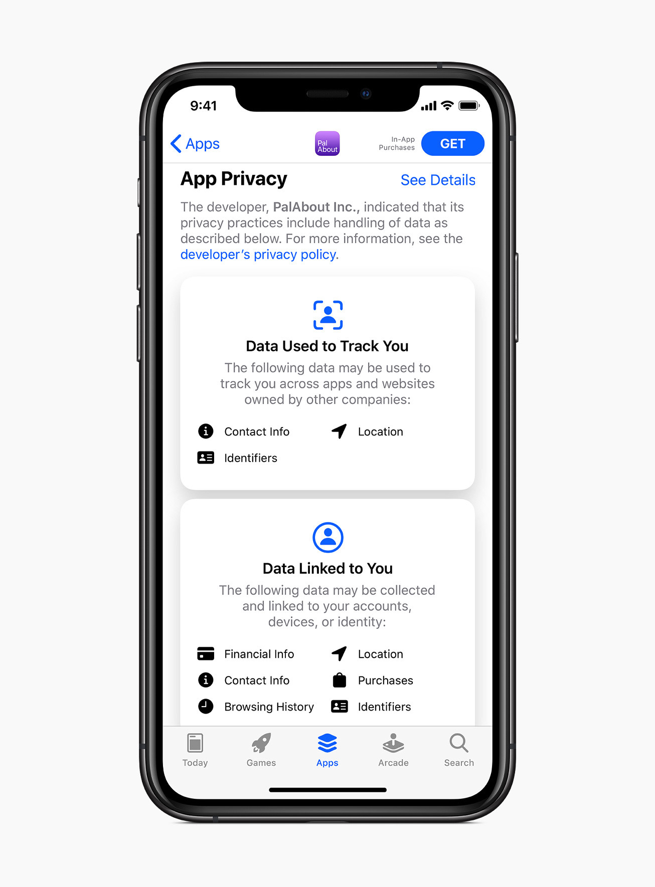 Visual information about the data collected by the application
(roughly as the nutritional value of a product).
 The opening of the car from the phone , which will gradually be supported by major car manufacturers.
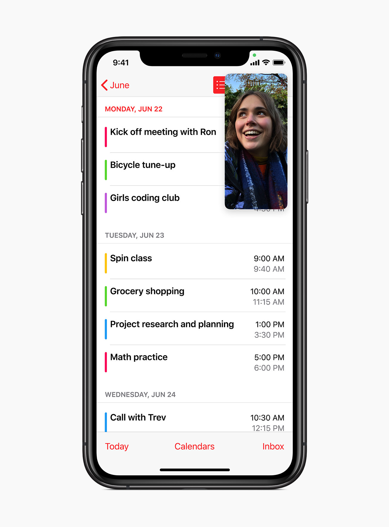 Picture-in-picture mode that allows you to minimize any video to a small size and move between applications.
 It will be possible to change the default browser and mail , which will slightly increase the reach of third-party clients.
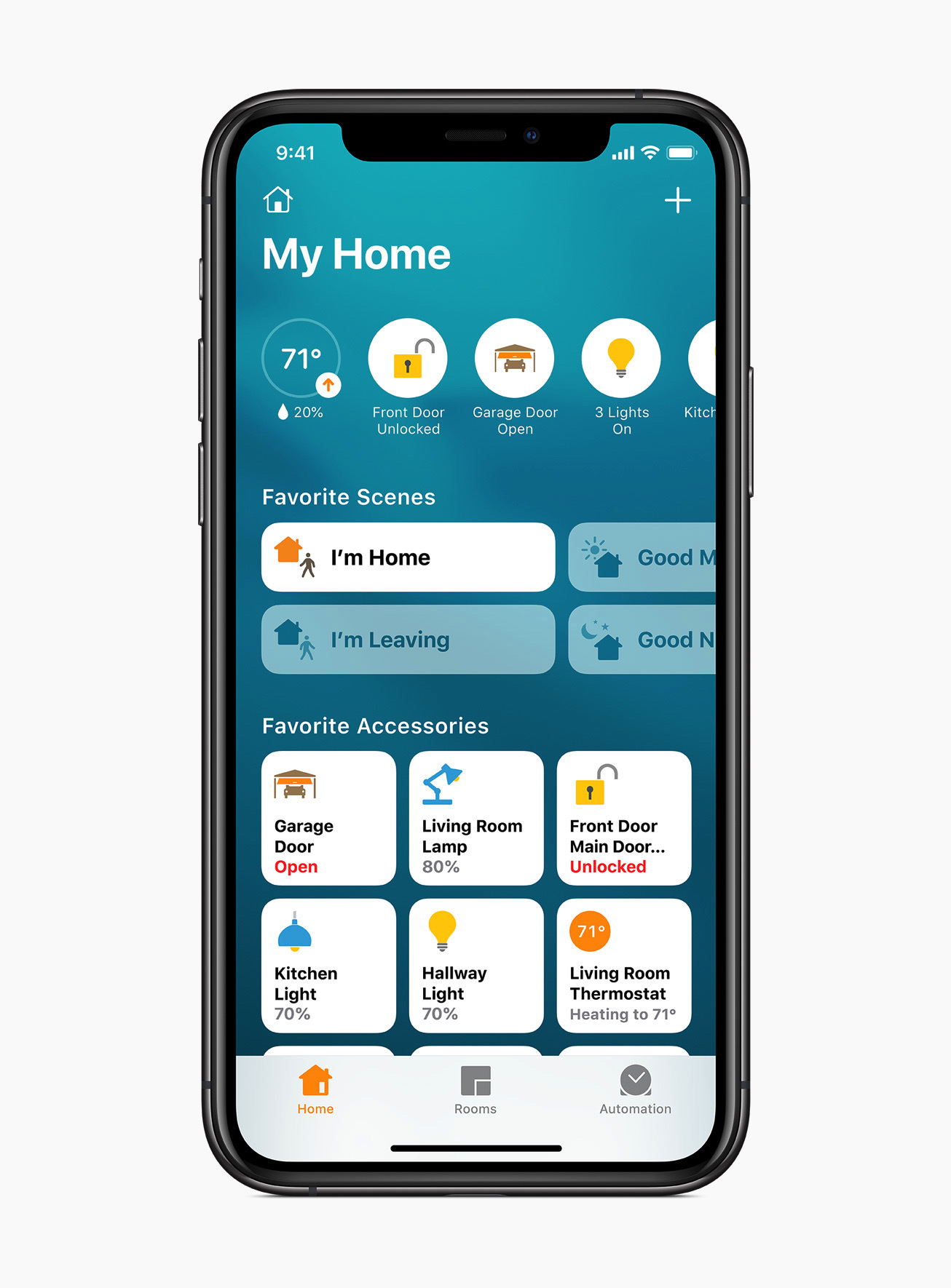 The smart home screen better shows the current status of devices. Apple's
 best iOS apps of 2020 .
Video presentation about design:
iPadOS 14

Permanent side navigation bar, which is even closer to desktop applications.

Spotlight-style universal search.

 Recognition of handwriting and shapes .
watchOS 7
Allows you to combine information from multiple applications on the screen. Development of health tracking and sports assistance capabilities. From the current agenda: looks at how effectively you wash your hands.
macOS Big Sur

Updating the interface, making it a little more visually closer to iOS.

And one step back to skeomorphism - application icons now with trash shadows and detail.
 And one step back to skeomorphism - application icons now with trash shadows and detail.
 Oops, wrong screenshot:

The first message icon layouts in Figma and Sketch have already appeared. As well as other "breakthrough" design elements (for example, the most fashionable notification icon for 2001):
Or this amazing Windows XP battery:
 And the sliders got the volume.
The pendulum of design trends is relentless, even if it spills out self-respect for the principles that you talked about with foam at the mouth the day before yesterday. That awkward moment when even neomorphism isn't so bad.
Beta versions can already be delivered , and the final ones will be released, as usual, in September. This is a bit more interesting and useful than Android 11, which was kicked under the carpet.
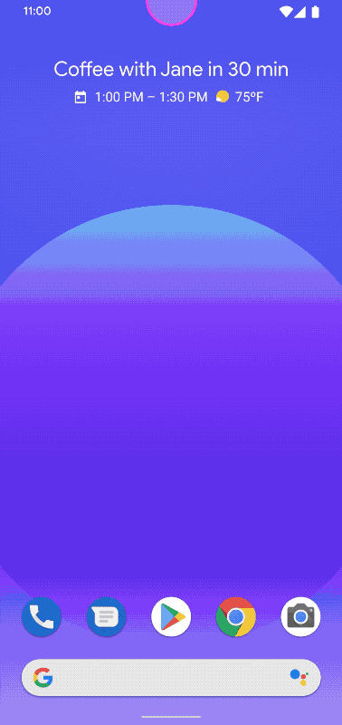
Android 11
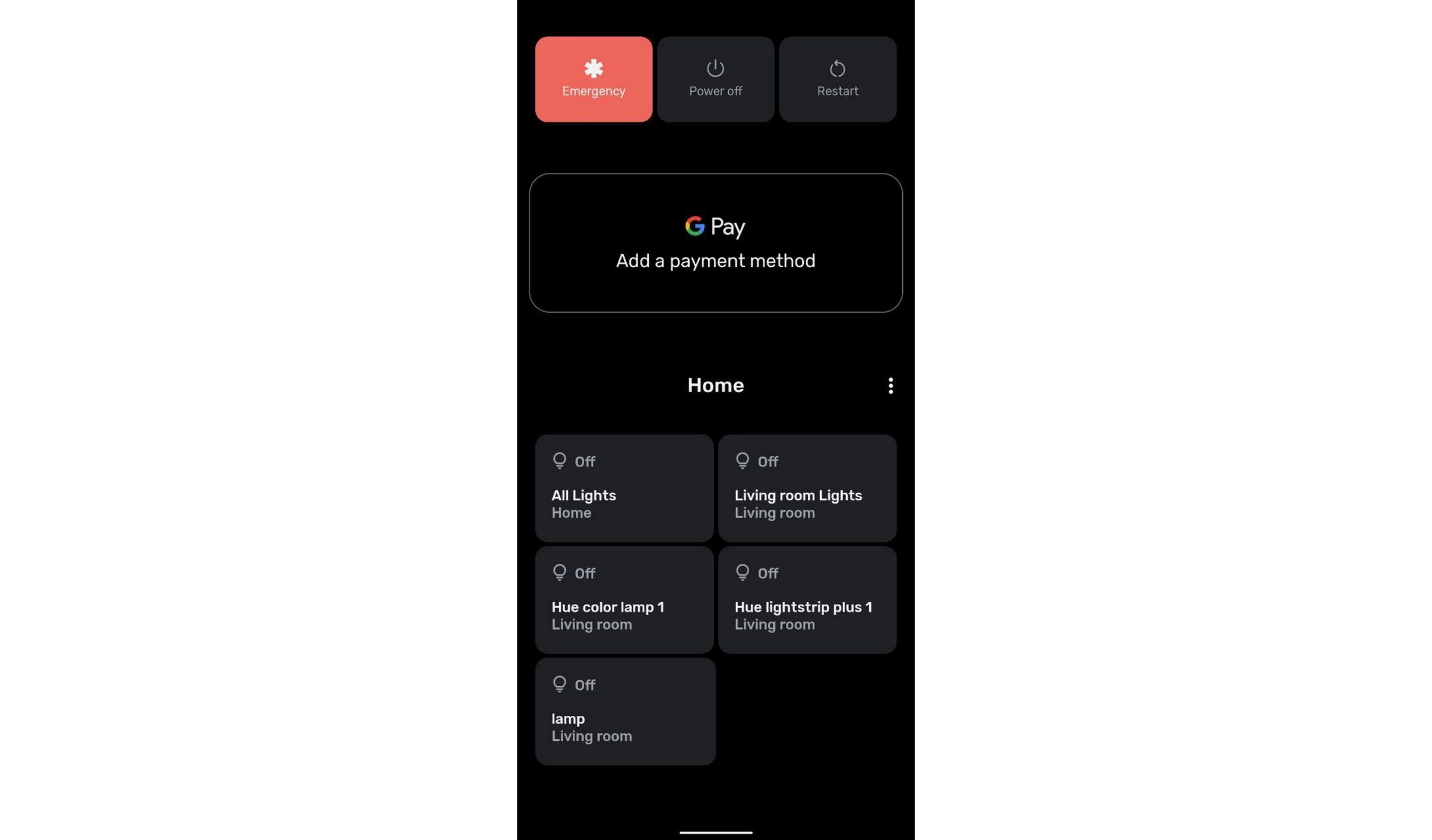
This year, traditional Google I / O first went online and then was postponed altogether due to protests. Therefore, the beta version of Android 11 has appeared relatively quietly. There are no big breakthroughs, but a lot of different optimizations: In the list of notifications, conversations with people and everything else from applications were separated. Plus there is a history of notifications for a day. A media player has appeared in the same panel in quick settings , so it takes up one line more. Even more settings will appear with a long press on the power off button of the phone. The new smart home control panel allows you to see everything on one screen. Improved and simplified access to screenshots - like many other things, it's now like in iOS.


In multitasking mode, you can now take a screenshot too.

Voice control through Voice Access works wonders - you can just name an item on the screen .
Third-party applications have even more limited access to the phone - many things can only be allowed when using it.
Reviews from Engadget and The Verge .
Google has posted a few videos for this quiet launch:
- What's new in Android
- What's new in System UI
- What's new in Design Tools
- Screens - large, small and foldabl e
The final version will appear in the fall. You can already put the beta .
Quick Tips for High Contrast Mode
Sarah Higley provides tips on how to work with Windows High Contrast Mode, which greatly simplifies website design.How Salesforce Accelerates Design Productivity and Collaboration
The Salesforce Lightning design team has released a Sketch plugin with all the components.Storybook Composition
Storybook 6.0 allows you to collect multiple branches into a single live guideline. For situations where different teams within the company make different frameworks.Understanding the user
3 Persona Types - Lightweight, Qualitative, and Statistical
Page Laubheimer of the Nielsen / Norman Group describes the specifics of creating three types of characters: the expert path, qualitative research, quantitative survey. Pros, cons and pitfalls of each.
Information architecture, conceptual design, content strategy
Approaches to Journey Mapping - 2 Critical Decisions To Make Before You Begin
Kate Kaplan of the Nielsen / Norman Group describes two paths to creating CJM: expert version and research-based, current and future state. The smartest way is to first make an expert version of the current state, then validate it with users and create a vision of the future.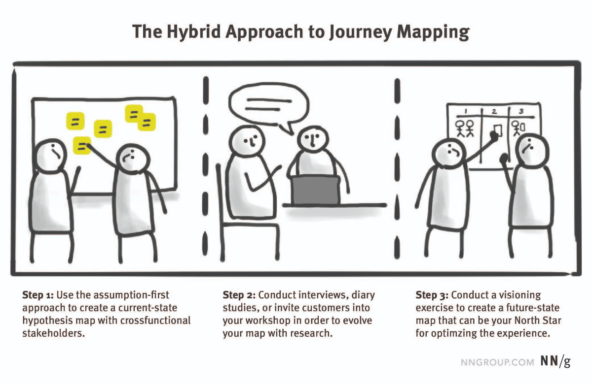
Customer Journey Map: Delimobil
Stanislav Khrustalev from Hard Client assembled CJM for Delimobil car sharing.
New interface design tools
Figma: Articles
- Anne-Sophie Delafosse from Deliveroo talks about a layout localization plugin . It allows you to check if the interface will fall apart.
- Instructions for creating a plugin from Varun Vachhar using the example of a confetti generator.
Templates
Adobe xd
June update . Tokens for colors and fonts, stacks of elements with flexbox behavior, scrolling within prototype blocks, Russian language support.UXPin
A certain holding company Xenon Partners bought the instrument . They buy up different cloud services.Sketch 67
Acceleration of work and optimization of the interface.
Color Copy Paste
The service allows you to define a color through your phone camera and insert it into Figma or Sketch.Seamless Pattern Maker
A repeating texture generator on a pictogram background.Protopie 5
Timelines for events, animation recipes, libraries (including iOS and Material Design).Shape Divider App
Generator of curly dividers between blocks on promo sites.Blobs
The service helps to quickly generate an abstract rounded shape for promo sites.CreateStudio
A new animation and motion design tool with a focus on video clips. Lots of templates and ready-made resources.Pose Animator
An experimental tool animates the illustration based on capturing your movements from your webcam.ShadeSketch
The Experimental Tool allows you to automatically apply shadows to painted images, including animated ones.User research and testing
How to properly integrate user and market research into your product team
Joom's Anna Cohn describes three problematic ways of integrating user researchers into product companies: they are carried out only by designers and managers, or only within the UX laboratory, and somewhere they do not exist at all.
Sensemaking & structure: how Airtable changed my practice
Rachel Miles shares how he uses Airtable to store finds from user research. It is based on the old instructions from the service itself .
UX Research Tools & Methods
Directory of tools for remote user research from the Ethnio service.Rating Scales in UX Research - Likert or Semantic Differential?
Maria Rosala of the Nielsen / Norman Group describes the difference between Likert scale and semantic differential. These are two popular graded user research question types.How to Convert Between Five- and Seven-Point Scales
Jeff Sauro and Jim Lewis show how to convert survey scale values in different dimensions: 5 and 7 answer choices.How To Test A Design Concept For Effectiveness
A quick overview of design concept testing methods by Paul Boag.12 Ways To Improve User Interview Questions
Advice from Slava Shestopalova from ELEKS on competent questions during interviews with users during research.A Cheatsheet for User Interview and Follow Ups Questions
Structured User Interview Checklist from Stéphanie Walter.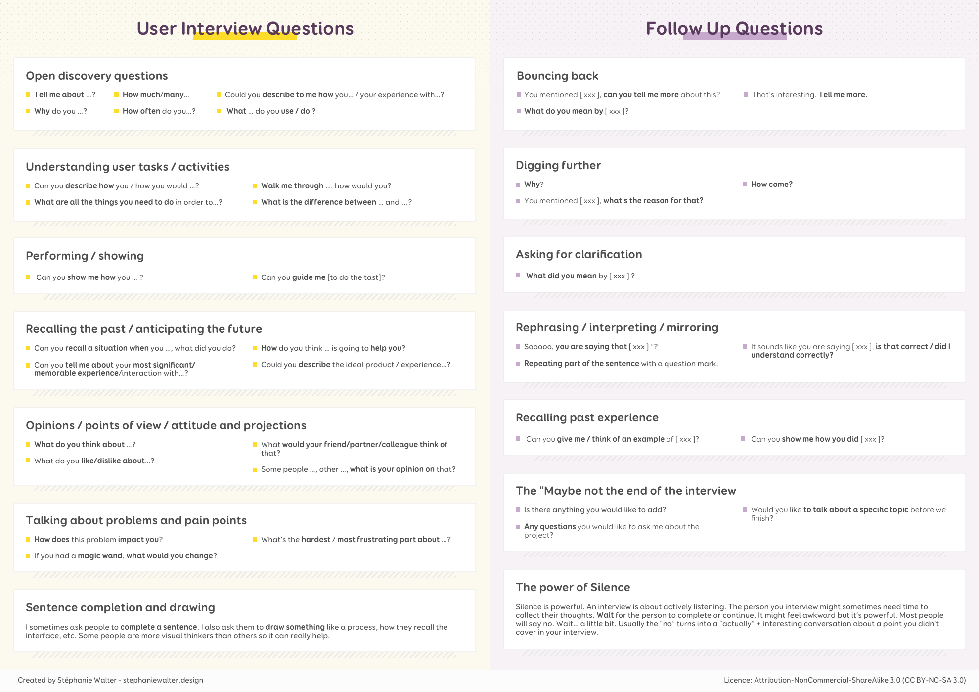
Case "VkusVilla" - Food retail in the era of "crown-crisis"
UXSSR conducted UX research for Vkusville stores. They studied the change in consumer behavior during the quarantine period.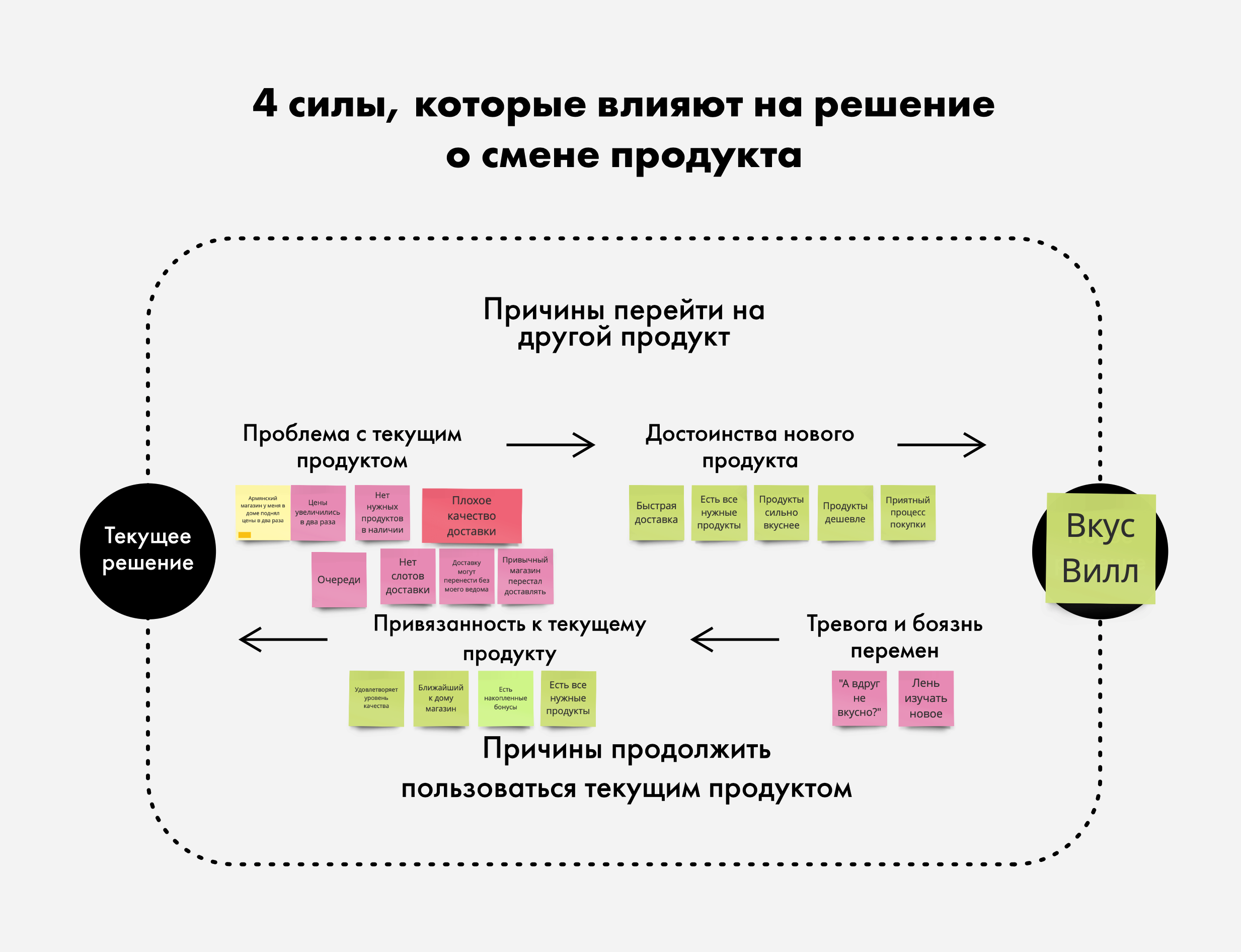
Sample Size Recommendations for Benchmark Studies
Jeff Sauro and Jim Lewis calculated sample sizes for comparative UX studies.Visual programming and design in the browser
Kinetic Typography with Three.js
Kinetic typography in the browser in JavaScript.
New scripts
- Folding magazine cover effect using Mad Magazine as an example .
- How to make complex illustrations in CSS .
- A photo grid that changes with light animation as you move the cursor .
Metrics and ROI
Leading Vs. Lagging Measures in UX
Jeff Sauro and Jim Lewis describe the relationship between leading and lagging metrics. How to predict the outcome of a product and its interface at an early stage.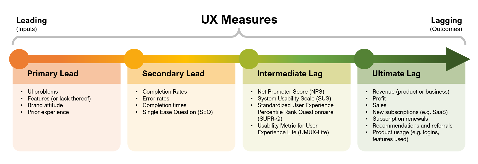
Design Management and DesignOps
DesignOps Maturity - Low in Most Organizations
Kate Kaplan of the Nielsen / Norman Group surveyed 557 front-end professionals and decomposed them into their DesignOps maturity model. What methods and practices do they use in three areas: human interaction, work result and its impact on business.
User-Centered Intranet Redesign - Set Up for Success in 11 Steps
Kara Pernice of the Nielsen / Norman Group describes an intranet redesign strategy. How to assemble a team, set goals, design and systematically launch a new version.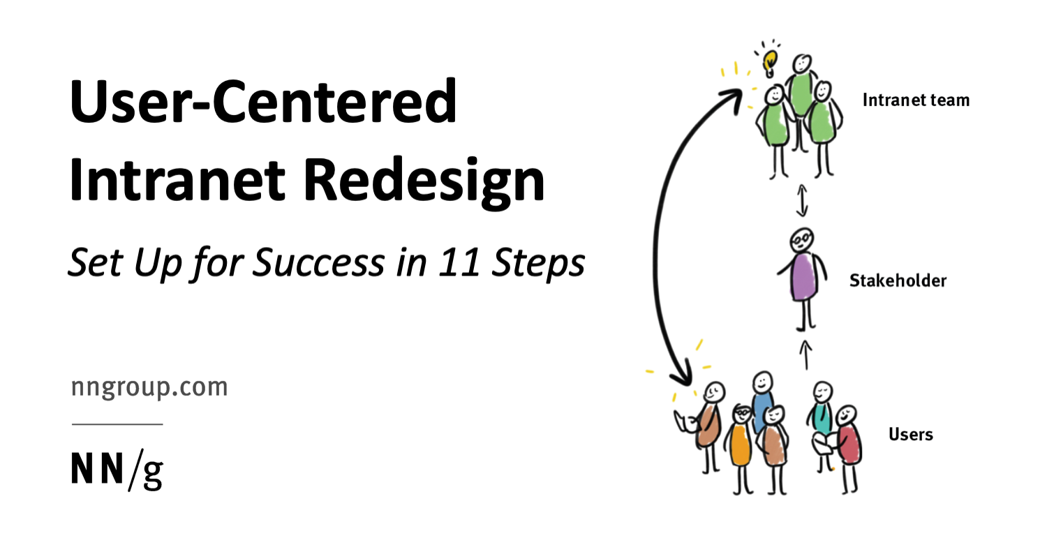
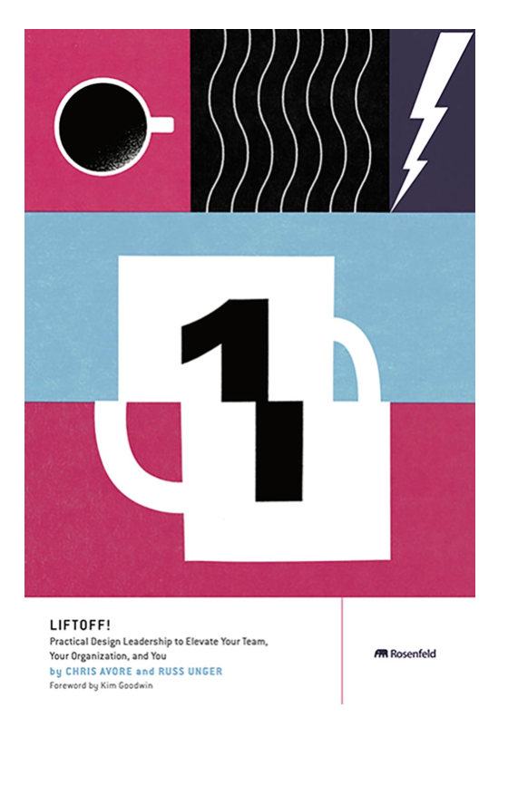
Chris Avore and Russ Unger - Liftoff! Practical Design Leadership to Elevate Your Team, Your Organization, and You
Book pre-order is open. It is dedicated to basic design management practices for team management and will be released on July 20.Introducing Spotify's New Design Principles
The Spotify Design Team talks about the redesigned design principles. There are few details about their creation.DesignOps - An IBM Point of View
IBM surveyed design managers at the company about the areas of responsibility they spend the most time on.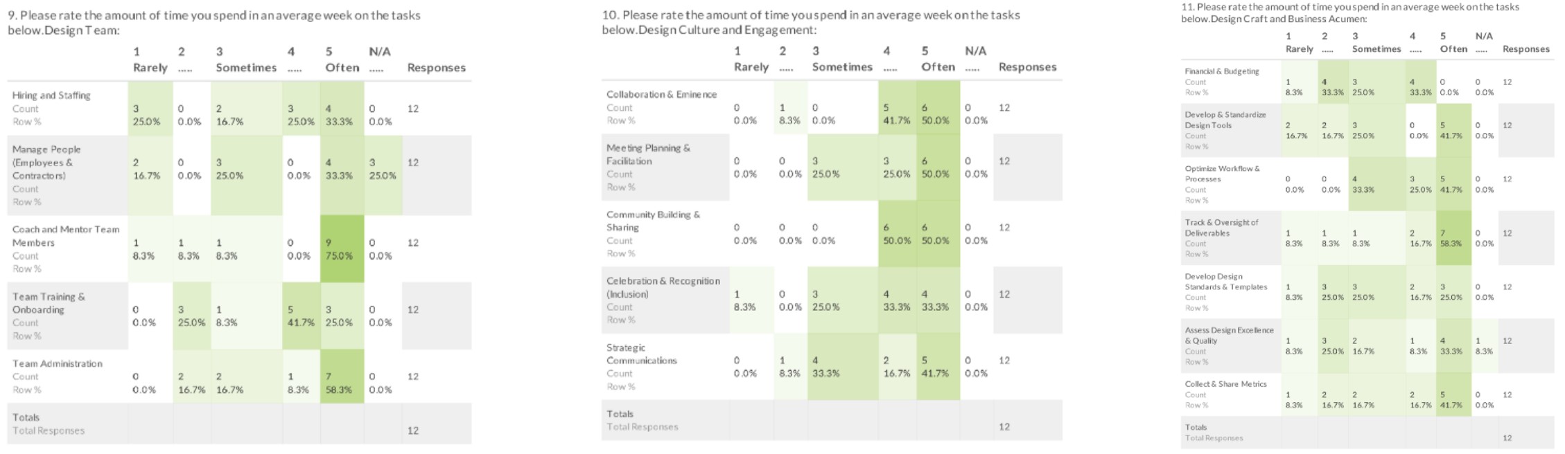
Team interaction
7 tips for an effective UX demo
Shopify's José Torre gives tips on showcasing designs to colleagues to gather feedback.Product management and analytics
From Gut to Plan - The Thoughtful Execution Framework
Annina Koskinen from Spotify talks about the decision tree for product development. This approach goes from a general business goal to growth opportunities and specific hypotheses. This allows you to consistently iterate through the space of problems and solutions. A template in Figma .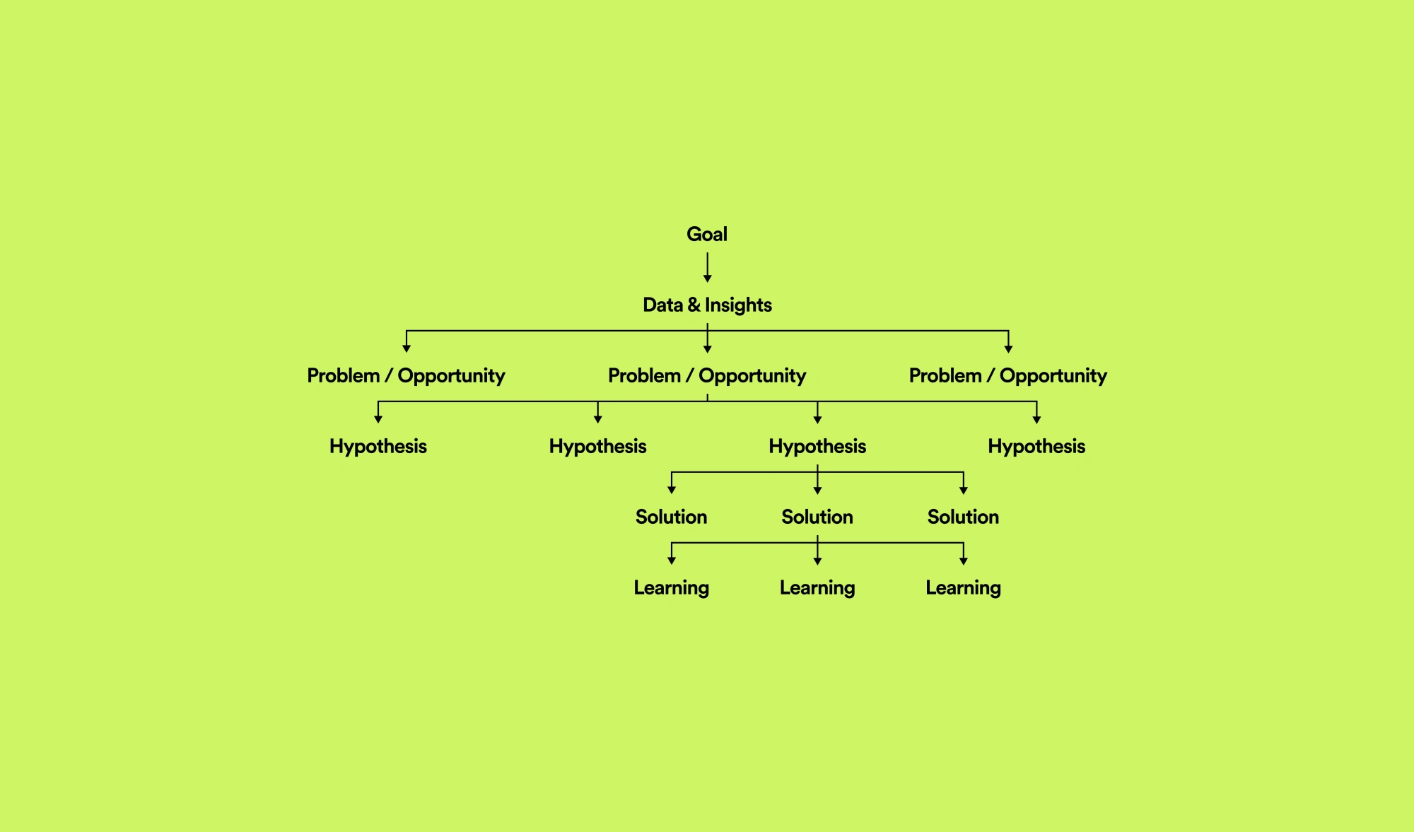
Case
How Redmadrobot and Otkritie launched a mobile bank for business in a year
The Redmadrobot design team talks about the work on a mobile application for entrepreneurs of Otkritie Bank.Branding digital products
Shaping an icon
Nick Levesque from Zendesk talks about creating a system of icons that support a brand. The result is a good constructor from basic shapes that are repeated in the logo and other design elements.
Trends
2020 Logo Trend Report
An overview of logo trends from Logo Lounge.
4 Design Trends That Will Define 2020
Trends from Adobe Stock. What bottom-up graphical techniques are visible in their collection.

Algorithmic design: the hype curve
For eight years I've been collecting algorithmic design examples. But last year, the topic was slowly blown away - you may have noticed that I have not done fresh collections for a long time. There are three reasons: overstated promises, really working examples seem self-evident, and human labor is cheaper. I selected 15 examples from the collection that still make sense.
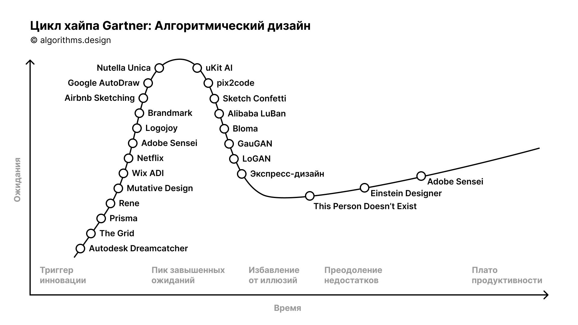
Einstein Designer - AI-Powered, Personalized Design at Scale
Salesforce's Sönke Rohde talks about algorithmic design using their Einstein Designer engine. It personalizes interface blocks based on the user's history and preferences - for example, a product card in an online store can focus on different information. Short story video .
Timecraft - Painting Many Pasts: Synthesizing Time Lapse Videos of Paintings
The experimental algorithm recreates the process of drawing paintings by famous artists step by step. Interestingly, he was trained on screencasts by real artists.Voice interfaces
Design patterns in voice interfaces
Jesús Martín offers his own approach to voice interface patterns: narrative, linguistic and audio.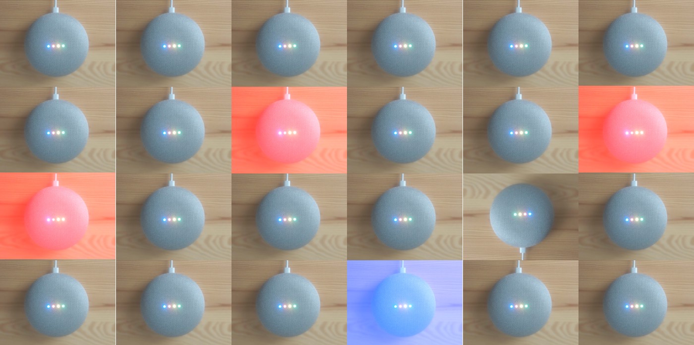
People and companies in the industry
Iconic design firm Astro joins a $ 600 million global consultation firm
British consulting company PA Consulting bought renowned industrial design agency Astro Studios.Societe Generale Design
Societe Generale design team blog.Conference materials
24 Hours of UX
An online design conference that lasted 24 hours - all this time a speaker from a specific time zone spoke. There are no materials, but the format is extremely interesting.Facebook, , , vc.ru ― . , , , , , , , , , . .