Our main product - the site - is constantly overgrown with new functions, but because of this it gradually becomes more heavy and unwieldy. Therefore, our technical department is busy from time to time to make it easier and faster.

One of the main elements that affect the loading speed of almost any site, especially a media site, is images. There are a lot of pictures on Meduza, and this is a valuable way for the editors to tell stories. The requirements of our photo service can be formulated as follows:
- the picture must be uploaded to the CMS (we call it "Monitor") as quickly as possible
- the picture should remain beautiful and look good on all platforms
- the reader does not have to wait for this image to load
First approach
When we launched in 2014, the process of working with images loaded into the Monitor looked like this: the file was loaded into a Rails application, using Paperclip and Imagemagick, it was cleared of metadata, compressed with the selected quality (for JPEG it was around 75) and cut into three sizes: small for phones, larger for tablets and phones with large screens, and very large for computers. The sliced files were put into AWS cloud storage along with the original. They were given (and are given) not directly from AWS, but through our CDN, which caches it on its edge servers.
The API that generates JSON for the site and applications, then, in addition to simple attributes such as headings of materials, also gave a huge chunk of HTML code, which was inserted into the "content" part of the material and was weighted with CSS styles. And the API itself was then the same for all clients: the site, applications and supporting services like RSS and search.

It was immediately clear to us that this approach would not stand the test of time, but it was necessary to launch quickly, test a huge number of hypotheses, experiment, survive. We consciously - at least we believe in it - chose "crutches", and not the beauty of the code and solutions. Time passed, our audience and our product grew. And along with this, the editors' appetites grew. The editors wanted more and more techniques and "tricks" in their materials. At the same time, of course, the design also changed.
The technical department had to conjure over the styles of pictures, methods of displaying them, sizes - they changed along with changes in design and new elements on the site. We added and supported more and more strange solutions.
Here is one of them
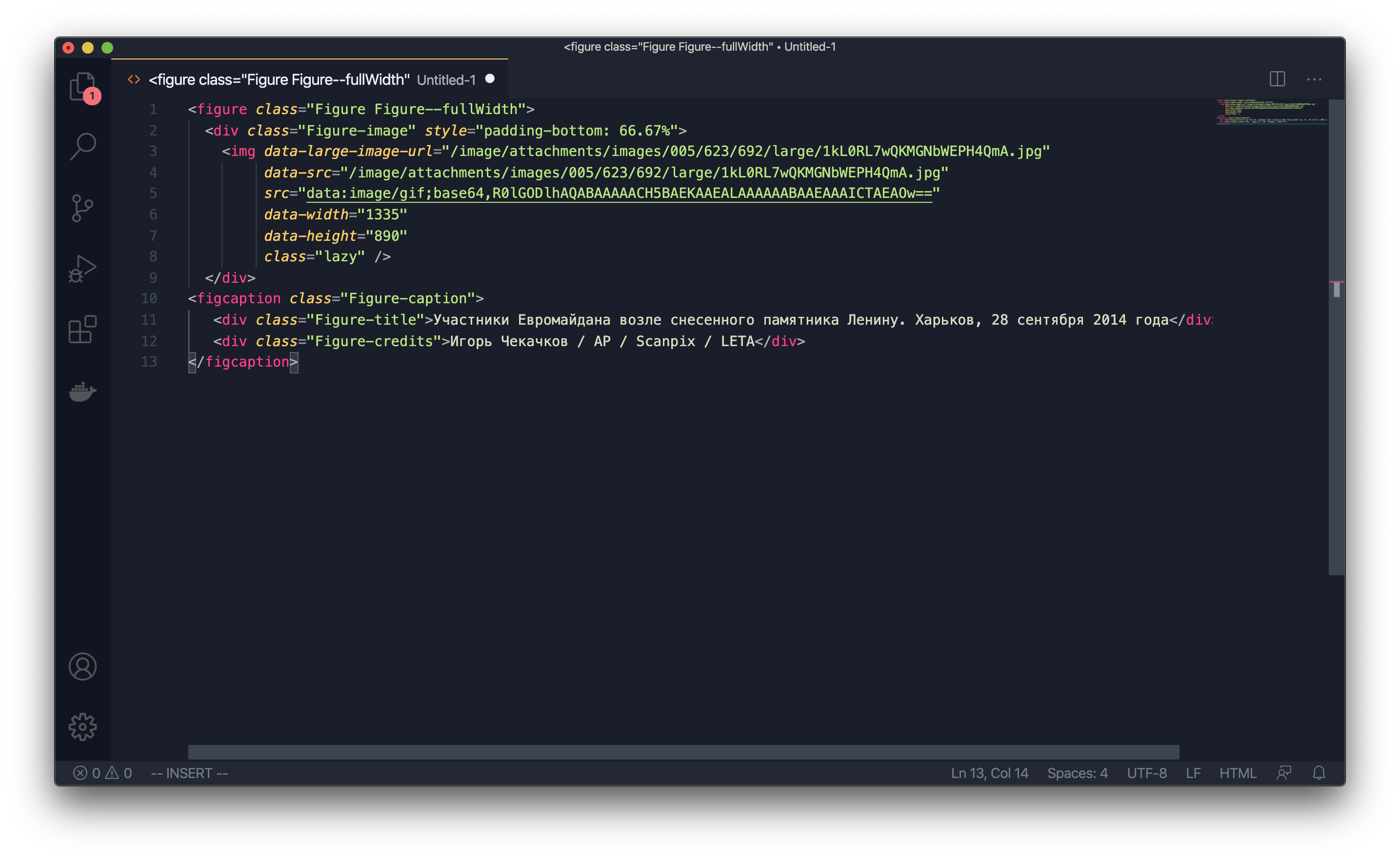

Over time, the Monitor infuriated everyone who came across it more and more: the editorial staff suffered from bugs, because the fixing of these bugs took a lot of time, the developers were furious, and the limitations of the invented architecture did not suit the bosses - we could not quickly develop the product.
We started redesigning the Monitor. We rewrote the main part of the CMS responsible for working on materials for about a year, regularly being distracted by bugs in the old version. Then an internal meme appeared in "Meduza": "It will be in the new Monitor." This is how we answered most of the editors' requests, although, of course, we did some things simultaneously in the old and new CMS: a bad version for now and a good version for later.
I will soon write a separate post in our blog in detail about the alteration of the "Monitor" .
Restart
After restarting and rebuilding the entire Meduza, the API remained the same in format, but it was no longer formed by the CMS itself, but was processed by a separate service. And we finally decided to divide the API into several - for different clients.
We decided to start with mobile applications. By that time, they already had questions about design, UX and speed of work, so we tidied up the applications and made the API the way our iOS and Android developers wanted it.
Before the separation of the API, we showed the content part of the materials through the WebView, so we could not show something exclusively in the application or exclusively on the site - everything was displayed everywhere. Now we have the opportunity to manage content more flexibly: to give only what is needed to mobile applications, to display heavy elements in a different way (such as YouTube video inserts), and finally to make Lazy Load, which allows you to gradually load heavy elements into the material - pictures and embeds.
Having separated the applications, we focused on the site. At this point, it was already decided that we would not make changes to the code of the existing site, but write everything from scratch (yes, we got involved in a project that lasted more than a year again). At the same time, our technical director was replaced, and in my new position I had to audit projects, decide what could be closed, and coordinate it with my superiors. Despite all the difficulties, the team decided to complete the new site. But before that, I decided that we needed another project.
This is how the UI-kit of Medusa appeared.
In order to be flexible in delivering content, it had to be in a form that was most suitable for transformation. The semantic boundaries of content units - pictures, paragraphs of text, headings - should be well aligned. A piece of content shouldn't be too simple or too complex. If it is complex, it most likely has more than one meaning. If it is too simple, most likely, when using it, you will have to hang around with complicating logic, and when you need to reuse such a unit, you will have to copy it in different parts of the project code.
Take Medusa's games for example .... They allow you to tell a huge number of stories in a playful way. They can be made specifically for the agenda or at the request of the advertiser. Or the game can be made on the basis of so-called mechanics - formats that are used repeatedly (for example, these are tests).
Games on Meduza: How We Design, Make, and Reuse
The code of these games does not lie in the code of the site. Each of them is created as a separate microservice, embedded into the site via an iframe and communicating with the site itself via postMessage. And the site doesn't really care what to show in the place where the game will be. Moreover, the game itself should be visually inseparable from the site: typography and interface elements should be the same.

When we first started making games, we copied styles, buttons and other things, and of course it was fast and it looked ok on the outside, but it was terrible on the inside.
The team decided that this should be changed. We paused the correspondence of the site and started making our own UI-kit - a library that included all the repeating elements and styles. We tried not to miss the long perspective: the site, and the games, and the mechanics - everything had to start using the same library.
All Meduza projects on the web are written in React, and the UI-kit is an npm module that plugs into almost everything we develop now. And the developer, when he needs to render something, writes something like this: render blocks.
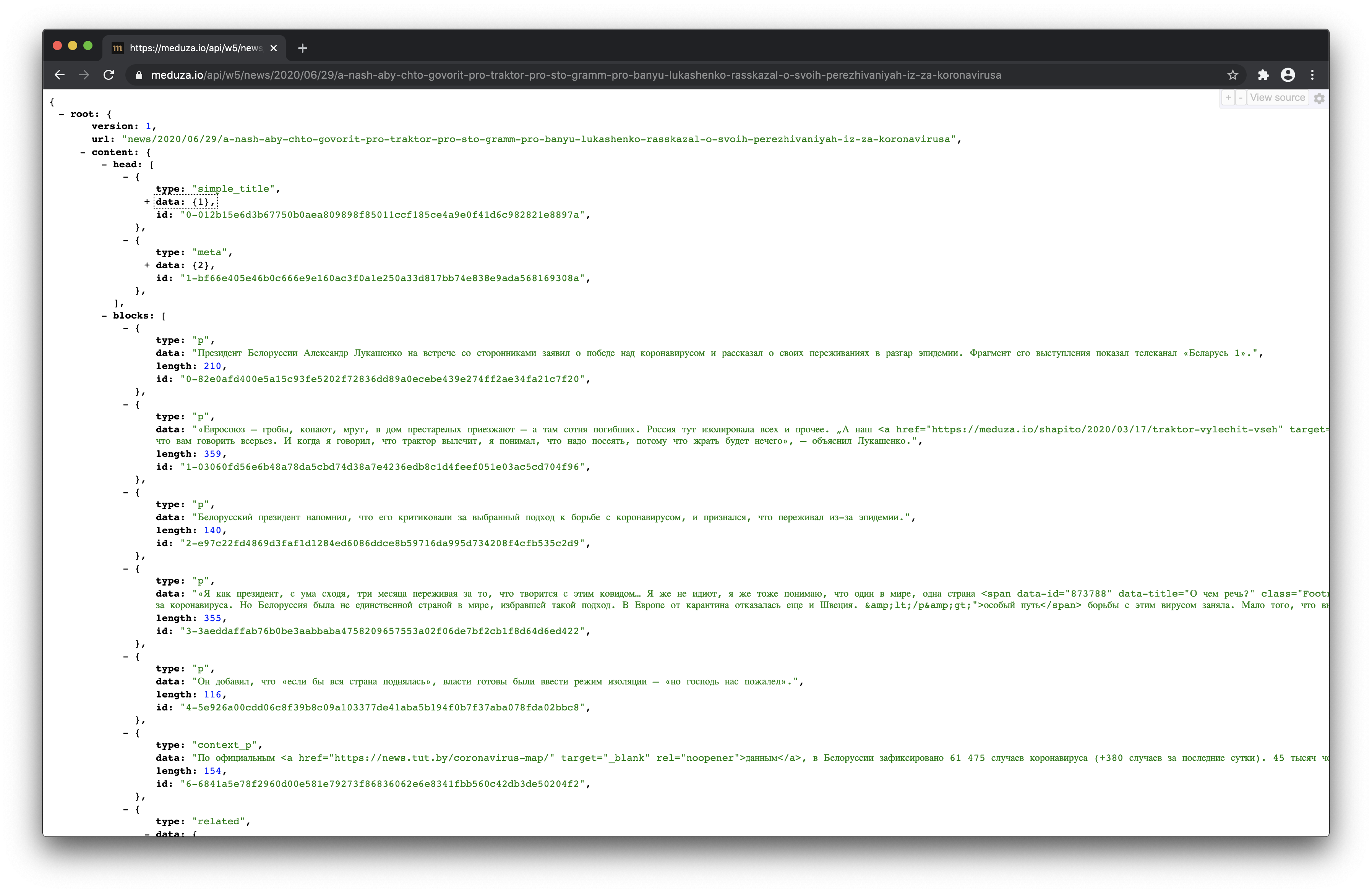
What does it do?
- The front-end developer doesn't think exactly how to render something.
- Everything has already been reviewed by the design department.
- : UI-kit, , , . , «», .
- — - UI-kit ( ) .
UI-kit
There are two groups of components: content and front-end. The latter are very simple React components such as buttons and icons.


Content Components are a little more complex, but still very simple React components with styles that represent one unit of content. For example, this is how a paragraph component looks like:

A component that "catches" simple blocks
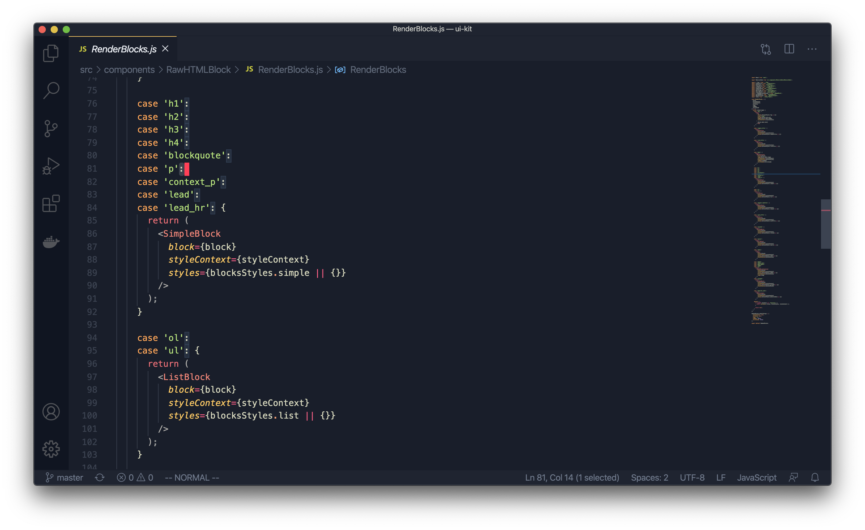
And this is a component that renders a picture: the

API from which the site takes data, inside each material contains an array of components that are eventually "rendered" through the UI-kit ... With games, everything works the same, they just go to their versions of the API for their data.
Hooray, we have restarted!
Below is a graph that shows the average page load time. This is a very inaccurate indicator - all pages on all devices are taken into account - but even it gives an idea of the trend.

The graph shows how the site speed has changed over the entire existence of Meduza. When we first launched with a very simple site in 2014, it was very fast. But when we started adding new features, the download speed dropped.
And here is the same schedule, but for the last two years. It shows how the page load times dropped after the site was restarted.

Then the time for pictures finally came.
Images
The scheme of working with images was then. The picture came through the API, where it had an address like /images/attachments/.../random.jpg . The file itself was served from the AWS cloud storage via our CDN.

We formulated the requirements for the new system as follows:
- the solution should allow us to quickly change the size and quality of the images being sent
- it doesn't have to be expensive
- it must be able to handle a lot of traffic
The scheme we were striving for turned out like this. The backend would generate a URL that would be picked up by the client - browser or application. The URL would contain information about what image is needed, in what quality and what size it should be.
If the picture at this URL is already on the Edge server, it would be immediately served to the client. If not, the Edge server would "knock" on the next server, which would have already passed the request to the service. This service, having received the URL of the image, would decode it and determine the address of the original image and the list of operations on it. After that, the service would serve up the transformed image so that it would be stored in the CDN and served upon request.
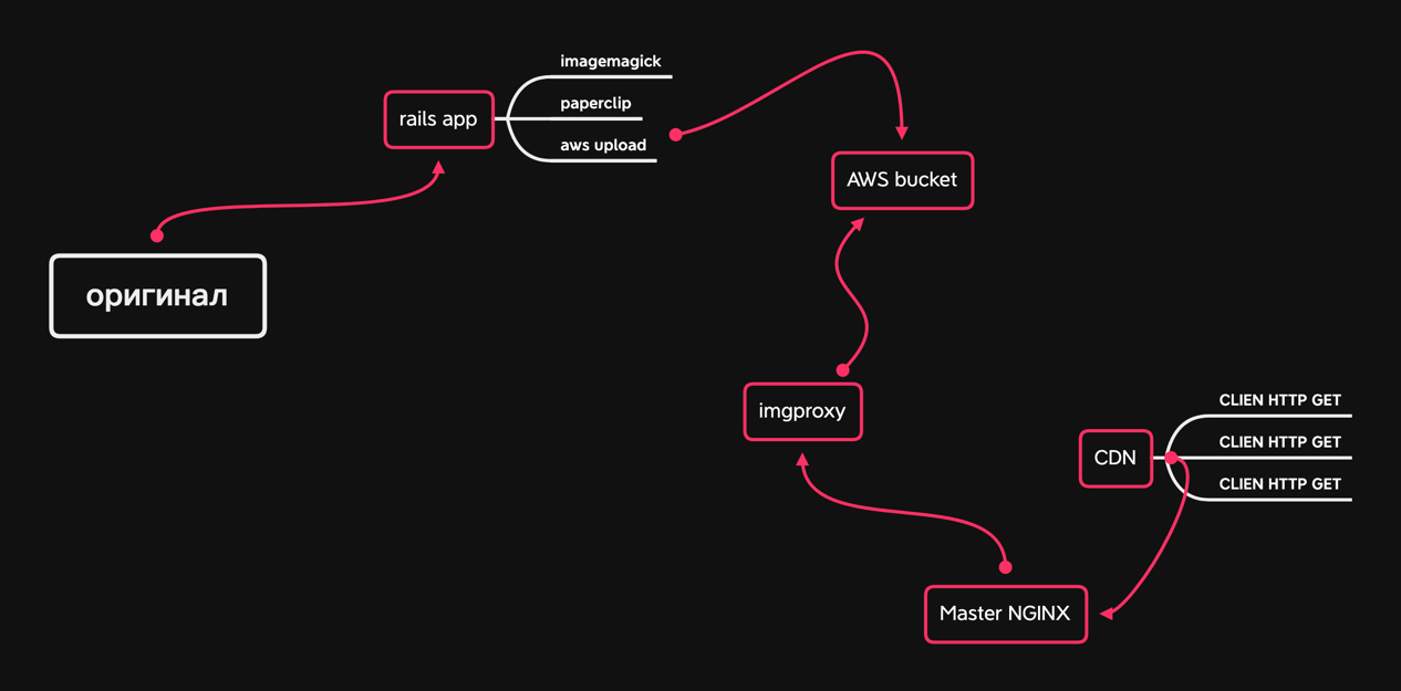
Meduza already has similar solutions. For example, we similarly make pictures for snippets of our materials and games on social networks - in this service we make screenshots of HTML pages through Headless Chrome.
The new service was supposed to be able to work with images, apply simple effects, be fast and resilient. Since we love to write everything ourselves, it was originally planned to write such a service in the Elixir language. But no one on the team had enough time, and certainly no one had the desire to dive into the wonderful world of jpg, png and gif.
We still needed to find a library that would compress images. Imagemagick, which we already had experience with, was not the fastest solution, but at least we knew how to prepare it. Everything else was new, and there would be a lot to check.
We also needed support for the webp image format.
Time passed, we mentally prepared ourselves to immerse ourselves in this project. But then one of our programmers read about the imgproxy library, which the guys from Evil Martians uploaded to Open Source . According to the description, it was a perfect hit: Go, Libvps, a ready-made Docker image, configuration via Env. On the same day, we deployed the library on our laptops and asked our DevOps to play with it too. His task was to bring up the service and try to kill it - so we would understand what loads it will withstand on our servers. During this time, the backend team continued to dabble with the project on their computers: we wrote Ruby scripts and mastered the available functions.
When DevOps returned with the verdict that the library could be used in production, we collected a large number of images that were passed through imgproxy - we were primarily interested in webp - and took their photo directives. The employees of the technical department cannot decide for themselves whether this quality suits us or not. Photo editors sent us their comments, we tweaked something, made sure that the images did not weigh a lot, and went to write the backend code.
Here everything turned out to be very simple: since in the version of the API for the site, the images were already separated by components from everything else, we simply extended their JSON and added additional addresses in different sizes and formats.
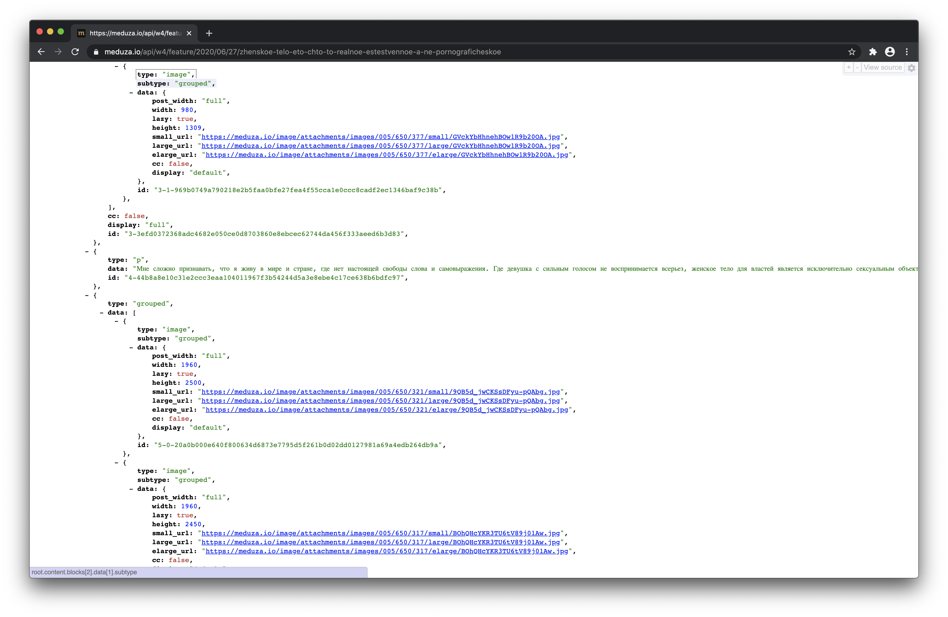

The updated one immediately went into production, since we did not change anything, but only added - the guys on the frontend could develop functions all in the same version of the API. They expanded the image component by function, added sets of images for different sizes and a special "crutch" for Safari. We changed the table of sizes a couple of times and checked the result through the eyes of the editorial office - for this we gave her the current version of the site and a duplicate one with new images for review.
When the comments stopped coming in, we finally deployed, reset the cache and rolled out into production.
Output
The essence of our changes can be summarized as follows: we have shifted the place of decision-making on which picture to give in what form to the place where the context is better taken into account and implementation and support are easier to implement.
Now almost all the pictures you see on Meduza are the result of imgproxy's work, and in each case they have different sizes and sometimes different quality. This is determined by the context - whether the content is open on the web, mobile app, or AMP - that the API service that generates the responses knows about.