The robots watched the training sessions and selected what was useful for the Redmadrobot Design Lab's thematic digest .
Learning and peeking at the best is an important part of our work. Therefore, as in previous years, in this we and tens of millions of developers, designers and engineers followed WWDC. And Apple's Keynote has definitely set a new benchmark for online conferencing : all these cool space changes, speaker switching and speaker at the right time.
After the introductory presentation, the conference itself began with training lectures (sessions) and working consultations (we have already written about how everything works ). And despite the name (Worldwide Developers Conference) Apple traditionally pays great attention to design: many lectures are given by designers and evangelists, the code on their slides is absent or is present in small quantities.
Evgeny Bondarev, creative director of the Redmadrobot design laboratory:
If we pay attention to how Apple presents each feature in iPadOS, iOS, etc., we will notice that first there is a story about design and then about functionality. Firstly, it is simply beautiful, and secondly, design creates emotions. And Apple is building user interactions on the level of emotions that work in conjunction with technology.
For example, at WWDC there was an announcement about increasing the line spacing in drop-down menus! It seems that only Apple in presentations on an international scale can talk about increasing line spacing. This suggests that a powerful design culture still dominates within the company, which is perhaps even ahead of technology.
iPad
IPadOS 14 redesigned the home screen, adding a side navigation bar, handwriting recognition, and more realistic AR objects.
From now on, there will be less white space and more content on the large iPad screen. Many apps have a sidebar for navigating folders or supporting information. File icons are now smaller, allowing for 300% more content on the iPad screen than before.

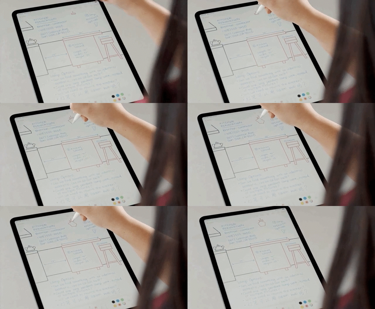
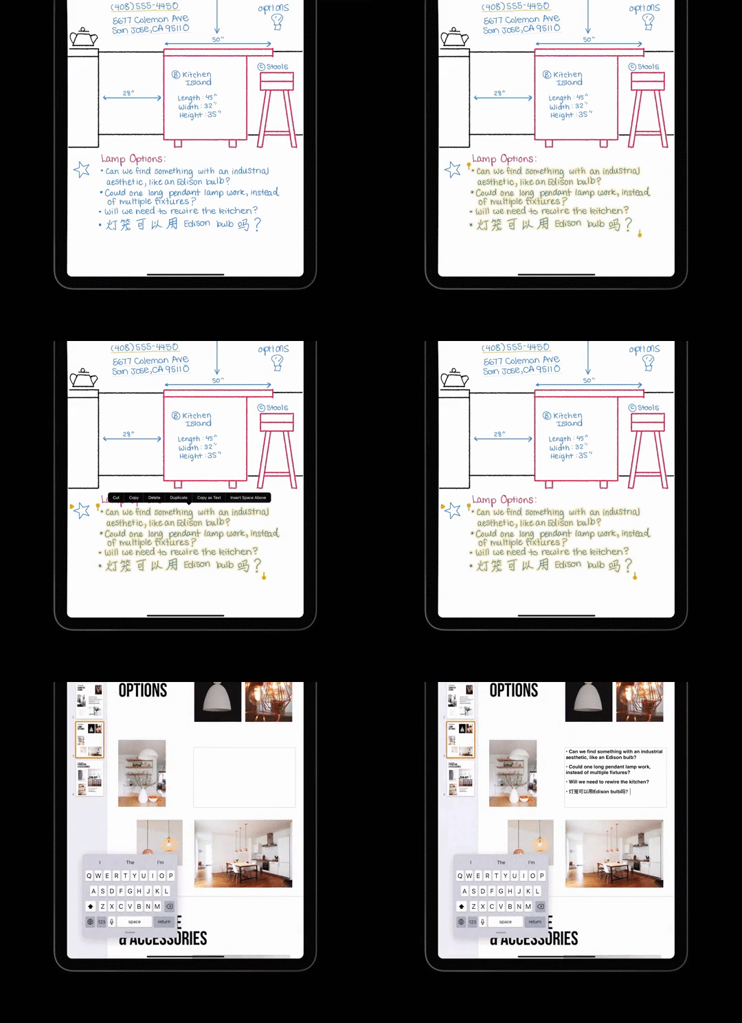
Freehand for Apple Pencil converts handwritten text to typewritten text, distinguishes lettering from drawings, and makes geometric shapes even and correct, which is great for sketching in notes. However, so far the program recognizes only English and Chinese.

Evgeny Bondarev , creative director of the Redmadrobot design laboratory
Pencil iPad — Apple . , , - , . — Pencil « » . , 99% , .
- « », Apple Meet Scribble for iPad.
- - , Inspect, modify, and construct PencilKit drawings.
- To design UI for iPad apps with touch bar and mouse support, see the Design for the iPadOS pointer session .
Apple also announced that iOS / iPadOS apps will start rolling out on new Macs with Apple Silicon processors. Therefore, we advise you to look at how everything works there, for example, in the What's new in Mac Catalyst and Adopt the new look of macOS sessions .
Evgeny Bondarev , creative director of the Redmadrobot design laboratory
Apple : iOS iPadOS, iPadOS macOS.
Mac iPad . UX, , . , .
, Mac, iPad. — Photoshop, Figma. , . , Apple iPad, .

macOS Big Sur. , Apple - ?
Sidebar iPadOS
Previously, we were used to seeing the Tab Bar, familiar to us from the iPhone, on the iPad - it allowed switching between application sections by clicking on the icons at the bottom of the screen.

In the new iPadOS, Apple's designers offer us a different navigation - with the Sidebar . The Sidebar is placed to the left of the app's content and not only contains links to the main sections of the screen, but also allows users to add their own links.
Sidebar on iPad looks more logical than Tab Bar. The old Tab Bar stretched to the full width of the screen, which took up an unreasonable amount of screen space. Sidebar aims to make navigation richer, more personal, and more similar to macOS navigation.
A few tips for designing a Sidebar:
- Use a component for top-level navigation.
- Add the ability to collapse navigation.
- Allow users to customize sections in Sidebar.
- Support Drag'n'drop.
- Use outlined icons.
It is important to remember that you cannot use Tab Bar and Sidebar at the same time - it will confuse users. Also don't forget that on the iPhone (Compact Width) we still use the Tab Bar as our primary navigation tool. You can learn more about this component in the Design for iPad presentation.
AR and updated icons
Apple introduced ARKit 4 with a new Depth API. The LiDAR scanner on iPad Pro 2020 estimates distance to objects and collects environmental data.
Using the georeferencing function, you can add AR elements to geographic maps and view them from all angles in iPhone and iPad apps. Learn more about what's new for iPad in the related session .

Sculpture by the artist KAWS in the Acute Art application
Evgeny Bondarev , creative director of the Redmadrobot design laboratory
New application icons have become more voluminous, multi-layered, they have shadows. It may seem that this is a step towards skeuomorphism, but there is a suspicion that these icons will look cool in augmented reality. When we start interacting with interfaces in space, the icons will move a little, showing different faces. This layering will work cool in spatial interfaces. This is just a guess, but today we see a powerful pumping of ARKit. There are rumors that next year Apple will release augmented reality glasses and perhaps we will see updated icons already there.
Interestingly, there have been no big changes in icon design for a long time. In my opinion, this led to the fact that the icons do not look very modern, but Apple relied on cultural heritage, it is more important for them to preserve it than to remake it into some kind of system.
Cars
Part of WWDC Keynote about Car Key and an example of its work with BMW (inside English)
Evgeny Bondarev , creative director of the Redmadrobot design laboratory
Apple . Car Play, Apple Map Car Key. Car Key iPhone Apple Watch. 5 . , Apple Map . iPhone . . , , , , .
San Francisco and New York fonts are now available in variable font format. Combining different styles in one file with interpolation support allows you to create intermediate styles. At the same time, the created fonts are adapted for different sizes. Using both typefaces can help create visual hierarchies or highlight semantic differences in content. Apple warns that using a variable font on earlier versions of iOS can lead to "unexpected results . "
Apple's library also has 750 new black and white icons and 150 more color ones. Colored icons are new for SF Symbols 2 and will automatically adapt to dark or light themes.
Negative side margins are supported in system and user-defined characters to better control horizontal alignment. More about symbols here .
App Clips
App Clips are gadgets that can be used without installing the full version. Now, to rent a scooter, you first need to install the application, register, enter the payment details. With App Clip, everything is easier and faster: we take a scooter, scan a QR code or use an NFC tag, register in one click through Sign in with Apple, pay for rent through Apple Pay and ride to our health. If you liked the application, follow the link and install the full version.

Another scenario is paying for parking in different cities (on vacation or business trip), so as not to download a new application every time. The developers also offer scripts for online shopping, coffee shops, food delivery and travel. Read more in the Apple section .
 |
 |
Evgeny Bondarev , creative director of the Redmadrobot design laboratory
App Clips greatly lowers the entry threshold for using mobile applications, opens up great opportunities for the platform and greatly affects the UX, since you can use a large number of applications simply by scanning the code.
Gadgets should not exceed 10 MB, use SwiftUI and UIkit, and have access to the same functions as the full version - camera use, geolocation, Bluetooth, and others. App Clips can send push notifications within 24 hours or, with the user's permission, within a week.
Widgets
Home screen widgets have been added to iPhone, iPad and Mac. According to Apple, this will give the home page a radically new and more informative look, and all the essentials will be at hand. The user can group widgets or use automatic arrangement, for example "recommended", "recently opened".
The Smart Stack function is available on iPhone and iPad - it is essentially a widget for widgets. It will allow you to combine widgets into a group based on some attribute and turn over these groups among themselves. For example, in the morning on the main screen there will be a group with weather and news, a calendar in the afternoon, and a map and information about traffic jams in the evening.
Widgets are available in three sizes: S, M, L for different information load. The widgets use vibrant colors, photographs, and a crisp font that's easy to read at a glance.
A couple of tips from the Widget UI kit: the widget does not need to include the application name or logo, only useful content. Widgets should look equally good in dark and light themes. The text should always be there, but do not convert it to a raster for the Voice Over function to work correctly. More information and tips for using widgets in an Apple session .
And a little more useful information about widgets can be found in the session about the capabilities of the operating system for solving user problems in various scenarios (Siri, notifications, widgets) - Design for intelligence: Discover new opportunities .
Interesting thoughts about widgets and a visual demonstration of how they work can be seen in the review from The Verge.
New design components and more
IOS updated pickers, context menu, and added color picker.
Apple has reimagined the visual style of pickers and how the user interacts with them. The date selection is available in 4 modes: countdown, time, date, time and date. This will make it easier to switch between years and months on the calendar. Time can now be entered from the keyboard instead of scrolling the switch. We also added a light gray background to the pickers to make the selected element more visible. The context menu can be added to any button, and the menu will not overlap the smartphone screen. A session on design components .
An update to the SwiftUI API makes it easier to choose colors for apps. Developers now have a Color Picker:
- choose a color from the grid, spectrum or using the sliders;
- change transparency and switch between color spaces (Display P3 and sRGB);
- choose a color from anywhere on the screen.
- There is an article about the custom Color Picker on Medium .
For updates in watchOS 7, including how the UI on the watch differs and why exactly such components should be used, see the What's new in watchOS design session .
 |
 |
And a few more design sessions that are less cool in our opinion, but you can watch them for inspiration:
- Evaluate and optimize voice interaction for your app.
- Design for location privacy.
- Design for intelligence: Apps, evolved.
- Design for intelligence: Make friends with “The System”.
- Design for intelligence: Meet people where they are.
Write in the comments what you remember about this WWDC. And this is where we conclude our apple design digest. Subscribe to Design Jam on Telegram and may the power of robots be with you!
PS Special thanks for participating in the preparation of the material, we expressvani2 (Head of iOS Redmadrobot), bealex(CTO Redmadrobot SPb), ex-iron designer Artur Abrarov and creative director of Redmadrobot Zhenya Bondarev.
PPS And finally, another example of UX magic from Apple, noticed after the release of the iOS 14 beta
With Back Tap, you can perform various action by double or tripple tap on the back of your iPhone. Here's one I set double tap to take screenshot. pic.twitter.com/uZKv4Cjorf
- Aditya Daniel (@adityadaniel) June 23, 2020