cognitive distortions about sunk costs (sunk cost fallacy) is one of the many harmful cognitive biases , which people become a victim. This refers to our tendency to continue to devote timeand resources to a lost cause, because we've already spent - drowned - so much time in pursuit. The under-cost fallacy applies to staying at a bad job longer than we should, slavishly working on a project even when it’s clear it won’t work, and yes, continuing to use the boring, outdated plotting library - matplotlib - when there are more efficient, interactive and more engaging alternatives.
Over the past few months, I've realized that the only reason I'm using matplotlib is because of the hundreds of hours I've spent learning the complex syntax . These complexities lead to hours of frustration figuring out on StackOverflow how to format dates or add a second Y-axis. Fortunately, this is a great time to plot graphs in Python, and after exploring options , the clear winner - in terms of ease of use, documentation, and functionality - is plotly . In this article, we'll dive right into plotly, learning how to create better charts in less time - often with one line of code.
All the code for this article is available on GitHub . All graphs are interactive and can be viewed on NBViewer .
Plotly Overview
Package plotly for Python - a library of open source software, built on plotly.js , which, in turn, is built on d3.js . We'll be using a wrapper over plotly called cufflinks designed to work with the Pandas DataFrame.So, our stack cufflinks> plotly> plotly.js> d3.js - this means we get efficiency in Python programming with incredible interactive graphical capabilities d3 .
( Plotly itself is a graphics companywith several open source products and tools. The Python library is free to use and we can create unlimited charts offline plus up to 25 charts online to share with the world .)
All the work in this article was done in Jupyter Notebook with plotly + cufflinks working offline. After installing plotly and cufflinks with,
pip install cufflinks plotly import the following to run in Jupiter:
# Standard plotly imports
import plotly.plotly as py
import plotly.graph_objs as go
from plotly.offline import iplot, init_notebook_mode
# Using plotly + cufflinks in offline mode
import cufflinks
cufflinks.go_offline(connected=True)
init_notebook_mode(connected=True)
Single Variable Distributions: Histograms and Box Plots
Single-variable plots - one-dimensional is the standard way to start an analysis, and a histogram is a transition plot ( albeit with some problems ) for plotting a distribution plot. Here, using my average article stats (you can see how to get your own stats here, or use mine ), let's make an interactive histogram of the number of claps on articles (
dfthis is the standard Pandas dataframe):
df['claps'].iplot(kind='hist', xTitle='claps',
                  yTitle='count', title='Claps Distribution')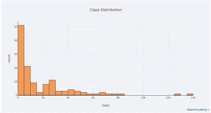
For those who are used to
matplotlib, all we have to do is add one more letter ( iplotinstead of plot) and we get a much more beautiful and interactive graph! We can click on the data to get more information, zoom in on portions of the graph, and, as we will see later, select different categories.
If we want to plot overlaid histograms, it's just as easy:
df[['time_started', 'time_published']].iplot(
    kind='hist',
    histnorm='percent',
    barmode='overlay',
    xTitle='Time of Day',
    yTitle='(%) of Articles',
    title='Time Started and Time Published')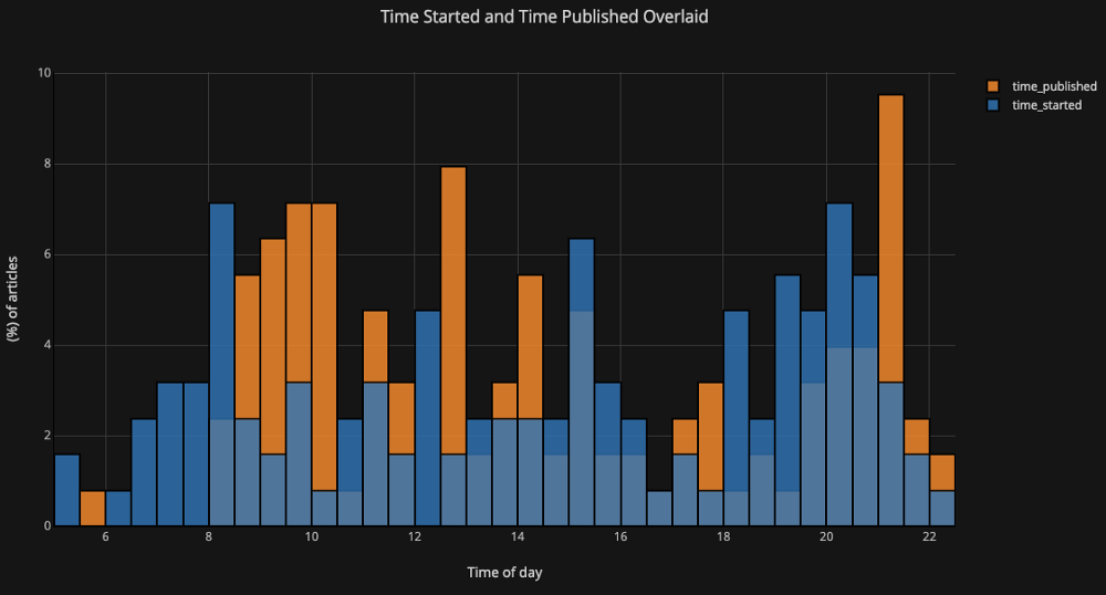
With a little manipulation
Pandas, we can make a barplot:
# Resample to monthly frequency and plot
df2 = df[['view','reads','published_date']].\
         set_index('published_date').\
         resample('M').mean()
df2.iplot(kind='bar', xTitle='Date', yTitle='Average',
    title='Monthly Average Views and Reads')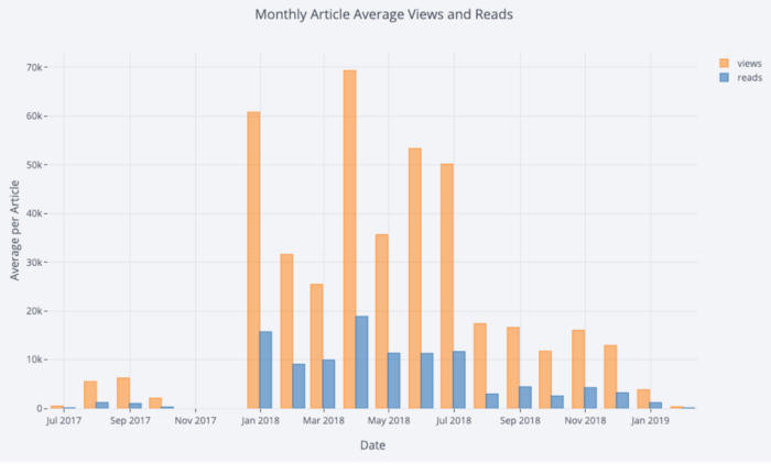
as we have seen, we can combine the power of Pandas with plotly + cufflinks. To boxplot the distribution of fans by publication, we use
pivot, and then plot:
df.pivot(columns='publication', values='fans').iplot(
        kind='box',
        yTitle='fans',
        title='Fans Distribution by Publication')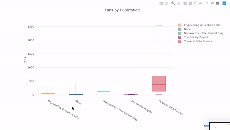
The benefits of interactivity are that we can explore and host the data as we see fit. There is a lot of information in the box raft, and without the ability to see the numbers, we will miss most of it!
Scatter plot
The scatter plot is the heart of most analyzes. This allows us to see the evolution of a variable over time, or the relationship between two (or more) variables.
Time series
Much of the real data has a time element. Luckily plotly + cufflinks was designed with time series visualization in mind. Let's frame the data from my TDS articles and see how the trends have changed.
 Create a dataframe of Towards Data Science Articles
tds = df[df['publication'] == 'Towards Data Science'].\
         set_index('published_date')
# Plot read time as a time series
tds[['claps', 'fans', 'title']].iplot(
    y='claps', mode='lines+markers', secondary_y = 'fans',
    secondary_y_title='Fans', xTitle='Date', yTitle='Claps',
    text='title', title='Fans and Claps over Time')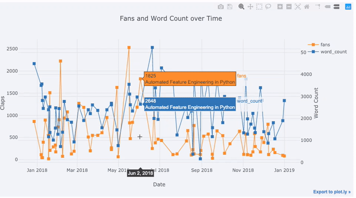
We see quite a few different things here:
- Automatically get nicely formatted time series on x axis
- Adding a secondary y-axis because our variables have different ranges
- Displaying article titles on hover
For more information, we can also add text annotations quite easily:
tds_monthly_totals.iplot(
    mode='lines+markers+text',
    text=text,
    y='word_count',
    opacity=0.8,
    xTitle='Date',
    yTitle='Word Count',
    title='Total Word Count by Month')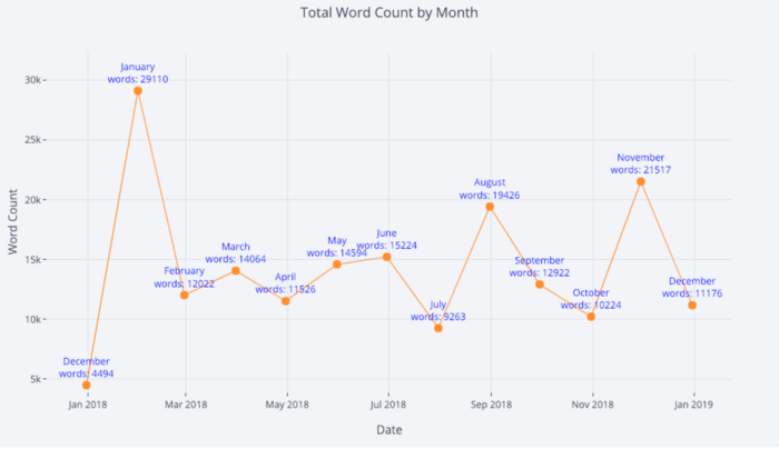
For a two-variable scatter plot colored with the third categorical variable, we use:
df.iplot(
    x='read_time',
    y='read_ratio',
    # Specify the category
    categories='publication',
    xTitle='Read Time',
    yTitle='Reading Percent',
    title='Reading Percent vs Read Ratio by Publication')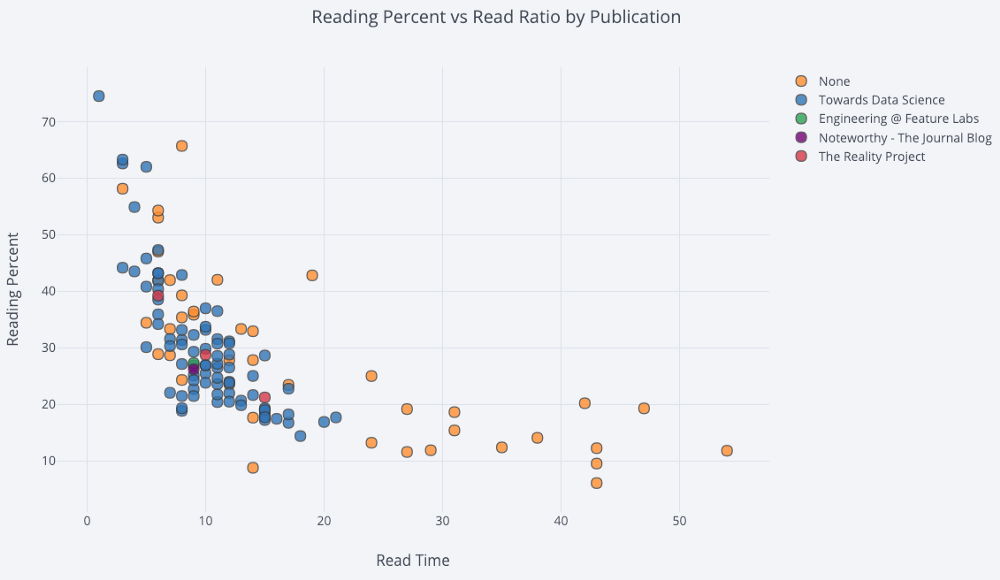
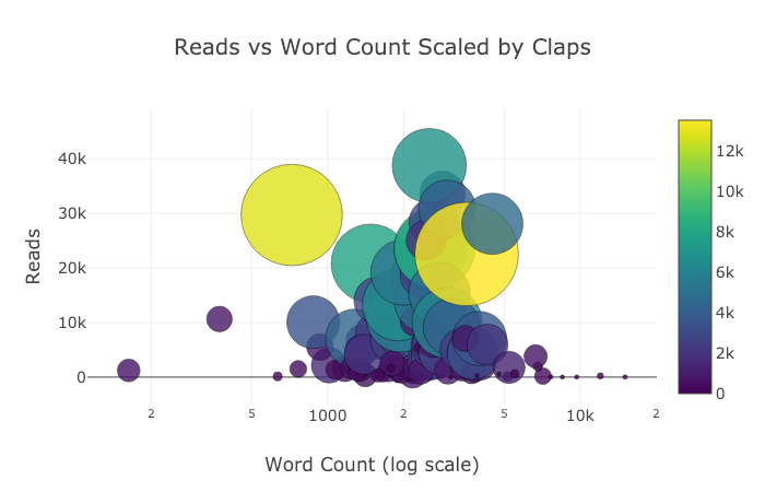
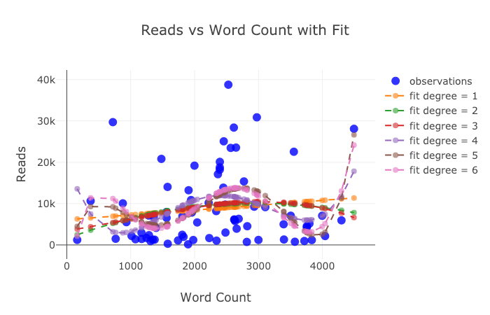
Let's complicate things a bit by using a log axis, specified as plotly layout - (see Plotly documentation for layout specifications), and specifying the size of the bubbles of a numeric variable:
tds.iplot(
    x='word_count',
    y='reads',
    size='read_ratio',
    text=text,
    mode='markers',
    # Log xaxis
    layout=dict(
        xaxis=dict(type='log', title='Word Count'),
        yaxis=dict(title='Reads'),
        title='Reads vs Log Word Count Sized by Read Ratio'))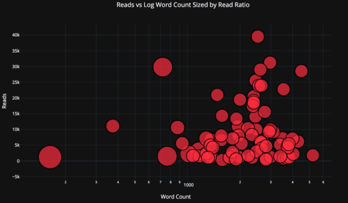
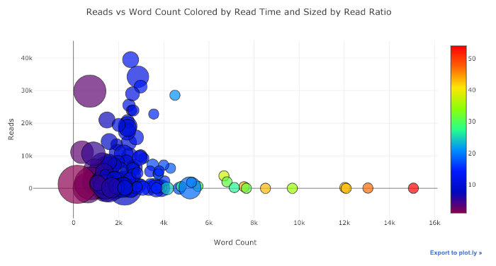
With a little bit of work ( see NoteBook for details ), we can even put four variables ( not recommended ) on one graph!
As before, we can combine Pandas with plotly + cufflinks for useful graphs
df.pivot_table(
    values='views', index='published_date',
    columns='publication').cumsum().iplot(
        mode='markers+lines',
        size=8,
        symbol=[1, 2, 3, 4, 5],
        layout=dict(
            xaxis=dict(title='Date'),
            yaxis=dict(type='log', title='Total Views'),
            title='Total Views over Time by Publication'))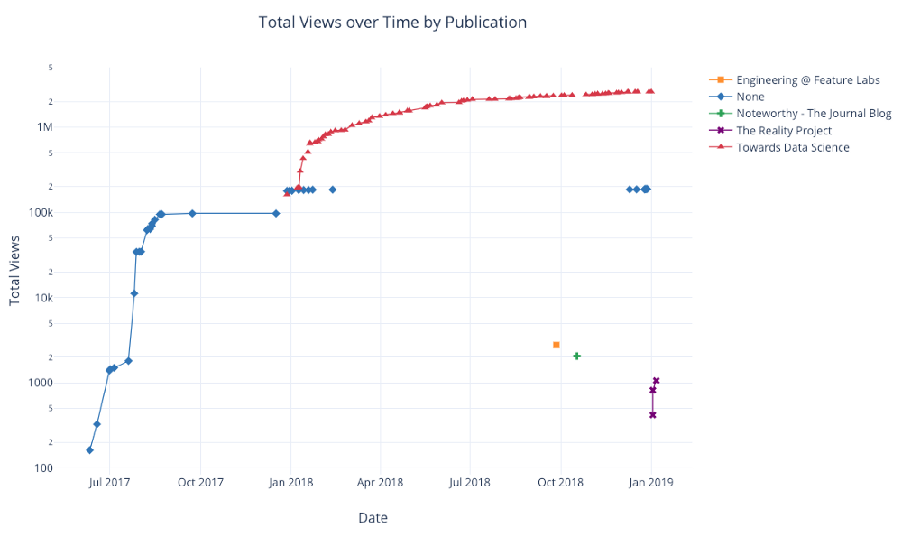
For more examples of functionality, see the notebook or documentation . We can add text annotations, reference lines, and best fit lines to our diagrams with one line of code and still with all interactions.
Advanced charts
We now move on to a few graphics that you probably won't use as often, but which can be quite impressive. We'll be using plotly figure_factory to do even these incredible haffics in one line.
Scattering Matrix
When we want to explore relationships between many variables, the scatter matrix (also called splom) is a great option:
import plotly.figure_factory as ff
figure = ff.create_scatterplotmatrix(
    df[['claps', 'publication', 'views',
        'read_ratio','word_count']],
    diag='histogram',
    index='publication')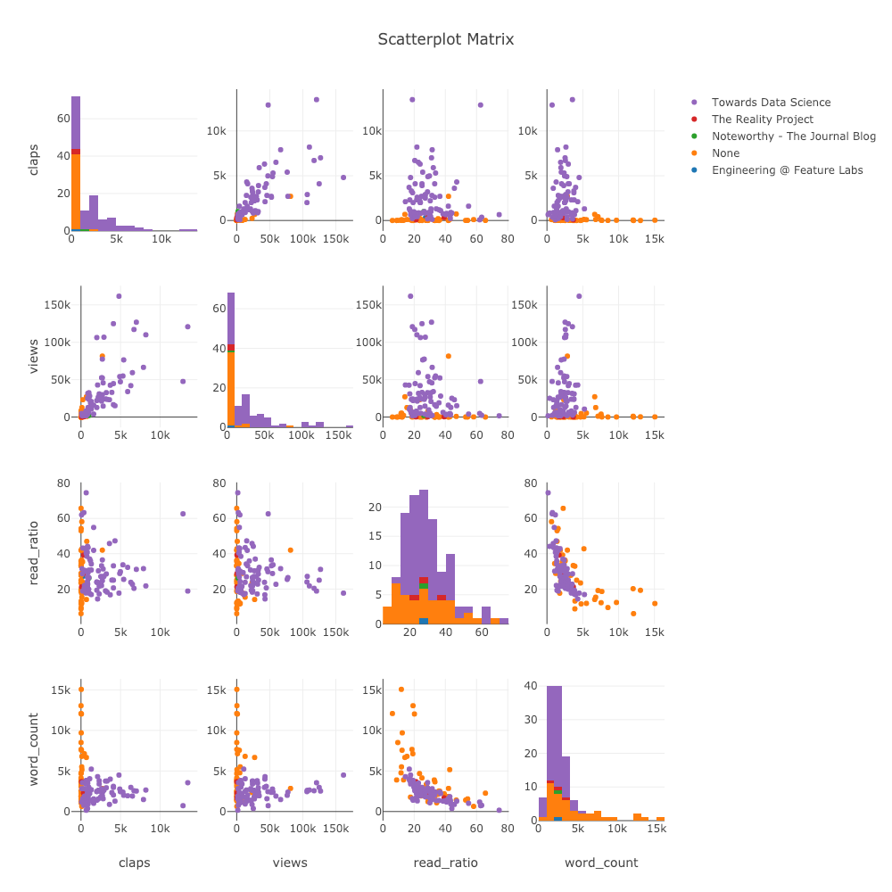
Even this graph is fully interactive, allowing us to explore the data.
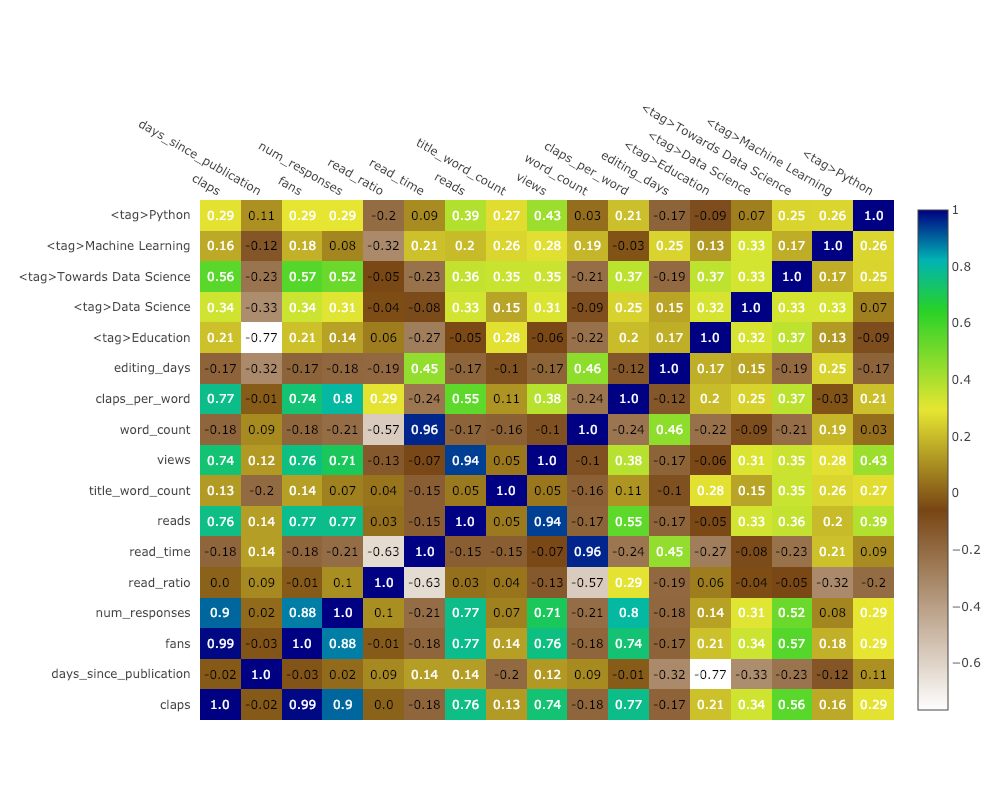
Correlation Heat Map
To visualize correlations between numeric variables, we calculate the correlations and then make an annotated heatmap:
corrs = df.corr()
figure = ff.create_annotated_heatmap(
    z=corrs.values,
    x=list(corrs.columns),
    y=list(corrs.index),
    annotation_text=corrs.round(2).values,
    showscale=True)
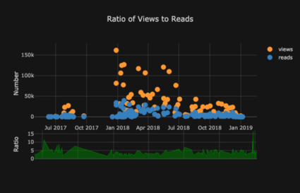
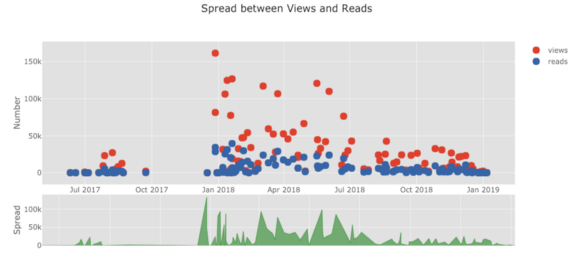
The list of graphs goes on and on. cufflinks also has several themes that we can use to get a completely different look and feel without any effort. For example, below we have a ratio plot in the "space" theme and a spread plot in "ggplot":
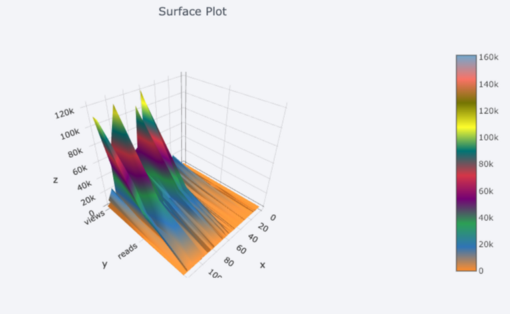
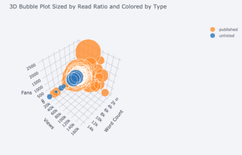
We also get 3D plots (surfaces and bubble plots):
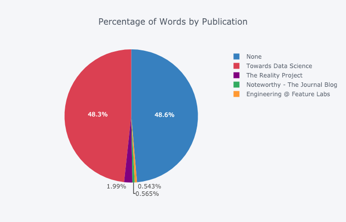
For those who like it , you can even make a pie chart:
Editing in Plotly Chart Studio
When you make these graphs in NoteBook Jupiter you will notice a small link in the lower right corner of the “Export to plot.ly” graph, if you click on this link you will be taken to Chart Studio where you can tweak your graph for the final presentation. You can add annotations, specify colors, and generally clear everything for a great graph. Then you can publish your schedule on the Internet so that anyone can find it by reference.
Below are two graphs that I tweaked in Chart Studio:
Despite what has been said here, we still haven't explored all the features of the library! I would advise you to look at both plotly documentation and cufflinks documentation for more incredible plots.
conclusions
The worst part of the undervalued misconception is that you only realize how much time you've wasted after you quit. Luckily, now that I've made the mistake of staying with matploblib for too long, you don't have to!
When we think about plot libraries, there are several things we want:
- One-line graphs for quick exploration
- Interactive Data Substitution / Exploration
- The ability to dig into details as needed
- Easy setup for final presentation
At the moment, the best option for doing all this in Python is plotly. Plotly allows us to make visualizations quickly and helps us better understand our data through interactivity. Plus, let's face it, charting has to be one of the nicest parts of data science! With other libraries, plotting has turned into a tedious task, but with plotly, there's the joy of making a great figure again!

Find out the details of how to get a high-profile profession from scratch or Level Up in skills and salary by taking SkillFactory's paid online courses:
- Training the Data Science profession from scratch (12 months)
- Analytics profession with any starting level (9 months)
- Machine Learning Course (12 weeks)
- «Python -» (9 )
- DevOps (12 )
- - (8 )