At the end of 2019, iOS 13 and Android 10 were released with support for auto-switching to a dark theme. We decided to add it to the Rostelecom Key application for iOS and Android, which we were working on at that time. The process was not without complications. We tell you about our experience so that you can save time and nerves in a similar situation.
Why make a dark theme
It may seem that this is all on the wave of hype. But not only :)
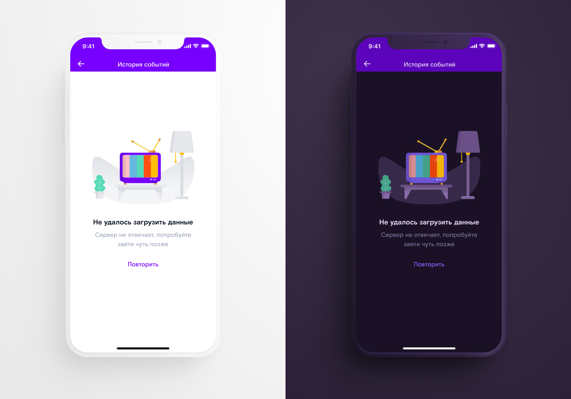
Dark theme - functional improvement. It is needed by applications that use it in low light conditions. To understand why this is so, we need to delve a little into the structure of our vision.
If we leave a dark room into a light one, then for a while we “go blind”, but we get used to the new conditions in 4–6 minutes. When we move from a bright place to a dark one, adaptation takes longer: an average of 30–45 minutes. If a person constantly has to shift their eyes between a bright application and a dark environment, adaptation to a bright display will be fast, but reverse adaptation to darkness will be slow.
For this reason, some applications, such as navigators, released dark themes before operating systems. If a person drives on the road at night, it is important that the navigation screen does not distract from the movement.
In our case, the RT Key application is a cross-platform service for managing devices on the territory of the house: intercoms, barriers, CCTV cameras in the yard and at the entrance. Residents of houses use it both during the day and at night.
It's fair to say that the dark theme also helps save power (for some types of screens: OLED / amoled - yes, LCD - no). And in the long term, it can slow down the development of myopia.
How to go to the dark side: step by step instructions
If you don't know anything about the dark theme at all, then you can start your acquaintance with articles in the Human Interface Guidelines for iOS and in the Material Guide for Android. It details how colors and layers interact with each other in night mode. Let's move on to our tips:
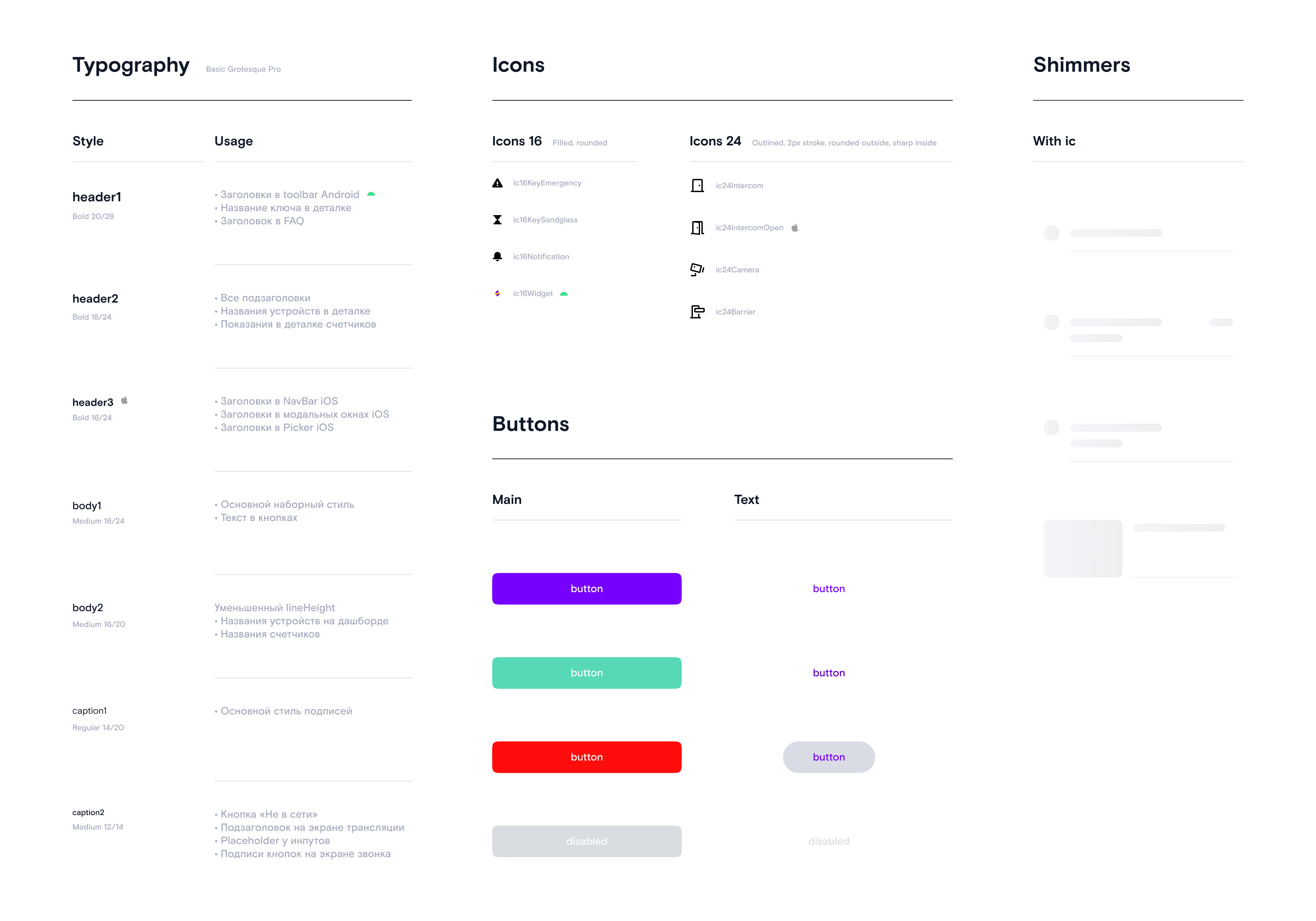
1. Tidy up the layouts and assemble the UI kit The
UI kit seriously speeds up the work of the designer and developers. We usually put it together right after the visual concept is approved, using the example of several main screens of the application. The UI kit includes:
- The color palette of styles for the normal state of elements, the state when pressed, colors for inactive elements, in-focus inputs, and so on.
- Text styles.
- All interface elements (buttons, input fields, list items, blocks with titles, etc.) in various states and situations in the form of master components.
- Set of icons in black.
- Illustrations.
 |
 |
All subsequent screens are assembled from ready-made components. But when exporting layouts from Sketch to Figma, our UI kit suffered serious damage: we had to update it, reassign a color style for each element, and rebuild screens from components.
All subsequent screens are assembled from ready-made components. But when exporting layouts from Sketch to Figma, our UI kit suffered serious damage: we had to update it, reassign a color style for each element, and rebuild screens from components.
2. Agree on color names
To make it easier for designers, iOS and Android developers to communicate with each other, we decided to name the colors universally for both platforms. In the previous version of the UI kit, we marked the color styles in a simple way - by numbers: C1, C2, C3 ... It was not very convenient: during the discussion, everyone called colors not by numbers, but by shades: purple, orange, black, etc.
However With the advent of the dark theme, it became impossible to use shades in the names of colors: for example, the white background color in the light theme changed to dark. So, it was necessary to come up with a new naming principle.
After several meetings with the participation of the entire team, it was decided that the name of the color should depend on its purpose and consist of the following parts:
- The purpose of the color or the element on which it is used.
- Priority of use (optional).
- The state of the item, if applicable (optional).

On the left are the names for the colors of the button in the normal state when pressed on iOS, the Ripple color on Android, and the inactive button on both platforms. On the right, there are names for texts on various surfaces.
In general, if your project does not yet have a UI kit, and instead of color styles you have assigned regular colors, it's time to "comb" the layouts.
3. Choose the colors for the dark theme
Katya Rokityan, designer at Redmadrobot:
, , . . , , , «». , .
3.1. Background color
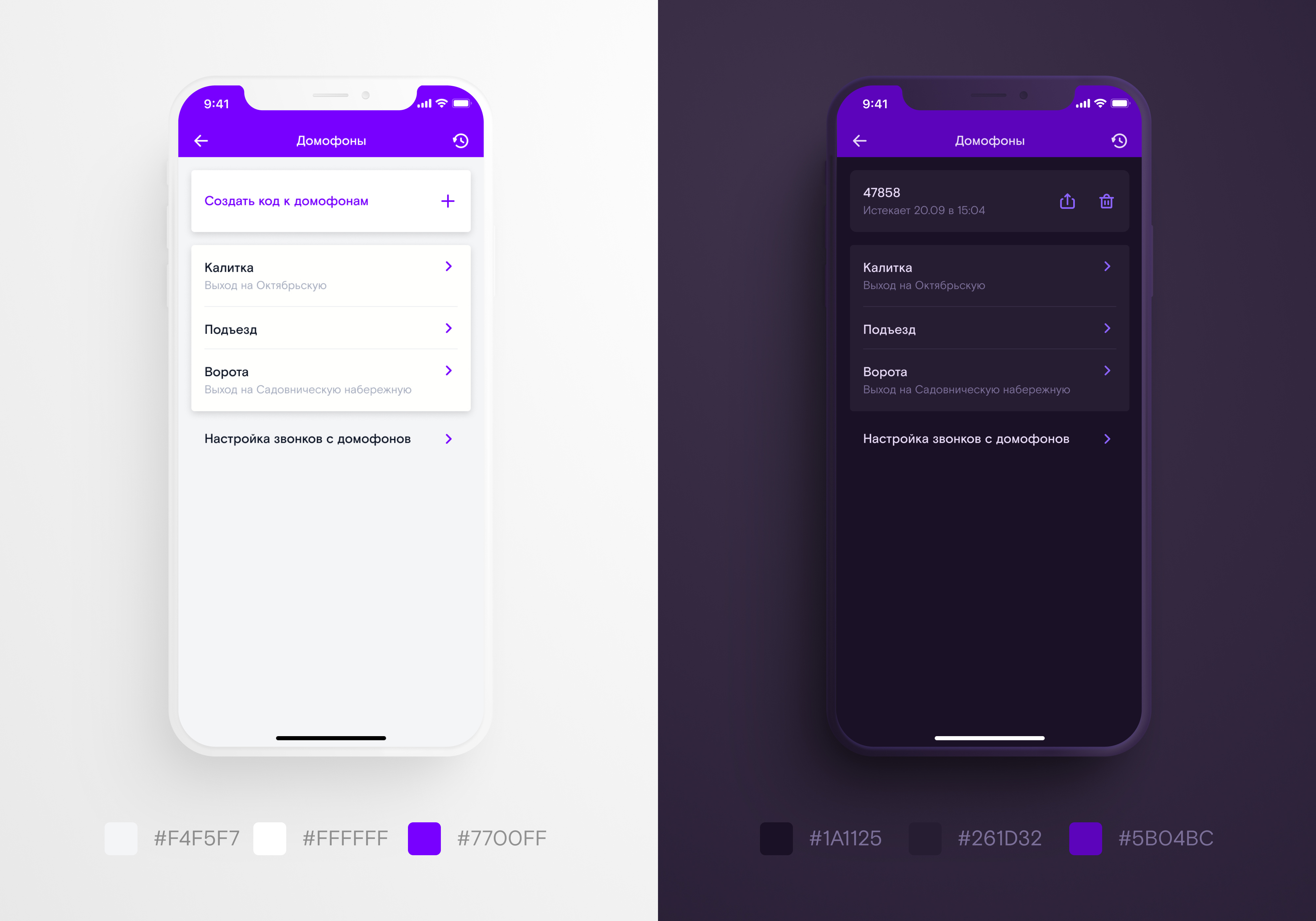
You should start redrawing the layout with the background color: it takes up most of the screen. Material Design guides recommend using a neutral dark gray (# 121212) as the basis. It, unlike black, leaves room for building the "depth" of the screen.
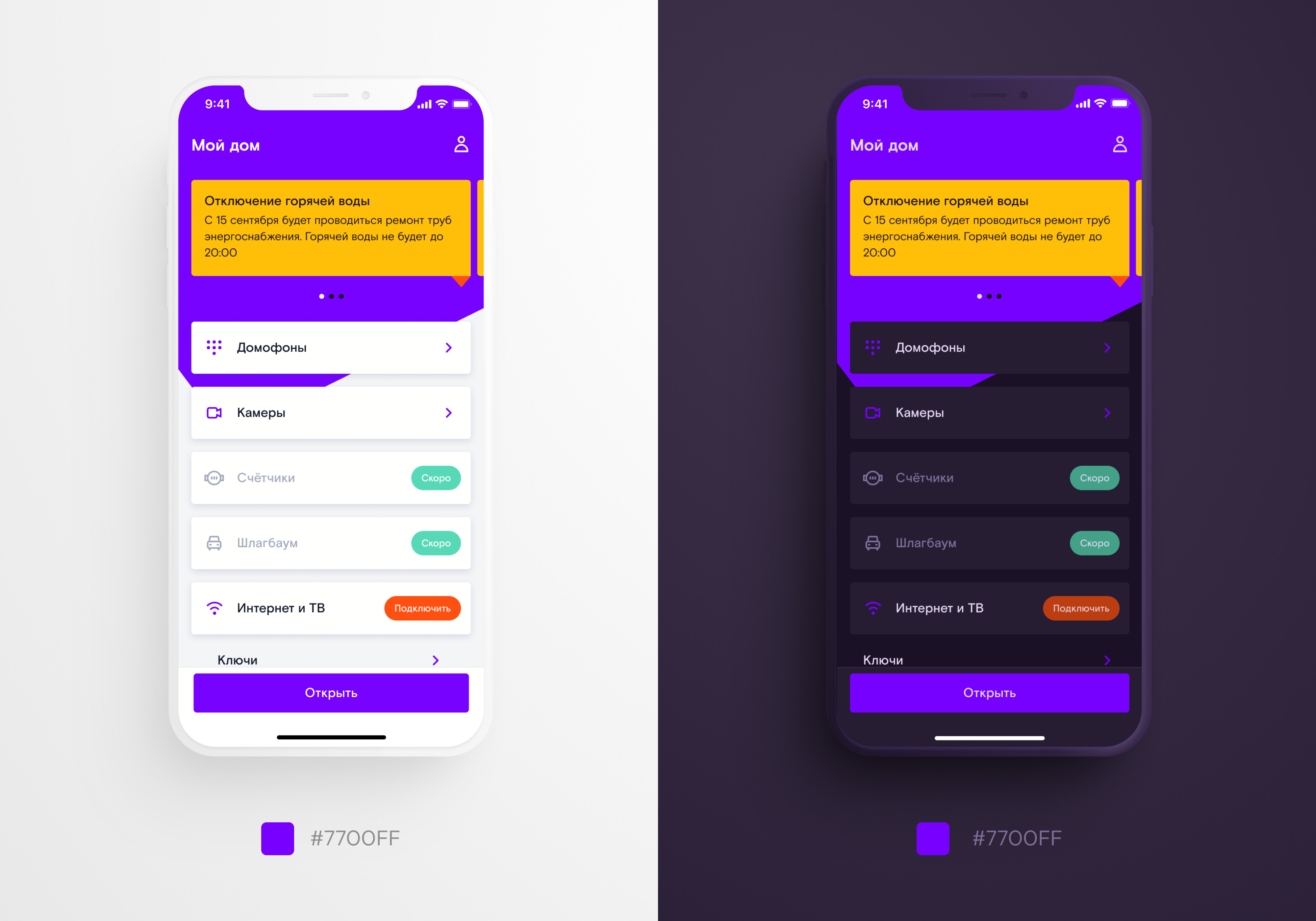
The background color should go well with the color of interactive elements: buttons, icons, etc. In our light palette for interactive elements we used Rostelecom's corporate purple color - # 7700ff. In further work, they started from him.
Neutral dark gray did not look good with branded purple, so we followed the advice of the Material Design guidelines. The guys recommend overlaying the # 121212 neutral background gray with a corporate color with 8% opacity.
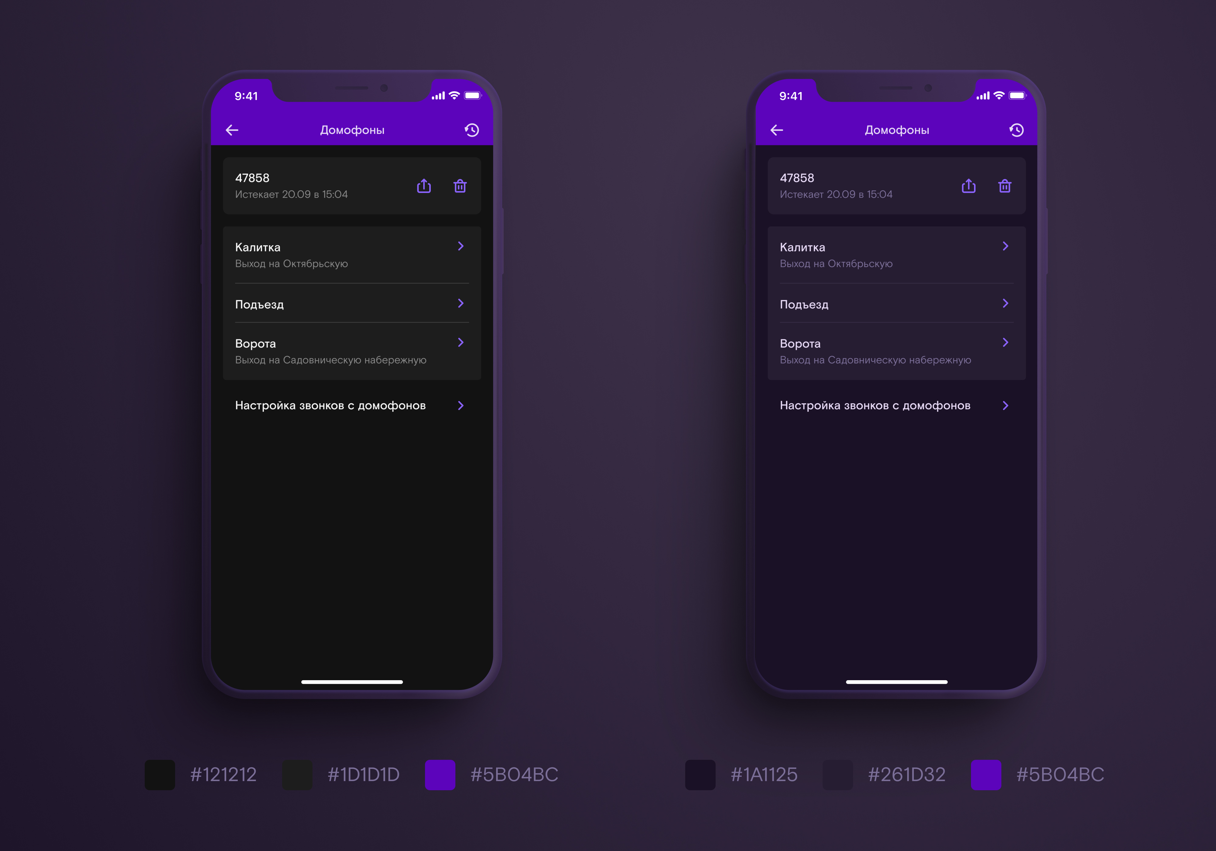
Neutral and branded background colors in a dark theme
In addition to the main background, we also have cards with a slight "rise" above the surface. Material Design recommends creating element elevation in a dark theme by lightening the background: the closer the card is to the user, the lighter.
You can find the right colors by overlaying the background color with a semi-transparent white layer. We did just that.
3.2. Creating a basic palette
Material Design recommends replacing colors with less saturated colors of the same shade when creating a branded dark theme. We used purple as the corporate color for RT Key.
When I tried to lighten it with the Material Design recipe, its hue turned pinkish. The original brand color looked “blue”, so we manually tweaked it.

The hue we got with the white overlay was too pink - we shifted the hue towards blue
In the light theme, we used one purple color for the large buttons, line icons and the navbar. When choosing colors for the dark theme, we couldn't find a purple hue that would look equally good on all these shapes.
The Navbar and large buttons in the lightened purple version were especially distracting from the content, and if we decreased the brightness, the line icons were lost against the dark background.
In the original light theme, rich purple looks equally good on large blocks with white text and thin line icons on a light background. But on a dark background, everything is not so.
I had to replace one original color with three in both dark and light themes: one for the outline icons, the second for the large buttons with a background, the third for the "corner" on the main screen and the navbar for the rest.

Replaced one purple with three - it's much better.
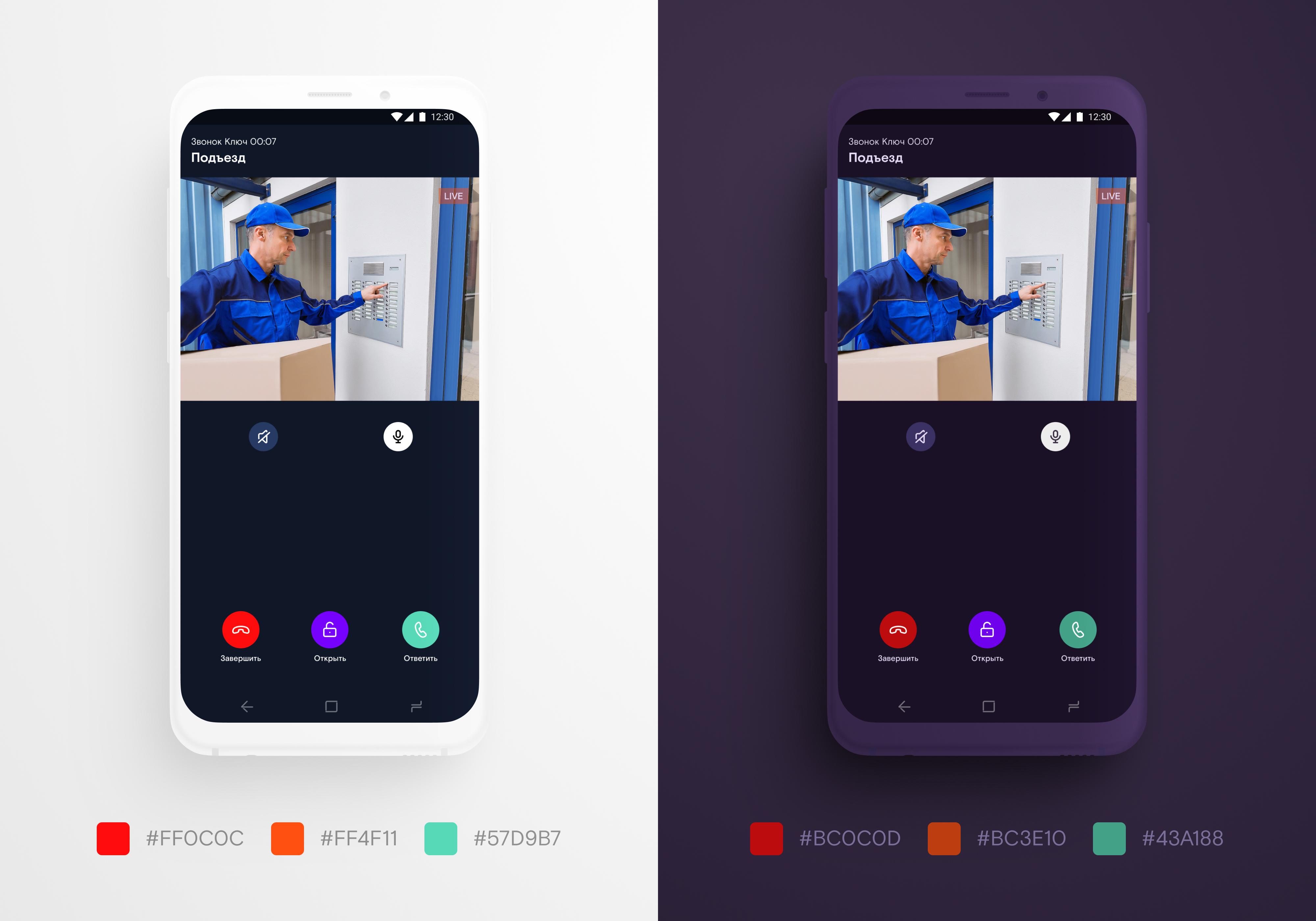
Besides purple, we used orange, yellow, turquoise and red. Orange - for call to action elements, yellow - for notifications, turquoise - for confirmation of the operation, red - for errors.
When we lightened these four colors on the advice of Material Design, the contrast of the app drastically changed compared to the light theme. I had to step back from the guides: we didn't lighten the orange, turquoise and red, but darkened it. The yellow was left unchanged because it was "dirty" when darkened.
3.3. Features of the iOS palette
In iOS, you can set the tint color (aka tint) that will be used to color all interactive elements: buttons, icons, switches, etc. For example, in the "settings" iPhone uses a blue color, and in the application "clock" - Orange.
In the light theme, our tint matches the color of the large buttons, and in the dark theme, we made it a little lighter so that the line icons are clearly visible against a dark background.

Tint color in dark theme
IOS has the ability to change the color of interactive elements when clicked. This is useful because it is immediately clear to the user whether the application has reacted to its action or not.
By default, the color becomes semi-transparent when clicked. We thought that it would look more interesting if, when the button was pressed, they "deepen", that is, darken.
3.4. Features of the Android palette
In Android, when you click on an interactive element, a wave spreads from the point of contact. This effect is called ripple. By default, ripple darkens the original element a little, but we wanted to lighten it, on the contrary.
Ripple in the Android application Android
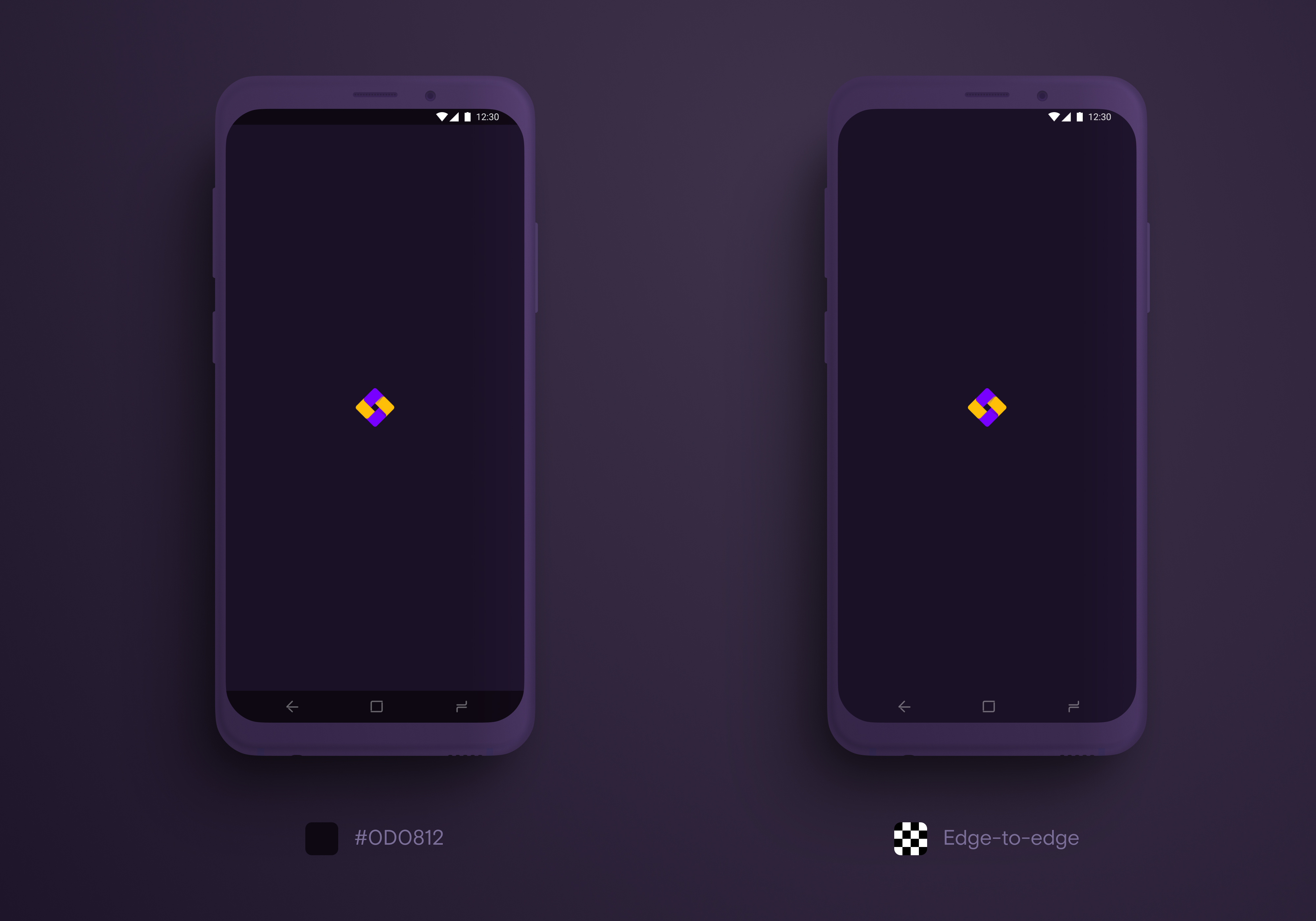
also has features for drawing the status bar and navigation bar. Status bar - a status bar that displays notifications, signal strength, battery power and time. Navigation bar - the panel where the buttons for back, home and recent applications are located.
With the advent of smartphones with large displays reaching to the very edge of the device, "bangs" and "holes" for the camera, Material Design introduced the concept of edge to edge. Its essence is that service elements should not "eat up" the usable area, and useful content should take as much space on the screen as possible.
To do this, Android has improved support for transparent status bar and navigation bar. The point is that these panels are not the same height on all phones. And if before the start of support for edge to edge we assigned them a transparent background, on some devices they were ugly overlaid on the screen content. Material components now have system padding: developers can size the status bar and navigation bar and set the appropriate padding for content. Therefore, earlier in Material Design it was recommended to choose an opaque background for the status bar and navigation bar, and now it's the other way around.
However, it is important to keep in mind that not all supported Android versions can assign the color of icons in system components:
- up to 6.0 icons in the status bar and navigation bar are always white;
- from version 6.0, you can set whether the icons in the status bar will be white or black, but the navigation bar will behave as in previous versions.
- from version 8.1 you can choose the color of the icons both in the status and in the navigation bar.
To avoid strange overlaps on the content in the "Key", we did the following:
- in older Android versions up to 6.0, both panels were set to a black background with 50% transparency - white icons look good on it;
- from 6.0 to 8.1 the navigation bar remains with a semi-transparent black background, and the status bar is completely transparent;
- since version 8.1 - the background of both panels is completely transparent.
If for some reason you are not ready for such edge to edge support, it is better to make the status bar and navigation bar universal. Edge to edge support:
 |
 |
3.5. Check the contrast of the elements
Before approving the color scheme for the dark theme and moving on, check if it has enough contrast. The fact is that people, especially if they have imperfect eyesight, a bad screen, or open the application in the bright sun, will find it difficult to see the elements that are weakly contrasting with the background. Especially if these elements are composed of thin lines like text and line icons.
The best way to check the contrast is through testing: open the interface on a smartphone using Figma Mirror or similar software, go out into the bright sun (the dark theme is intended for use in the dark, but nothing prevents people from using it in the light ).
It will also be useful to ask people with visual impairments to look at the application (myopia, hyperopia, color blindness ). But if this is not possible, the contrast can be checked on the contrast-ratio website or using the plugin in Figma .
3.6. Illustrations and Animations
If your application uses illustrations, you will need to recolor them for the dark theme. Intense colors, which look great on light surfaces, hurt the eyes and make it difficult to see on dark ones. Use less saturated tones.

For a dark theme, you have to make separate versions of illustrations and animations in dark colors
How to submit to development
We worked with Figma + Zeplin. It may seem strange, but our whole company switched to Figma from Sketch at the end of summer 2019, right before we started working on a dark theme. And to save time on adapting developers to the new tool, we continued to work with Zeplin. And then he presented us with several surprises.
It is not possible to create color styles with the same HEX in the Zeplin palette. Therefore, we had to slightly, almost imperceptibly to the eye, change the HEX of the purple color in the light theme.
Daniil Subbotin, iOS developer at Redmadrobotsubdan:
It turned out that none of the designer tools, including Zeplin, support the dark theme and therefore do not allow multiple color palettes in one project. I had to look for workarounds. For example, we created two projects: one with a light palette and the other with a dark one.
1. Features of iOS dev
The next surprise that Zeplin gave us is that you can export only one palette from it to an Xcode project. Either light or dark. When trying to export the colors from the dark palette, Zeplin simply replaced all the light ones with them. We started transferring colors manually by copying HEX values. The same was done with the images.
Daniil Subbotin, iOS developer at Redmadrobotsubdan:
After much agony, I wrote a utility that dumps both color palettes directly into an Xcode project using the Zeplin API. This made life much easier. The designer says that he added a new color or changed an old one, I run the script and all changes are automatically pulled into the project
2. Features of Android dev
On Android, the dark theme is available on all OS versions (we've tested since the fifth). But you can switch it in the system only on the 10th Android, so it is worth adding to the application the ability to switch it manually.
Vladislav Shipugin, android developer at Redmadrobotshipa_o:
: , , (9- ), (10- ). , .
Android has its own color system for material components (buttons, app bar, text boxes, etc.). Material Design guidelines for color.
It's important to match your palette to your material palette with the app's theme description. Here's an article to help your Android developers figure out how to do this . Even then, the problem with the wrong colors may persist. To fix this, you can describe the style of a specific component.
 |
 |
How to maintain and develop
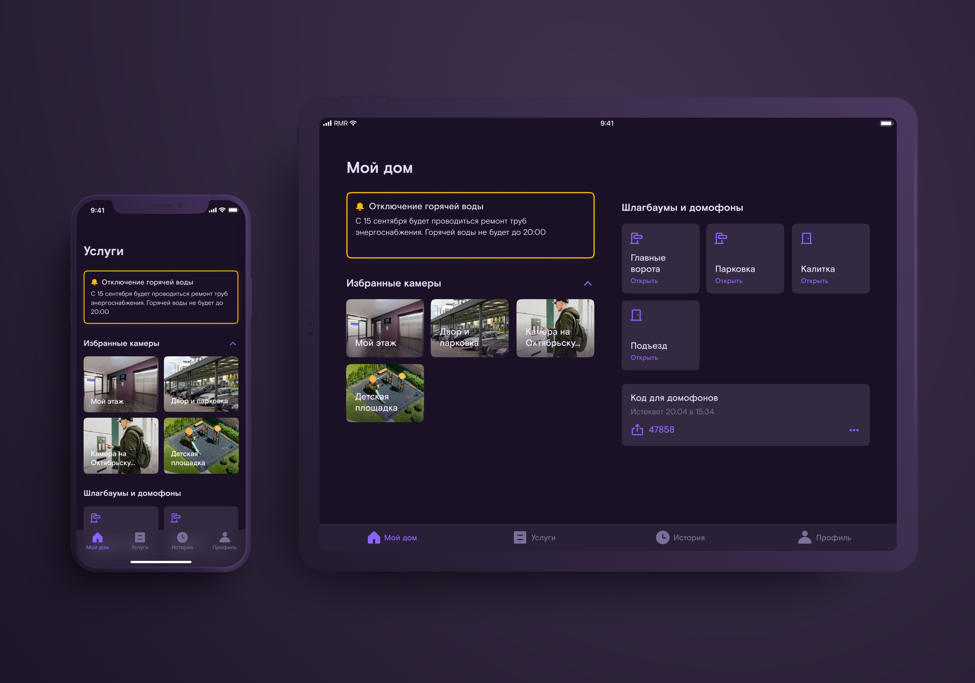
Since we worked on the dark theme, we have added several new functions, tablet users have appeared, and the product office in Rostelecom has thought about releasing the RT Key application as a white label for developers - in their corporate colors.
Olya Sartakova, art director of Redmadrobot:
We realized that the current version of the design, developed for the launch of the MVP, is time to rethink both structurally and visually. We have completely redesigned the structure of the application, taking into account those functions that should appear in the next two years, added a dashboard for quick access to the most popular functions, got rid of bright corporate elements in the design (like a corner on the main screen and a colored nav bar). But competent work on the color system made it possible to almost completely preserve it with a total redesign of the application.
The second version of the app design in the same color palette:
 |
 |
Daniil Subbotin, iOS developer at Redmadrobot subdan:
By the time the second version was launched, we had painlessly moved to Figma, I adapted the utility I had originally written for Zeplin for Figma. Now we update colors, icons and pictures in Xcode and Android Studio in one click
You can download our utility here .
Conclusions: like ours, only better
If your application needs a dark theme, it is best to start with it, right after the visual concept is approved. This will help avoid almost all of the problems we have encountered. How to do it:
- Assemble the UI kit.
- Think over a color naming system or use ours.
- Choose a branded background color.
- Choose a shade for the primary and secondary corporate colors.
- If your app is cross-platform, make a list of the differences between iOS and Android color schemes. Also check if you need to add manual dark theme settings to the Android app.
- Check the contrast of the selected colors.
- Prepare illustrations and animations for the dark theme.
- Update the UI kit.
- Use our utility to transfer items for development.
Useful materials
To dive deeper into the dark theme:
- for acquaintance with the theory of color - Johannes Itten "The Art of Color" ;
- for an introduction to how different colors interact with each other, - Joseph Albers, "The Interaction of Color" ;
- a quick dive, for those who have no time to read theory - Material Design guidelines for creating a dark theme ;
- and similar guidelines for iOS ;
- session with WWDC 2019 about dark theme design for iOS;
- the basics of designing a dark theme for different operating systems in the collection of Yuri Vetrov.
And some useful things for developers:
- WWDC 2019 session on dark theme for iOS;
- creating themes and styles in Android applications;
- Working with material components on Android.