
General information
When you, when talking about a certain element of a web page, find out that we are talking about a wrapper or a container, this means that, in fact, in front of you is a group of elements that is “wrapped” in another element or “placed "Inside this element. If, when customizing a web page, you do not use additional elements, assigning the role of a container to an element
<body>, then you can style this element like this:
body {
    max-width: 1170px;
    margin-left: auto;
    margin-right: auto;
    padding-left: 16px;
    padding-right: 16px;
}
But in today's environment, using an element as a container
<body>may not be practical. The container allows you to prevent children from going out of its boundaries.

The container does not allow the child elements to go beyond its borders
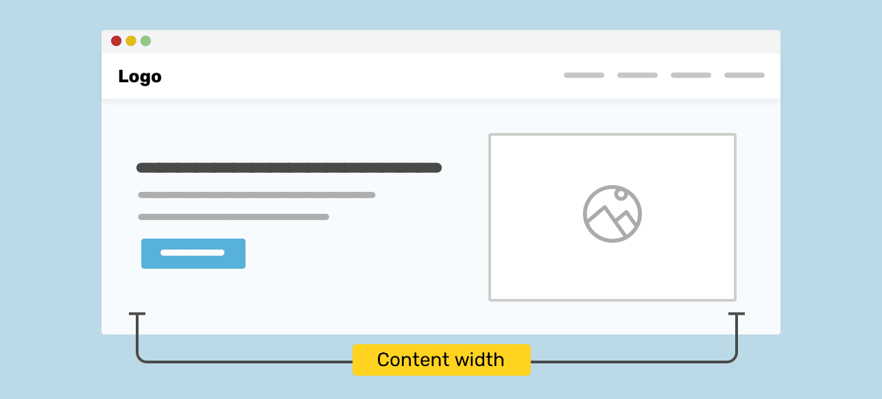
There is a side and main page area. Both of these areas are inside the container element. He is assigned a class
.wrapper. Among other properties of the container, of course, its width is also set. The structure of the HTML code for such a page looks like this:
<div class="wrapper">
    <aside>...</aside>
    <main>...</main>
</div>
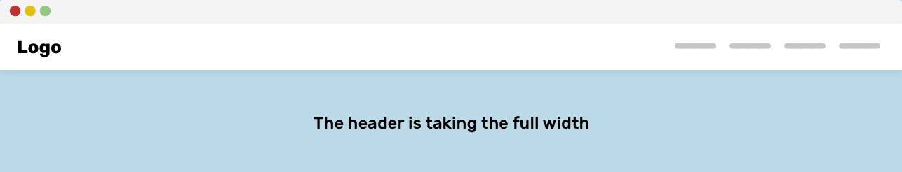
Without using a wrapper element, children will be laid out based on the edges of the screen. This may be inconvenient for users. Especially for those working on large screens.
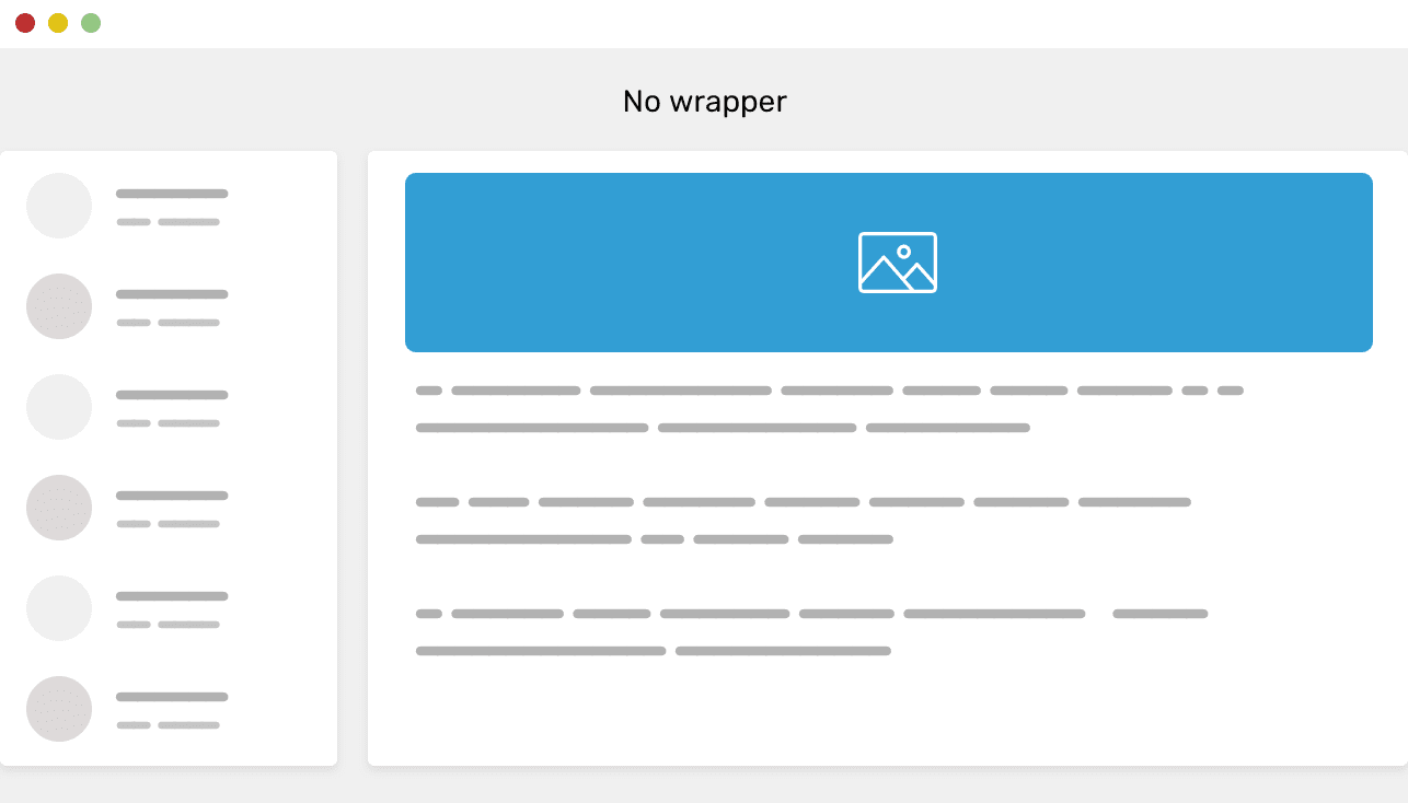
A page without a container element that includes its contents
This page shows how the elements, stretching, occupy the entire screen. This happens when there is no container element in the page layout. I suppose you shouldn't be prompting users to work with such pages. Let me explain this thought.
About the need to use containers for the content of web pages
Using a container for web content has many strengths that designers and developers should be aware of. Some of these strengths are:
- Using a container improves readability of page content. Without a container, content like text can stretch to the full width of the screen. On small screens, this can give an acceptable result. But it looks really bad on big screens.
- Grouping page design elements makes it easy to adjust the distance between them.
- If design elements need to be grouped into columns, this can be difficult without using a container.
Customizing a Container Element Using CSS
Now that we've covered the basics of using containers and the benefits of using them, let's take a look at how to customize them using CSS.
▍Adjust the width of the container
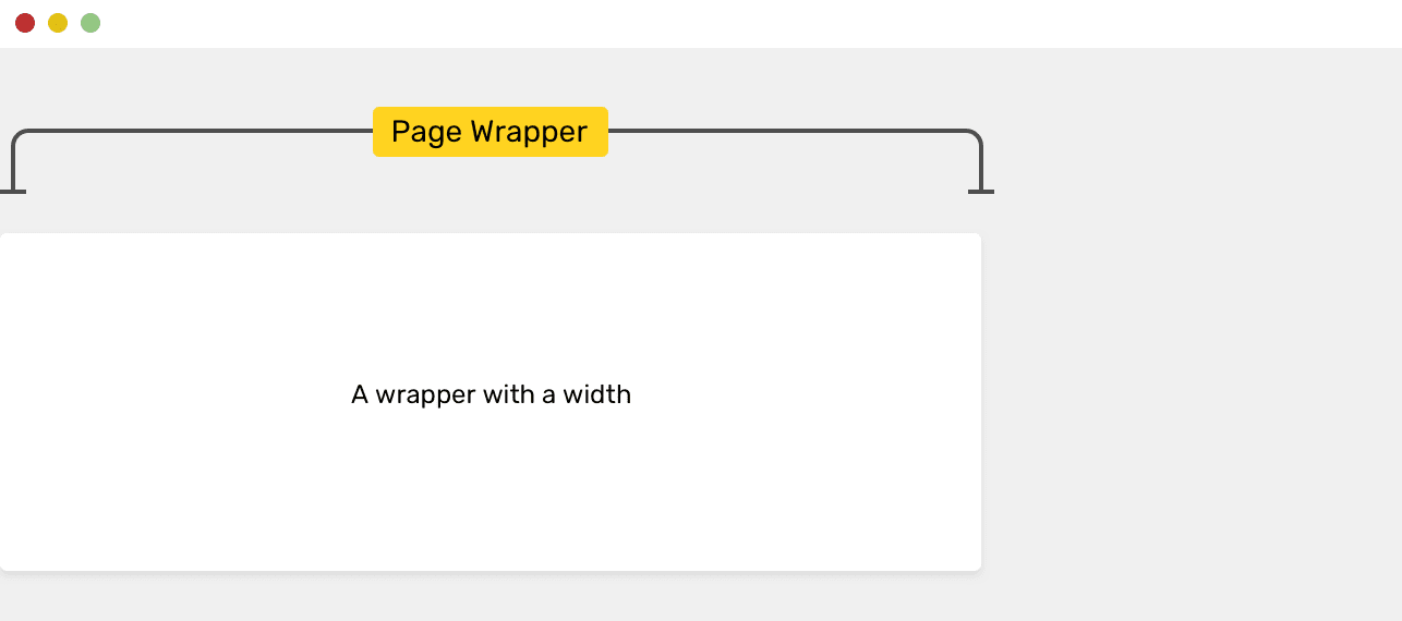
Custom Container Element
When creating a container, the first thing to decide is how wide it will be. The question of the desired width of the container can be answered by analyzing the page design. In general, we can say that containers with a width in the range of
1000px- aremost often used1300px. For example, the popular Bootstrap framework uses equal widths1170px.
.wrapper {
    width: 1170px;
}
This shows how to set the width of an element with the class
.wrapperto 1170px, but in fact it is widthnot recommended to use the property for setting the width of containers. The fact is that this leads to the need for horizontal page scrolling if the width of the area of the browser window available for displaying the page is less 1170px. You can solve this problem by using the property max-width:
.wrapper {
    width: 1170px;
    max-width: 100%;
}
While this is a workable trick, you can get rid of the property entirely
widthand, as in the following example, use only the property max-width:
.wrapper {
    max-width: 1170px;
}
Now that we have found a suitable mechanism for adjusting the width of the container, let's talk about how to align the container to the center of the page.
▍Align the container to the center of the page
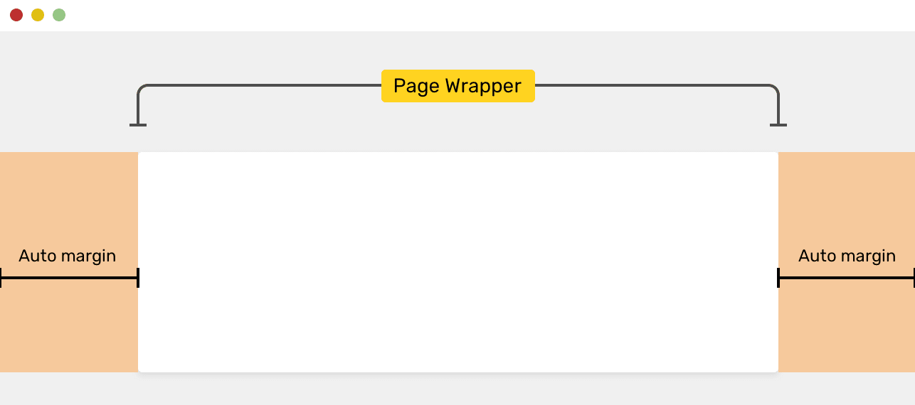
Center
Aligned Container To align a container to the center of the page, when setting its margins, use the value
autofor the left and right margins:
.wrapper {
    max-width: 1170px;
    margin: 0 auto;
}
Here's how the paddings that are assigned a value behave according to the CSS specification
auto:
If margin-left and margin-right are set to auto, then the values that will be used for these paddings will be the same. This allows you to center the element horizontally relative to the edges of the block containing it.
If you are interested in the details of keyword usage
autoin CSS, take a look at this article of mine.
I used the construction here
margin: 0 auto. It resets the size of the upper and lower indents to 0, and adjusts the left and right indents according to the particular use of the keywordauto... This step has some consequences, which I will discuss below. In the meantime, I want to note that it is recommended to use the full version of the shortened construction described above to configure external indents:
.wrapper {
    max-width: 1170px;
    margin-left: auto;
    margin-right: auto;
}
▍Adjust left and right padding
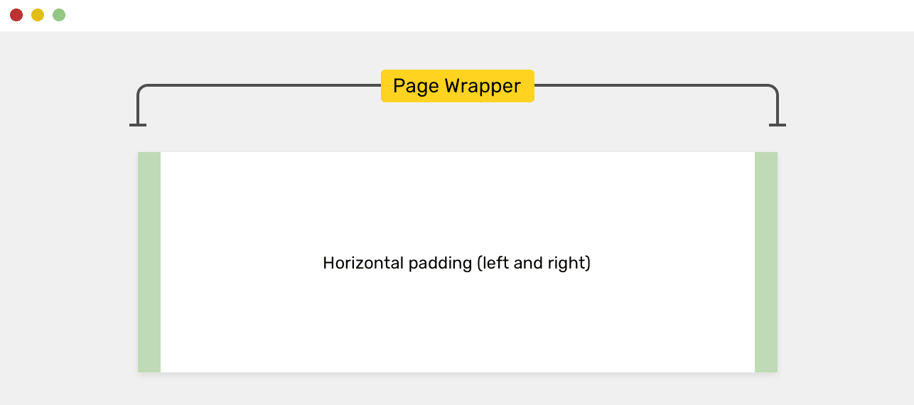
Horizontal (left and right) padding
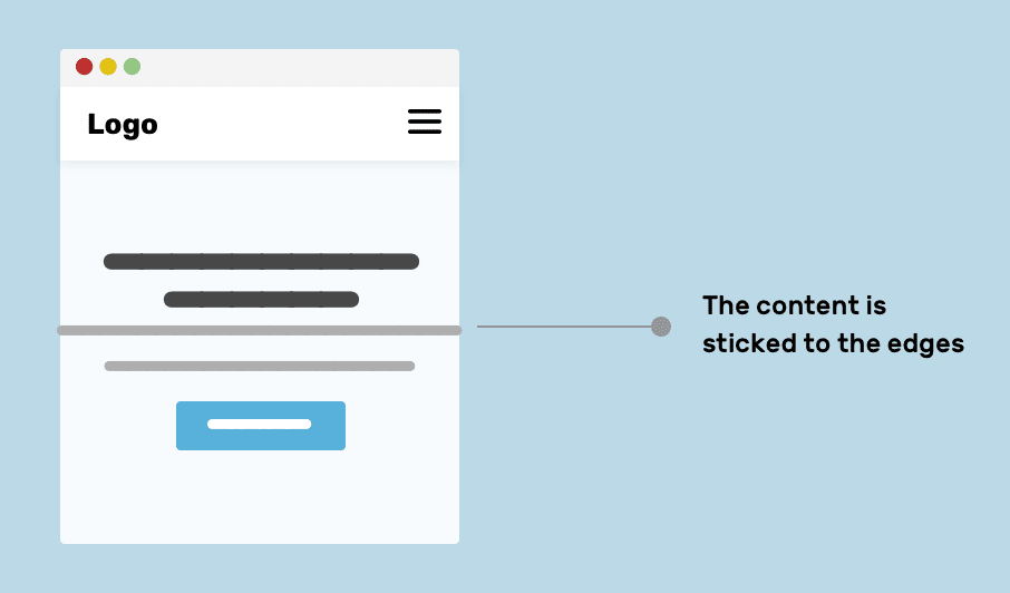
When designing a container, it is important to pay attention to adjusting its left and right padding. When the size of the viewport is less than the maximum width of the container, this will cause the edges of the container to be pressed against the borders of the viewport. Here's an example of styling a container with padding:
.wrapper {
    max-width: 1170px;
    margin-left: auto;
    margin-right: auto;
    padding-left: 16px;
    padding-right: 16px;
}
By adjusting the internal padding of the container, we can be sure that the edges of the container, in any case, will be located at least
16pxfrom the edges of the viewport, even if the width of the viewport is less than the maximum width of the container. Padding is a kind of protective mechanism that prevents the borders of the container from snuggling against the borders of the viewport, even when the viewport is narrower than the container's maximum width.
▍Using percentages when setting up containers
After the publication of the original version of this material, they wrote to me about the use of percentages when setting up containers. In particular, we are talking about using a CSS property
max-width: 90%instead of using the padding-leftand properties padding-right.

Using Percentages When Setting Up Containers and Situations Where Max-Width: 90% Leads to Acceptable and Unacceptable Results
While this approach worked well, it turned out that 90% of the viewport width was too much on large screens. But this problem can be solved using the media query:
.wrapper {
    max-width: 90%;
    margin-left: auto;
    margin-right: auto;
}

/* -    */
@media (min-width: 1170px) {
    .wrapper {
        max-width: 1170px;
    }
}
As a result, it turns out that using a percentage value, we complicate the CSS code. In order to rid ourselves of the need to use a media query, we can use a fixed value for the width. Another solution suggested in this tweet is to use a combination of properties
width: 90%and max-width: 1170px:
.wrapper {
   width: 90%;
   max-width: 1170px;
   margin-left: auto;
   margin-right: auto;
}
This is an interesting approach, but I would prefer to adjust the padding myself rather than relying on percentages.
▍The display property of the container element
Since tags are used to design containers
<div>, containers, by default, are block elements. What if you need to change the container property displayto grid, in order to place its children on the grid?
I do not recommend doing this, as it goes against the idea of separation of concerns. A container element, a "wrapper", is an entity whose purpose is to "wrap" other elements. If you need to place the child elements of the container in the grid, then it’s worth adding another one to the container
<div>that includes other elements whose property is displayset togrid. It will be easier and cleaner than setting up the grid with the main container. This approach, in addition, allows us to say that in the future the project in which it is used will be easier to support.
Let's have a container like this:
<div class="wrapper">
    <!--  -->
</div>
It is
display: gridnot recommended to set the property of such an element because such an element can be used on different pages. Its special settings can accidentally lead to incorrect placement of elements. Here's the bad setup option for the container in question:
.wrapper {
    display: grid;
    grid-template-columns: 2fr 1fr;
    grid-gap: 16px;
}
It would be better to use the following HTML code:
<div class="wrapper">
    <div class="featured-news">
        <!-- ,       -->
    </div>
</div>
An element with a class
featured-newscan be styled like this:
.featured-news {
    display: grid;
    grid-template-columns: 2fr 1fr;
    grid-gap: 16px;
}
Note that in this example we have used a separate element
<div>as yet another wrapper for the page content. You can ignore the names of the classes used here. To solve this problem, you can choose more successful class names that are suitable for repeated use on various pages of the site. However, naming CSS entities is outside the scope of this article.
▍Adjust the margins separating container elements
Remember how I didn't recommend using the shorthand way of setting margins to center a container element above? It was about such a design:
.wrapper {
    margin: 0 auto;
}
Although this is a completely working style, if there are several wrapper elements on the page, and there should be some distance between them, using this style can lead to confusion. If, for some reason, you decide to clarify the stylization of the wrapper element by using an additional class, then setting the outer indentation using this class will not give the desired results due to the peculiarities of calculating the specificity values of CSS rules.
I mean the following stylization scheme:
.wrapper-variation {
    margin-top: 50px;
}
The property
marginfor an element with a class .wrapper-variationwill not be applied to the element because it is overridden by a property margin: 0 auto. A short form of setting a property redefines its full form. To avoid this, it is recommended in such cases to use the full form of recording properties. That is, when styling an element with a class, .wrapperyou need to do the following:
.wrapper {
    max-width: 1170px;
    margin-left: auto;
    margin-right: auto;
    padding-left: 16px;
    padding-right: 16px;
}
Now let's talk about setting the padding of elements. As I work on each of my projects, I prepare a set of helper classes for setting up padding and padding. I use them wherever I need them. Take a look at the following figure.

Standalone container and container within an element
<section>
Here is the HTML:
<div class="wrapper mb-5"></div>
<section>
    <div class="wrapper"></div>
</section>
<div class="wrapper"></div>
Here's the style:
.mb-5 {
    margin-bottom: 3rem !important;
}
With this approach, the CSS code for the wrapper element remains unchanged, and the distances between the elements are adjusted using auxiliary CSS classes. Here you may have a question about why I needed to use several containers on the page, when you can do one. Please note that in the above HTML code there is an element
<section>located between two wrapper elements.
This is where the use of the modifier works well
!important. The point is that the point of using helper classes is to force property values to change. You can achieve this behavior with !important.
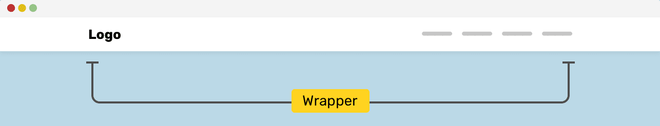
A container inside a full-screen item
In some cases, it happens that there is an element
<section>with a background that occupies 100% of the width of the viewport, and inside this element there is a container element. This circuit is similar to the one we looked at in the previous section.
The HTML structure of the page in such a situation may look like this:
<section>
    <div class="wrapper"></div>
</section>
<section>
    <div class="wrapper"></div>
</section>
The item
<section>occupies 100% of the width of the viewport. You can assign a background image or background color to this element. The container inside this element prevents the content from taking up the entire width of the viewport.
The element
<section>spans the entire width of the viewport, the container limits the space in which the page content is displayed.
In this illustration, the element has a
<section>background image. It spans the entire width of the viewport, and the page content displayed in the container is limited to the width of the container.
Do I need to enclose the contents of the top block of the page in a container?
Do you need a container to design the top block of the page, which is often called the "Hero Section"? It depends on each specific situation. Let's explore two of the most common approaches to page header styling.
The first approach involves centering the contents of the block and limiting the width of the content.

The width of the content of the top block of the page is limited The
second option provides for the distribution of content within the top block.
Content is distributed within the top block of the page.
In order to better understand these patterns, I suggest exploring the features of their internal structure.
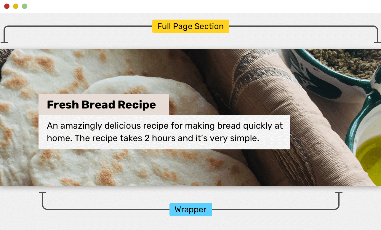
The top block of the page, the content of which is centered
As you design the top block of a page, you might want to place
<section>some content in the corresponding element and align it to the center without using a container element.
<section class="hero">
    <h2><font color="#3AC1EF">How to make bread at home</font></h2>
    <p>....</p>
    <p><a href="/sign-up">Sign up</a></p>
</section>
When styling the above HTML code, you can center its contents in the center using the property
text-align:
.hero { text-align: center; }
With this approach, everything will look decent until the width of the browser window changes. Here's a breakdown of the problems this can cause.
▍ Problem number 1: the contents of the section is pressed to the edges of the viewing area
Since the right and left indents are not configured in this example, the contents of the section will be placed close to the borders of this section. This creates inconvenience for users, since it will be more difficult for them to read the contents of the top block of the page.
Section content is pressed against its edges
▍Problem # 2: too long text lines on large screens
On large screens, tagged text
<p>can be very difficult to read due to the paragraph length being too long. According to this document, the recommended number of characters per line is 45-75. Line lengths outside this range complicate reading.

The line length is too long
▍Solving problems
To solve the above problems, you can use a container. It will allow both to keep the line length within reasonable limits and prevent the content from snuggling to the section boundaries.
<section class="hero">
    <div class="hero__wrapper">
            <h2><font color="#3AC1EF">How to make bread at home</font></h2>
            <p>...</p>
            <p><a href="/sign-up">Sign up</a></p>
    </div>
</section>
Here, when setting up the container, I use the class name
hero__wrapper, since this container, quite possibly, will be unique and will only be used to design the top block of the page. Therefore, in particular, the width of the container can be smaller than the width of containers used in normal conditions.
.hero__wrapper {
    max-width: 720px;
    margin-left: auto;
    margin-right: auto;
    padding-left: 16px;
    padding-right: 16px;
}
You can center the contents of the top block of the page using any convenient approach. It all depends on each specific situation. In this example, to align the content, just use the property
text-align: center.
How to align the container: in the center, or on the left edge of the page?
I can’t give an unambiguous answer to this question, but I saw sites whose containers used on them are aligned in the center on laptop screens and on the left edge of the page on desktop screens.
An example of such a site is Techcrunch. Notice that on a desktop computer screen, site content is aligned to the left of the page.

Aligning content on a laptop screen and on a desktop computer
I like to work with sites that have their content aligned to the center. The pages of such sites have symmetric left and right indents. But the fact that the content of some sites is aligned to the left of the page, there may be some reason that I am not aware of. If you know why this is the case, let me know.
Using CSS variables to create different container styling options
It rarely happens that all container elements used in a project have the same width. The width of the container can vary depending on the contents of the container and how it is used. Great flexibility in working with containers is provided by the use of CSS variables. This, in addition, is a very modern approach to configuring containers. Let's look at an example.
Here is the container HTML:
<div class="wrapper"></div>
Here's the style:
.wrapper {
    max-width: var(--wrapper-width, 1170px);
    margin-left: auto;
    margin-right: auto;
    padding-left: 16px;
    padding-right: 16px;
}
If you read the CSS carefully, you might have noticed that
var()two values are being passed: the first is a variable --wrapper-width, the second is a normal value 1170px. The second value is reserved. The meaning of its existence is that it will be used in the event that the value of the variable --wrapper-widthis not set.
What does it mean? And this means that we have in our hands a tool for creating various variants of wrapper elements due to the possibility of redefining the value of a variable
--wrapper-width. It looks like this:
<div class="wrapper" style="--wrapper-width: 720px"></div>
Thanks to this approach, I was able to create a special container without resorting to the following actions:
- Adding a new class to the element.
- Copying and duplicating existing styles.
Such an element will be easier to maintain in the future. And besides, it makes it easier to customize with browser developer tools.
If you don’t like this approach because it uses the built-in style to override the value of the CSS variable, you can quite solve this problem by adding a new class to the element. For example - as shown below.
Here is the HTML markup:
<div class="wrapper wrapper--small"></div>
This is how the style looks like:
.wrapper--small {
    --wrapper-width: 720px;
    /*       . */
}
A working example can be found here .
Using display: contents
First, let me tell you a little about the
contentsproperty value display. Every element in CSS is a block. This block contains something, it has padding and padding and a border. Using a property display: contentscauses the block to which it is assigned to be removed from the document flow. Think of this as removing the opening and closing tags of a block.
Here's the markup:
<header class="site-header">
    <div class="wrapper site-header__wrapper">
            <!--     -->
    </div>
</header>
Here's the style:
.site-header__wrapper {
    display: flex;
    flex-wrap: wrap;
    justify-content: space-between;
}
Wrapper Element
When implementing something like this example, you might want to make the header section of the site stretch to the full width of the page so that its width is not constrained by the properties of the container.
.site-header__wrapper {
    display: contents;
}

.site-header {
    display: flex;
    flex-wrap: wrap;
    justify-content: space-between;
}
Here, due to the use of the property
display: contents, the wrapper element will be “hidden”. Now, when a property display: flexis applied to an element with a class .site-header, the children of the container become children .site-header.
The header part of the site takes up all the available space wide
Responsive background and fixed content
The CSS Secrets book presents an interesting technique that can be used to style sections that have a responsive background (a background that can take up the full width of the viewport) and a container element for content. Consider the usual way to create layouts for such sections.
Here is the HTML markup:
<section>
    <div class="wrapper"></div>
</section>
Here are the styles:
section {
    background-color: #ccc;
}

.wrapper {
    max-width: 1170px;
    margin-left: auto;
    margin-right: auto;
    padding-left: 16px;
    padding-right: 16px;
}
Here, the values of
margin-left: autoand margin-right: autoare calculated by taking half the width of the viewport and subtracting the width of the content from it. The same can be achieved using padding.

Indentation
section {
  padding: 1rem calc(50% - 585px);
}
But the deal has not yet been done. On mobile devices, the content will be pushed to the edges of the viewing area. You can solve this problem, for example, like this:
section {
  padding: 1rem;
}

@media (min-width: 1170px) {
    section {
      padding: 1rem calc(50% - 585px);
    }
}
As an alternative solution, we can suggest the use of a new CSS function
max(). Using it, we set the minimum size of the internal padding equal 1rem, and as the second value passed to it, we specify the expression 50% — 585px.
section {
  padding: 1rem max(1rem, (50% - 585px));
}
If you are interested in details about CSS functions
min(), max()and clamp()- here is my material on this topic.
How do you style container elements?
