In the RSHB Ecosystem, we create innovative products for agriculture.
For their development, we decided to use the approach of world companies in the field of UX / UI.
In order not to repeat the mistakes of competitors and create a complete ecosystem.
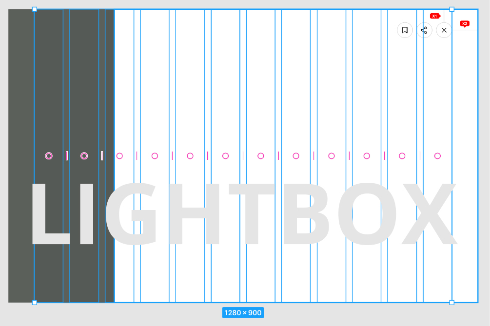
The basis of all ecosystem products is LightBox, which is an end-to-end functional design solution. For example, in a project for farmers, we solve urgent problems and questions of a farmer in one window and, in addition to a marketplace of goods, we provide a large number of services
and services.
The complexity of the project lies in combining different scenarios and roles in one portal.
What is LightBox and why exactly “LightBox” and not “LightWindow”, what is its difference from Pop-up, how is it able to change the product. All this I will try to tell below.
1 - From a design point of view, LightBox is an image popup.
2 - Pop-up or modal window, is a pop-up window with a minimal set of functionality that does not have a separate URL. Its main task is to inform the user, ask and clarify, warn, open viewing and media content.
3 - Modal windows usually occupy less than 30% of the screen. LightBox is already a full-fledged page with full functionality and a separate URL and a coverage area of 70% to 90%.
4- Why do we consider this solution key and important for the UX and UI of most products?
It's simple. All interfaces and solution design have several goals and a single development path. Everything changes and has a cyclical nature, and so - if you delve into the history of the first interface solutions, then they were all based on LightWindows, these were functional pop-up windows. Now the whole design strives for maximum convenience, time optimization and minimalism of one window.
The ideal product interface is one window.
Why now more and more products are using consciously or not LightBox, and why they haven’t done this before. Users were not ready for radical changes, technologies did not reach the appropriate level.
Why we started using LightBox, I will tell you in one example below.
The user is on the portal, looking for the necessary product or service, through the search, receives a search page, adds filters and additional criteria. He finds the desired product, clicks on the card, makes a purchase, closes through the browser or "bread crumbs", goes to the list page, losing the context, filters and search that he did earlier.
This is about 7-10 minutes, and in complex products more than 25 minutes.
A person loses time, loses context and starts his journey anew.
LightBox helps to solve the problem of loss of context, filters, search and search results. This is a page with a unique URL (you can always track the transition to it and share the link), opens on top of the SERP page and allows you to return to the same screen where the user left. When testing this technology on users at the prototype and prototype stages, 100 out of 100 users positively evaluated this solution.
Also, with a large number of similar products or services, LightBox allows the user to turn the page without closing it.
Benefits of LightBox:
- Unique URL
- Full page with preservation of functionality
- Preservation of context
- Intuitiveness
- Freedom of implementation and design
- 70% -90% of the workspace with the ability to display the interface in full.
- The ability to build block and integrate the embedded scroll.

Ecosystem for farmers (Own | Farming)
How LightBox works in real projects and what are its advantages.
First, the time of work and transitions is reduced from an average of 10 minutes to 1 minute.
Second, the total time and speed of interaction until the final action is halved.
Farmers and users positively evaluated this solution and we strive to work in one window.
My name is Kirill Tagintsev, I head the UH / UX ecosystem of the RSHB, we develop projects and apply LightBox in our projects. The article presents only a part of them.
One of the latest products to use this solution ranked # 1 by markswebb and the LightBox was decisive in terms of user experience.

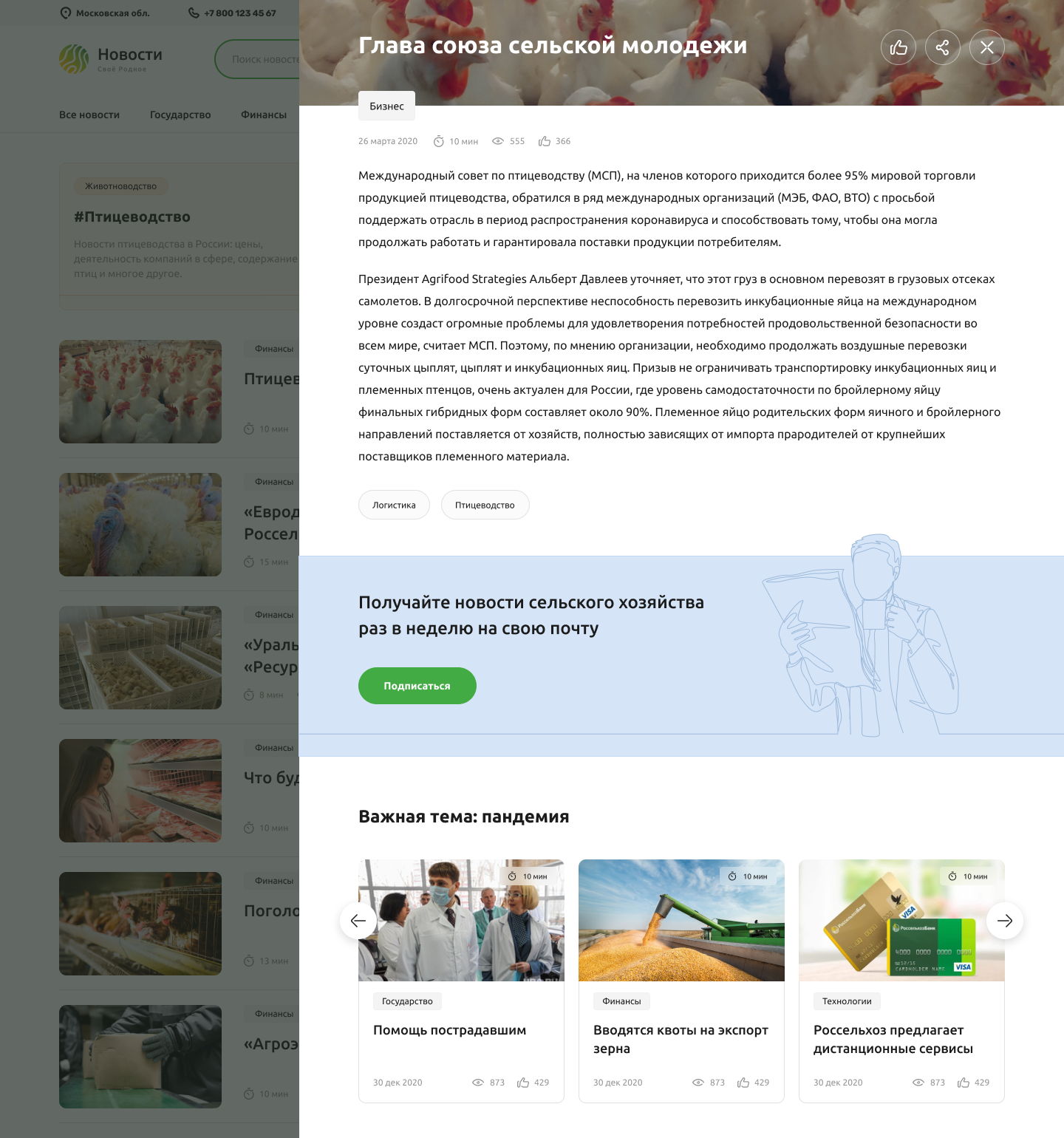
A news portal with social blogs for farmers (News and Blogs)

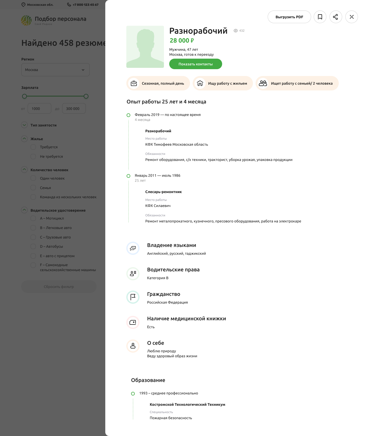
Portal for finding employees and work in the agricultural direction (Recruiting)
Which companies use LightBox:
- Yandex
- Mail.group
- dribbble.com
- Bechance.net
- Sberbank