Illustration: Julia Prokopova.
I am a programmer. I am not engaged in digital painting, photo processing, video editing. I really don't care about wide gamut or even correct color rendition. I spend most of my days in a text browser, text editor and text terminal, looking at barely moving letters.
Therefore, I optimize the settings to show really, really good letters. This requires a good monitor. Not just necessary, but MANDATORY. And by "good" I mean as good as possible. These are my thoughts based on my own experience of which monitors are better for programming.
Low Density Displays
According to my survey of programmers , 43% still use monitors with less than 150 ppi:
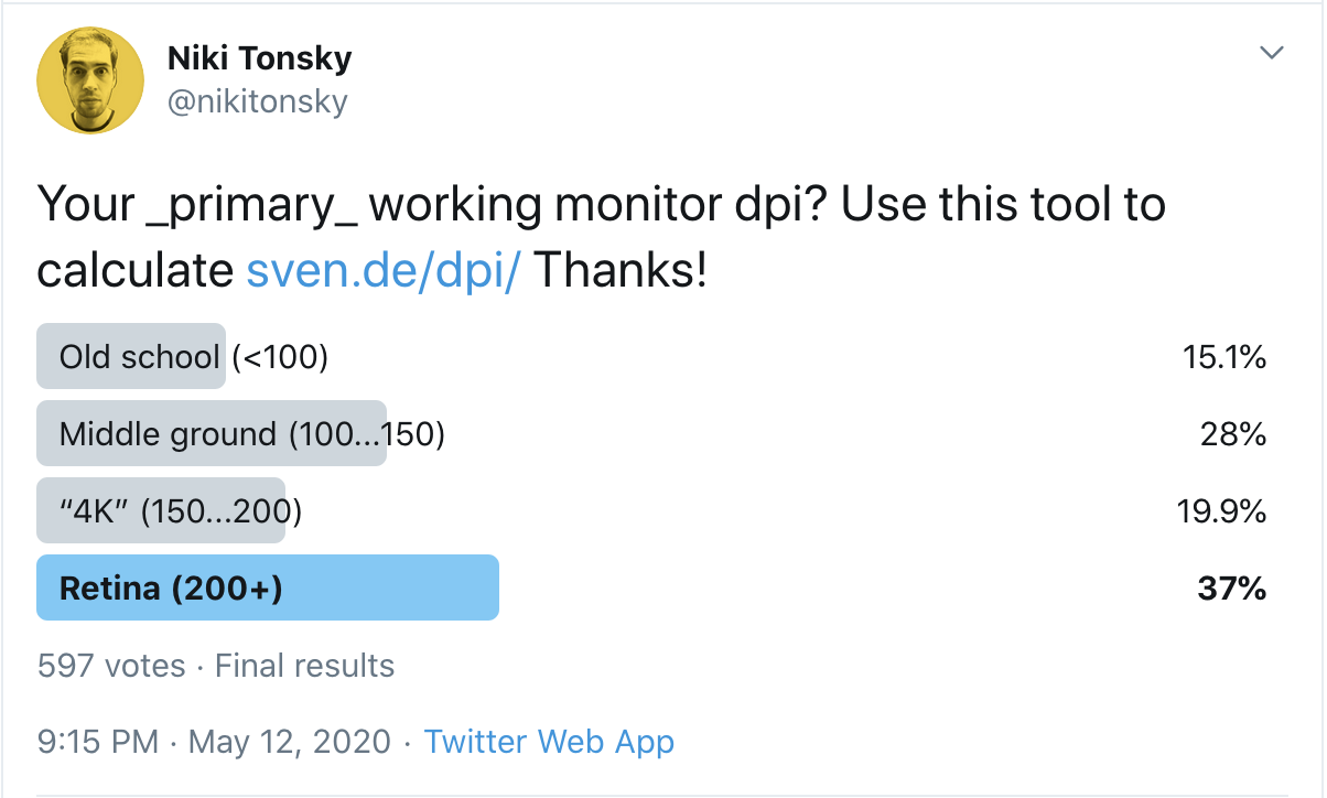
What is the dpi of your _main_ monitor? Use this tool to calculate.
Why is this a problem? Because the only way to get good letters is to spend more pixels per letter. So simple. In the past, the number of pixels on the displays was small, so we learned how to live with it and even invented some very smart tricks to make our life better. Two important things to understand:
- The days of low-resolution displays are over. High-resolution displays are now in use.
- The tricks designed for low-resolution displays couldn't magically make the text look good. It has always been and remains impossible. They just made the text a little less awful, but it's still awful.
If you think you can somehow make your 1080p display good text, that it just needs a few more settings, no. It won't happen. The sooner you accept this, the sooner you can start looking for real solutions.
To make my claim more valid, let's take a closer look at what text actually looks like on a low-res display and what you can do about it (spoiler alert: not that much!).
Not enough pixels
First, there are simply not enough pixels to draw characters. Take the Consolas font, designed specifically for programmers. Microsoft has worked very hard to configure it to render on low-res displays. We set it to 14px, which is the default in VS Code (and people often

scale it down!): Consolas at 14px, macOS
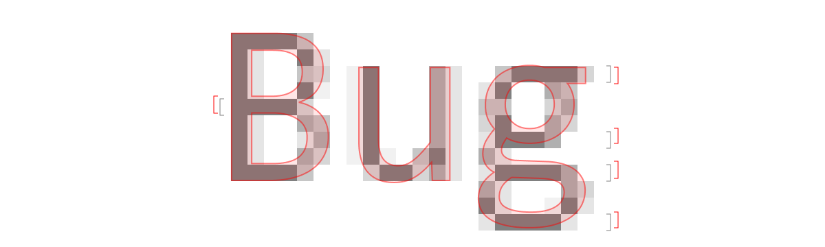
At this size, the capital B is only 6x9 pixels on screen. Lowercase letters have only 7 (seven!) Vertical pixels. It's not much. I have more fingers on my hands than pixels here. No matter how well-designed a font is, it's hard to show anything when all you have is seven pixels. Anything a little more complicated than “T” or “H” becomes illegible pixel mess.
Look at the letter 'g' in the picture above. It's hard to tell where the strokes begin or end, or even how many there are. It's just a random gray noise or checkerboard, but not a letter. Here is the letter:

Consolas at 168px It is
indeed very disappointing to see these beautiful little details compressed to just 7x10 pixels.
Horrible hinting
To combat the grayish mess, Windows uses a rather aggressive hinting. In fact, it simply bends and moves the letters to the nearest pixel, providing sharper boundaries.
And it works! Fonts really look better with hinting than without it:

No hinting (macOS) → there is hinting (Windows)
But do not rely on it: nothing will come of it anyway. It will not make the text look good . It will look better , but still bad.
However, the main problem with hinting is that it destroys the outline of the letters. Pixels are rendered not where they should be, but rather where the pixel grid passes. For example:

Verdana (k) and Times New Roman Italic (z) before rasterizing at 13px. Source
The idea is that it will look better when rendered in real pixels.
But even if we just look at the vertical hinting of horizontal lines, it still changes the font too much:
See how the horizontal lines are offset from their actual position in the vector font file? The error here is as much as ¼ pixels!
But hey! If you've never seen Consolas in high definition, who cares if 'g' has the same shape or not? Who cares if the lines are in the wrong place if you don't know where they were originally supposed to be? Well, sometimes the problems are more obvious: circles are not circles, equal distances become unequal, the proportions are all wrong, what should be small becomes huge and vice versa, and so on. Here:

After moving the horizontal lines in accordance with the pixel grid (by shifting them down to ½ a pixel!), Windows has a hard time splitting the other 7 pixels into three equal spaces. Unfortunately, the alternative is no better:

From my personal experience with developing Fira CodeI've seen too many ways that a simple idea of “just glue the edges to the nearest pixel” can go wrong:
This is a game that simply cannot be won.
Pixel crushing
Can you draw a perfect line that's thinner than one pixel?
Yes. The idea is really simple. Your display pixel is made up of three vertical sub-pixels, each of which is responsible for a different color. We can illuminate them individually, effectively tripling the horizontal resolution!

However, in practice, you cannot literally implement it, because you just get a Christmas garland:

So you have to compromise again (inside another compromise!), Setting a limit on how far color can deviate from black:

This means that the shapes the letters are not three times clearer, they are probably one and a half times clearer, but in general they are still quite blurry.

Ultimately, readability improves, but at the same time, black and white text takes on a light turquoise-orange halo. This is not very bad, but you may notice it.
What I'm trying to say is that all of these tricks work. Having them is clearly better than not having them. For low DPI displays, all of this is essential. But at the same time, they represent a tough compromise reached at a time when we did not have the best displays. Now that we have them, the time for these tricks is over.

Consolas 14px with ClearType and hinting → Consolas 14px @ 2x
MacBooks with Retina
Retina MacBooks can make text look good. However, there are two things that you absolutely must do.
Disable font smoothing
First, turn off Font Antialiasing in System Preferences -> General Settings:
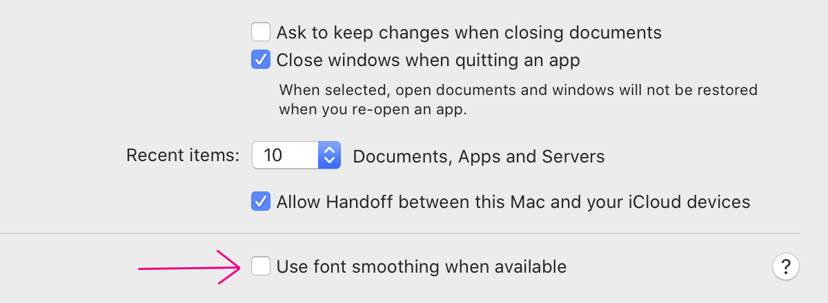
I'm not sure what the default is today, but make sure it's turned off anyway.
UPD: judging by the reviews, it looks like the default value is on. Be sure to turn it off!
This name of the setting is misleading. Previously, it was called LCD font smoothing, which implied sub-pixel smoothing. But Apple removed subpixel anti-aliasing from macOS in 2018, the same month it released its last non-Retina laptop.
Another thing is that the title suggests that your fonts may not be anti-aliased at all. This is also not the case.
It actually just makes the font a little bolder:
So why turn it off? Because there is no automated way to make the font bolder. Typically, each font weight is carefully designed by a professional font designer. It is a complex process that includes millions of restrictions. If you try to simulate it, for example by adding an outline to a letter, it looks awful:

Real bold and fake one that mimics with an outline
But that's exactly what "font smoothing" does in macOS! Here's another example. MacOS blurs pixel boundaries with "font anti-aliasing":
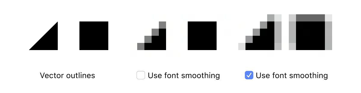
Imagine a font designer carefully balancing every letter, positioning every dot to 1 / 100th of a pixel, only to be ignored by dumb software that thinks it knows better.
What does this mean for us programmers? If you use a hand-optimized font for a specific pixel size (which many software fonts are, such as 11px Input or 12px Monoid ), it will appear blurry despite your best efforts.

And all other fonts, including system fonts, will be slightly more blurry than necessary.
UPD: Chris Morgan mentioned in a comment that this setting might explain why so many designers use
font-weight: 300 default web pages as their font . They overcompensate for macOS font bumping!
Integer scaling
When I bought my first (and world's first) Retina Macbook Pro in 2012, it was exactly what it advertised: 2x scaling, each logical pixel rendered on a 2x2 screen. A 2880x1800 screen is rendered from a 1440x900 logical source.
Unfortunately, Apple has since left the mind, and at some point the MacBook began to get weird, non-integer default scaling. For example, a 2880x1800 screen would have a logical resolution of 1680x1050. This is a scaling factor of 1.7142857143 ..., or 12/7.
Why? I think someone at Apple decided that more screen area sold better. The problem is that this is not that much growth: only 15%. I mean 15% is good, but not essential. The worst thing is that this comes at the cost of losing any chance of rendering any pixel-sharp image at all!
Let's watch. A scaling factor of 12/7 means that for every 7 logical pixels, there are 12 corresponding screen pixels. This means that every 7 pixels you have a chance to draw a 7 pixels high rectangle, and this is your only chance to line up with the pixel grid.
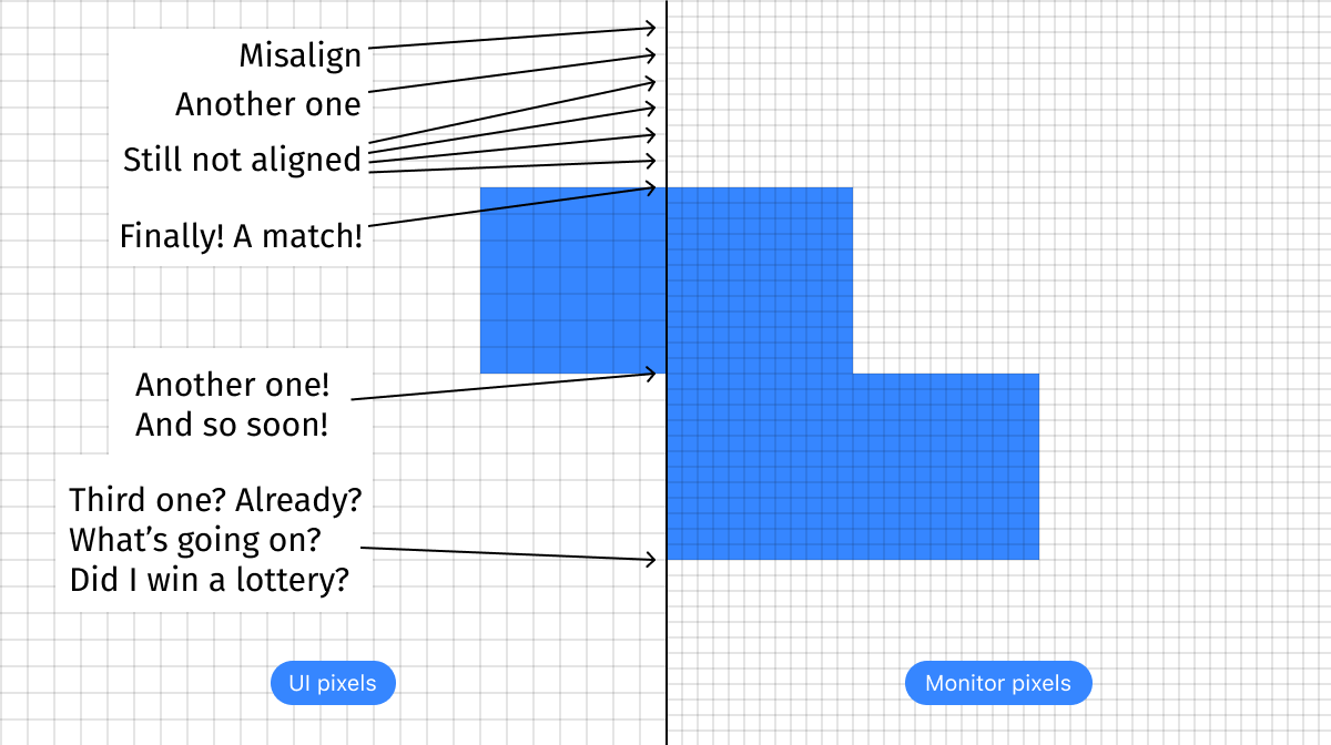
Move 1 pixel up or down and you lose. Make it 1px higher or shorter - you lose.
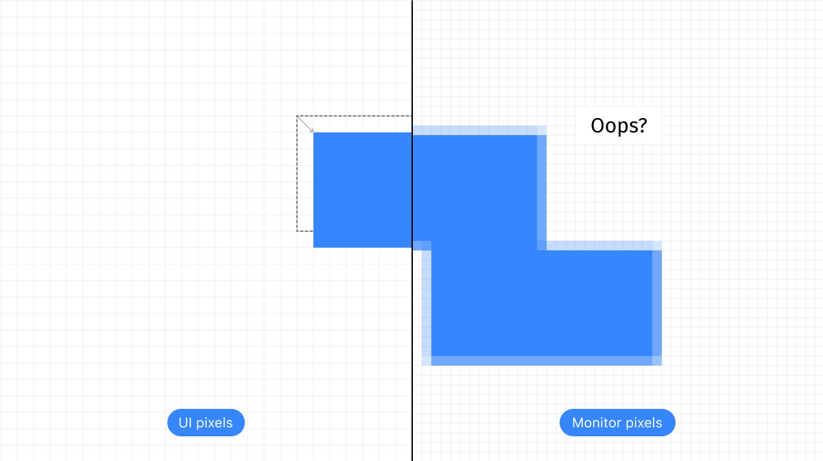
Pixel-perfect line? Sorry, but you cannot specify 7/12 pixels as the line width. Even worse, that each line 1px looks different depending on its vertical position:

not surprising that modern icons mainly consist of grooves the width of one pixel:
Top: scale 2 ×, bottom: same after 12/7 downsampling
Difficult imagine someone who specifically wants to see this.
(have no idea why the bottom right pixel is missing on all icons)
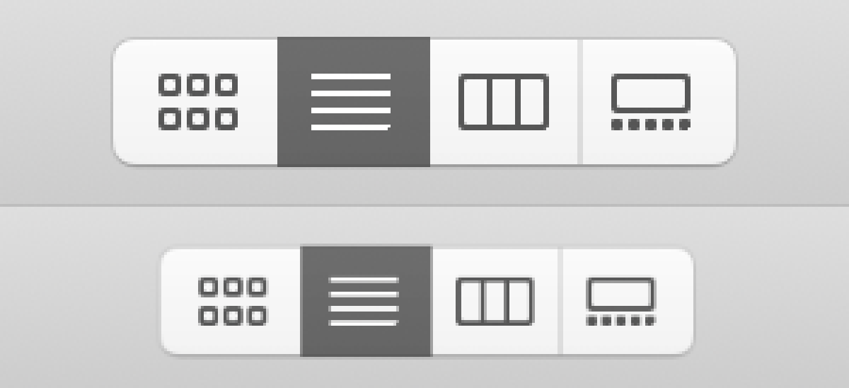
What happens to the text? Nothing good. First, it is visualized clearly pixel by pixel with a resolution of 2 ×, then it is scaled to 85.7142857143 ...% to fit into physical pixels:

Monoid by 12px. Top: 2 × scale, bottom: same after 12/7 downscaling.
Correctly, the user interface does not even appear in this strange target resolution. Each Mac application thinks it renders at 2 ×, and only after that does the OS scale it to the target resolution. Much precision and nuance is lost due to this two-step resizing process.
In my opinion, nothing can do more damage to the look and feel of the UI than this. Even older low DPI dpi UIs are better, as their lines at least match the pixels!
And don't forget: this is the default. Every Macbook comes with these settings. Millions of people work without knowing that they have been robbed of the joy of the retina screen.
Luckily for us, this is easy to fix (at least for now). Go to System Preferences → Displays, uncheck the default box and choose 2 × resolution instead:
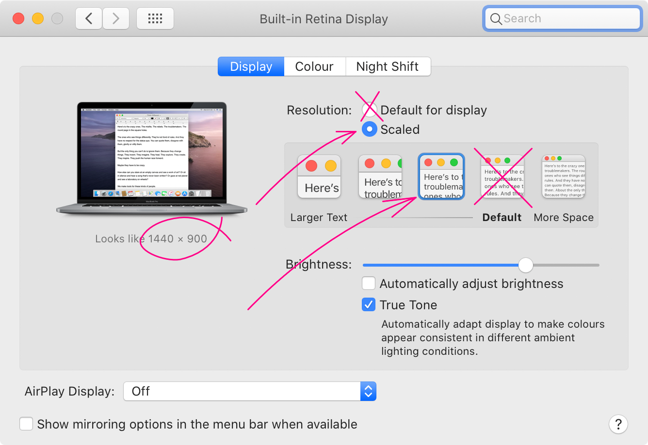
This will make everything on the screen a little bigger, leaving (a little!) Less screen real estate on the screen. This is expected. My opinion is that a laptop is a limited environment by definition. An additional 15% will not turn it magically into a huge convenient desktop. But at least you can enjoy this gorgeous screen and crisp pixelated fonts. Otherwise, why would you buy a retina screen at all?
ClearType on Windows
Given all this talk about ClearType's flaws and the fact that it is simply needed on low pixel density displays, should it be turned off on the 4k display? Theoretically, yes. In practice, no.
First, Windows doesn't even have a user interface to disable it. I mean, there is this checkbox:

But even if you turn it off, you still have to go through the ClearType setting. There simply is no OK \ _ (ツ) _ / button.
If you turn it off this way, it will disappear in some places, but will appear in others. I assume that these places use different APIs, and one takes this setting into account, and the other does not.

And most importantly, text without ClearType looks like shit. It doesn't have to be that way (it looks perfect on macOS, for example), but especially on Windows it's unbearable. I think they don’t even check this option:
Just for fun, I reprinted all the text labels using the same font, size and color, but on macOS:

But the ClearType text on Windows still looks good, even on the 4k display. The only pity is that we cannot turn off ClearType yet.
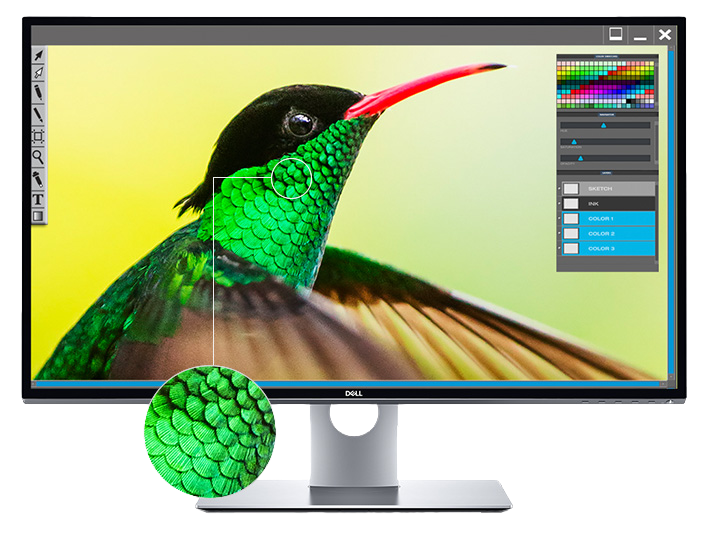
Take a good monitor
Let me give you my opinion. After all, this is my blog. I think that laptops are not very good for development. They're great for portability and convenience, and that argument might outweigh everything else for some people. I accept it. But still a desktop monitor + external keyboard is always better than a laptop. There may be other reasons not to buy a monitor, but with one, I hope no one will argue that this is an excellent development environment.
After that, the question arises, which monitor do you need? From what we've already discussed, two things should be clear:
- It should be at least a 4k monitor. Both 5k and 6k are great too, of course ( except for the LG 5k ).
- You need to use an integer scaling factor.
This means that if you have a 4k monitor (3840 × 2160) and you use 2 × scaling, you will get the equivalent of 1920 × 1080 logical pixels. So this is a basic 1080p monitor in terms of how much you can fit, but with a much sharper user interface and text everywhere.
Now it might be tempting to use, for example, the 1.5x scaling. This will give you the equivalent of 2560 × 1440 logical pixels, which you might think is much better. This is a misuse! The idea behind a 4k monitor is not to get more pixels, but to get pixel-perfect rendering with a high UI density. Otherwise, a regular 1440p display will work better. A simple rule to remember: pixel alignment outweighs everything else. A 1440p display displays 1440p content better than a 2160p display.
It is also possible to run a 4k display with a native resolution of 3840x2160 pixels. Of course it depends on the size of the display, but in my experience even 27 '' 4k displays are too small to work at 1x. The user interface will be too tiny.
Apple's PPI Myth
Some articles suggest that Apple computers should only be used with 220 PPI (pixels per inch) displays, because this is the number Apple itself uses on all MacBooks and iMacs. Sometimes people go so far as to say that displays with other PPIs are unusable on macOS.
That's what I think. PPI defines the physical size of a pixel (220 PPI means there are 220 pixels per inch, or 1 pixel is 1/220 inches wide). In this way, Apple ensures that the pixels on all its devices are the same size. Does this mean that macOS controls have the same physical size? Not anymore after Apple started using default integer scaling on the MacBook.
Then it is almost impossible to guarantee that the perceived size or how large the user sees the control is the same, because the distance to the display is different. For example, the average distance between my eyes and the screen is 33 cm with a laptop, but 68 cm with a monitor. This is a twofold difference!
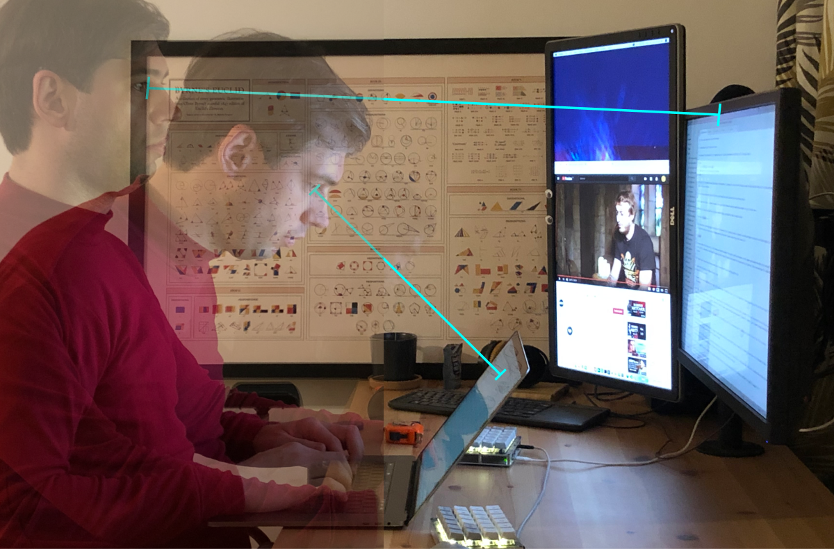
This means that an angular pixel size of 1/220 Macbook is equivalent to a monitor pixel of 1/110. I actually have fewer perceived pixels on a 27 "4k monitor than I do on a 15" Macbook Pro!
Even Apple itself understands this! Their iPhones have a higher PPI than MacBooks, because they are usually viewed from a closer distance.
To summarize, I see no problem with 24-inch 4k displays or even 27-inch displays. I use both with macOS and love both, never had any problems. Sure, 5k or 6k would be better, but they go into the “nice to have” category. 4K is a must-have, absolute minimum for anyone who works with text.
Go to 120 Hz
The world used to be divided into two camps: high-resolution displays and high-frame-rate displays. The first was good for text, the second was good for games, and there was no middle ground between them. If you love playing action games, buy both (and a large table). Gamers didn't need 4K displays as no sane game would run at 4k @ 120Hz, and creative pros didn't use 120Hz for photo / text editing. Of course, I have been in a high-resolution camp since 2014 and would never trade the rendering of retina text for a subtle change in the refresh rate.

HP Z27 (4k) and LG 34GL750-B (120Hz)
Well, the split no longer exists. Since recently (yes, I'm too lazy to check) you can get both! You can find a 4k monitor operating at a frequency of 120 Hz. Actually, this discovery served as the main motivation for this article.
Why 120 Hz?
If you, like me, work with text, you might think you don't need 120Hz. And they would be right. This is categorized as “nice to have,” but if you're looking for ways to improve your experience, this is a great way.
120Hz gives you several significant improvements:
- The animation becomes smoother, up to the point where it starts to seem like a continuous motion instead of a very fast slideshow.
- In particular, very smooth scrolling. Browser, code editing, among other things.
- The whole system feels much more responsive.
- You can play games and work on one display.
Of course, I cannot show you what 120Hz is. But here's what you can do to get the idea: switch to 30Hz and try it for a while.
You will notice that everything is poorly animated and less responsive. This is because the time between monitor updates is now 32ms instead of 16ms at 60Hz. This means that no matter what you do (press a button, move the mouse), the closest point in time when the computer can start displaying the result could be 32ms away.
32 ms is very long and very noticeable. At 60 Hz, this time is halved: the longest thing you need to wait for is only 16 ms. at 120 Hz, this time is halved again: from 16 ms to 8 ms. in absolute numbers, you eliminate the extra 8ms, which means that a 60Hz → 120Hz transition is about half as efficient as a 30Hz → 60Hz transition. But still worth it, in my opinion.
What to buy?
In fact, we have no particular choice. From what I can find, there are only four (yes, four!) 4k 120+ Hz displays on the market right now! I think this is because the demand is not so high, but I'm glad that we have at least such a choice!
First - Asus ROG SWIFT PG27UQ :

Second - Acer Predator X27 :

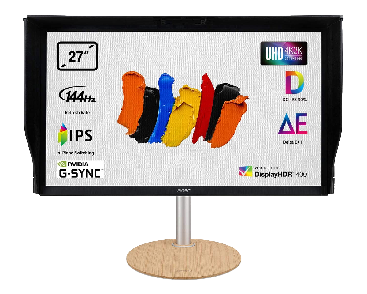
Third - Acer ConceptD CP7 :
They are all very good monitors, I'm sure. But the price is a little overpriced (~ $ 2,000), especially for those for whom 120 Hz is not a matter of life and death.
There are several more monitors with a diagonal of 55 inches or more, which would be difficult to use on a normal desktop.
Finally, by some incredible luck, we do have one inexpensive, reasonably sized 4k 120Hz monitor. This is the Acer Nitro XV273K :

And this is the only one I have.
Things to Watch Out For (Windows)
On Windows, it’s easy to run 4k resolution at 120 Hz. Make sure your video card has DisplayPort 1.4, use it, that's all. Seriously, it just works.

Things to watch out for (macOS)
MacOS support sucks. Officially, none of Apple computers supports anything above 60 Hz, even at normal resolution:

So the purchase of this display was based on pure faith. Here's what I figured out:
- 4k @ 120Hz requires 3840 x 2160 x 3 bpp x 120 Hz x 8 = 24 Gbps. Just below 25.92 Gbps DisplayPort 1.3 / 1.4.
- HDMI 2.0 only provides 18.0 Gb / s, so you need to use DisplayPort.
- Thunderbolt 3 supports DisplayPort 1.4, so if you find an adapter it should be fine.
How do I determine which port my Macbook has? Easy! Use this diagram provided by Apple:
So, the lightning bolt means Thunderbolt (not to be confused with the Lighting port!), And the railway arrow means USB-C. Now just look at your Macbook:

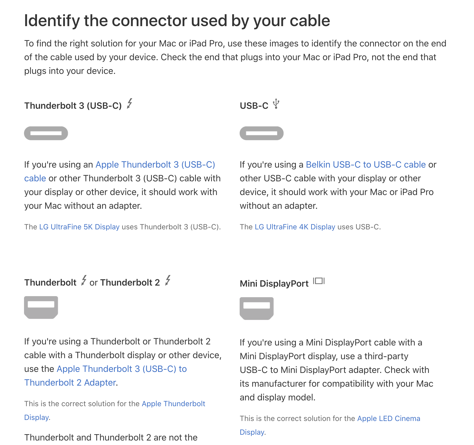
I think it's not easy to figure it out \ _ (ツ) _ /. Alternatively, look at Apple's intuitively titled SP794 page :


So first of all, what does Thunderbolt 3 (USB-C) mean? Is it Thunderbolt 3 or USB-C? This could be the difference between "works flawlessly" and "doesn't work at all":
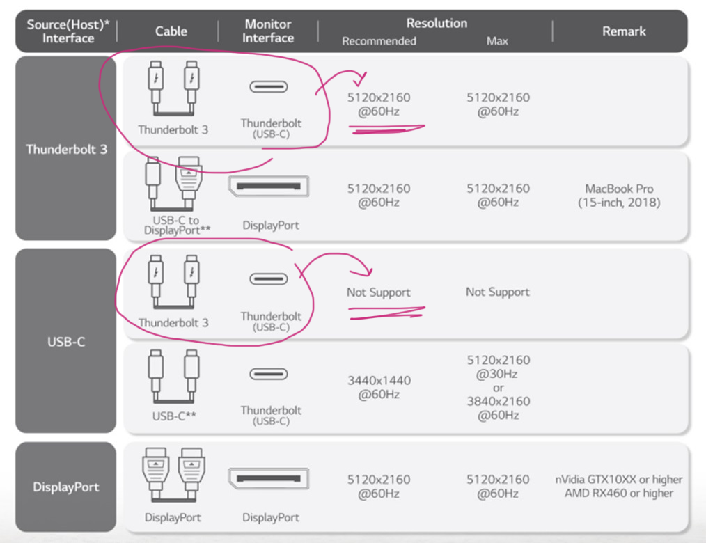
Then “DisplayPort over USB-C” is mentioned (but we have Thunderbolt 3, not USB-C!). The page does not specify the DisplayPort version, and without it, it is useless. She also says that USB 3.1 Gen 2 is limited to 10 Gbps, but I think USB 3 does not apply to USB-C? Also, what's that name - USB 3.1 Gen 2? Already accepted USB 3.2?
Well, Wikipedia to the rescue !
2016 Apple Macbook Pro Thunderbolt 3, . 2017 Apple iMac Thunderbolt 3, iMac Pro 2017 .
8 2018 Intel ( Titan Ridge) « » DisplayPort 1.4. USB sink ( USB-C).
It turns out Thunderbolt 3 may or may not have DisplayPort 1.4. Some of them reach only DP 1.2. The Wikipedia article assumes that everything released before 2018 will definitely not work, but after 2018 it may or may not work, depending on the version of Thunderbolt. Do you feel lost? Use my scheme:

I think we can all agree that this whole Thunderbolt / USB-C situation is a very strong contender for "the most intricate port standard ever created by mankind."
In short, I was lucky. My Macbook Pro 2019 had the correct port, and it worked with the Thunderbolt 3 (USB-C) adapter for DisplayPort. As I understand it, the port versions on the devices do matter, but the cables and adapters do not, as long as they are physically placed in the hole. In my case, it was a Xiaomi USB-C → miniDP converter and a miniDP → DP cable.

Will this work for you? I have no idea! I hope it will be. All I know is that you have to make sure your Thunderbolt 3 can carry DisplayPort 1.4. This is a magical combination.
Things to Watch (macOS) - continued
If it hasn't been confusing enough so far, there's more!
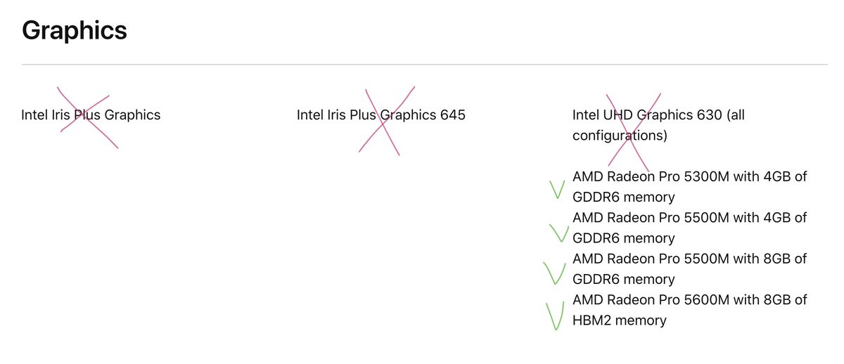
I think your Macbook should have a discrete graphics card (There may be other reasons, for example, the Thunderbolt revision. I have a limited test base, but: Macbook Pro 15 ”2019 works, Macbook Air 2018 - no, Mac mini 2018 only works with eGPU ). Various Intel UHD / Iris graphics cards do not work. eGPU is working.
But even if you have a compatible Mac, with compatible ports, compatible cables, this is not enough. Every time I boot my Mac, there is a ritual that I have to perform to get my display to switch to 120 Hz mode. I call it the “120 Hz dance”:
- Download macOS completely. At this point, the display is usually at 60 Hz.
- Go to System Preferences → Displays.
- Alt/Option ( ⌥), Scaled «».

- , « ». — .
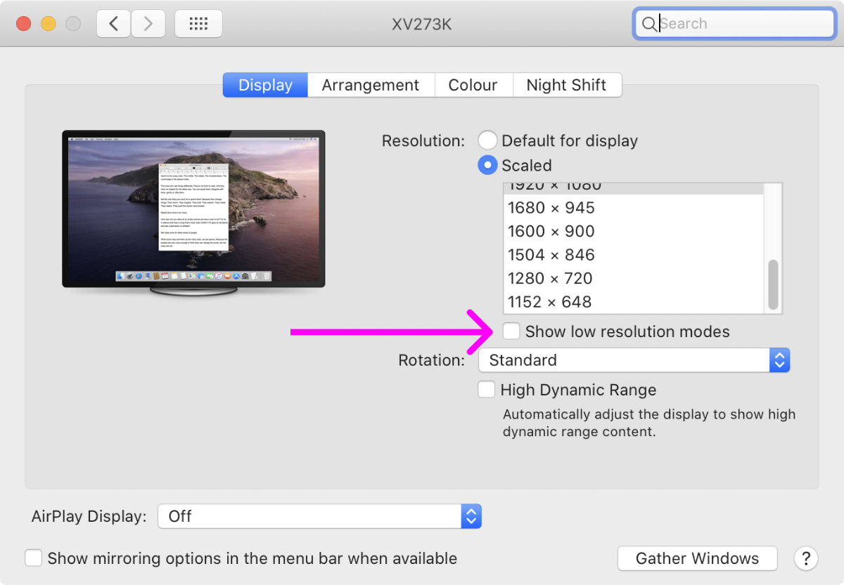
- « ». 60 .

- .
- .
- .
- « ». , «119,88 ».
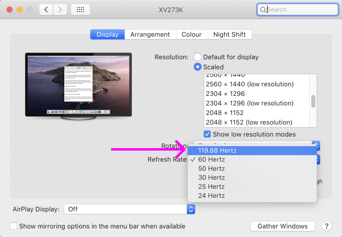
- «119,88 » « ».
- .
Why is it 119.88 hertz and not 120 Hz? No idea. It seems to work the same way. Why can't macOS remember it? I dont know. Why doesn't macOS see 120Hz as an option until I turn off / turn on my monitor? Who knows! The main takeaway is that the 120Hz option may not always appear, but after some dancing around it it may appear, and if it does, it really works no matter what.
This whole situation reminds me of buying a 4k display in 2014: there are only a couple of models, the ports are confusing, Apple support sucks. I hope in five years 120 Hz will become the standard. Until then, we should be grateful that, with great inconvenience, we can at least use modern displays with macOS. Thanks, Apple!
What's next?
Every person needs a dream. At some point 4k @ 120Hz will become commonplace and we may even see 5k @ 120Hz and more. We can also see retina screens with a ratio of 21: 9 and even 32: 9 (more horizontal space), which is always a welcome addition (in fact, there is an impressive 34WK95U-W , but you can also find it as a shorter version of a more traditional 27MD5KL-B ).
But even today you can look into the future if you have an extra 4,000 dollars. This is the Dell UP3218K , the world's first and only 8k monitor:
Even on the promo page for the 8k display, Dell only posts 1 × photos of it
Its pixel density is so high (280 PPI) that it is probably best used at 300% scaling (which, of course, is not in macOS, but is in Windows). It also requires two simultaneous DisplayPort cables to work, which again is not suitable for a Mac.
But even at 300%, it will still give you an effective logical resolution of 2560 × 1440, which is significantly higher than the 1920 × 1080 modern 4k displays. More pixel density and more resolution! Well, you can dream.
Conclusion
To summarize, here is the best setup for programmers:
- Text may not look good on low-resolution displays.
- High PPI displays are no longer exotic, it's time to switch.
- Laptops are fine, but a standalone monitor is always better.
- A 4k monitor only makes sense at 2x / 200% scaling.
- If you want to take it a step further, there are now 4k @ 120Hz options available.
Good coding!