TLDR: Tilda is a cancer that is gradually engulfing healthy Runet (and on a much smaller scale the rest of the Internet). Tilda takes work from developers and designers and gives it to people who are doing much worse. She contributed to the emergence of a whole layer of “specialists” who can do nothing but visual layout, but position themselves and sell themselves as cool designers / developers. It generates heavier pages than WordPress!
Tilda is an absolute visual editor. In it, you can use the mouse to sketch out a static page of arbitrary length and complexity, add a little dynamic functionality available out of the box, and publish it all in a couple of clicks. It's very simple. Too easy.
This evil
I got my sight when I came to a big project on Tilda. By that time, I had managed to launch several sites of varying complexity on it and was generally pleased with the platform, with the ease it provided. There was almost no need for dynamics in the project, but there was a ton of static that I had to organize and comb into a single style. The site was previously occupied by a person who was as far from design and layout as possible, and on the first day I immediately understood everything - about the person, and about Tilda, and about the horror that happens when these two meet. The site had a subdomain on which all sales went at all, that is, all the money on the site was spinning on this subdomain. Do you know how much his homepage weighed? Seventy-Eight Megabytes. It loaded ETERNITY. You could buy something on the site only through it.
What weighed so much there? Pictures. The whole page consisted of dozens of full-screen blocks, each of which had 3-5 pictures and gifs, including very heavy ones. Some pictures occupied an area of the order of 300 * 200 pixels, but were uploaded at a resolution of 3000 * 2000. Some GIFs were 5-10 megabytes in size. It was a real Sodom, and the saddest thing is that I was not allowed to completely rewrite it, only compress the pictures and throw out some of the useless, ugly gifs.
Then I realized that big problems come with great force. It is easy to choose Tilda when you do not need a complex expensive site, it is easy to edit texts and pictures on it, change the design. But sooner or later you will not have enough time or it will simply become too lazy to do everything according to your mind, typeset correctly, monitor margins, adaptability, compress images before uploading (because Tilda compresses high-quality photos, this compression has almost no effect on the file size ) And then your cute, neat site will be overwhelmed by a wave of slops, and it will be unpleasant to enter it.
And why?
Because before WYSIWYG, such sites were riveted mainly by freelancers (web studios were more expensive). They, too, were not cool specialists and often wrote poorly, but support generally worked differently. The content was filled by one person, and the design was ruled by another, everyone was busy with their own business and everyone lived happily. And now, in an effort to save money, the owner is simultaneously trying to get into the functionality of a cheap account (because a full-fledged business for a year is like developing and maintaining a normal site by normal people) and hang all the tasks for one person, usually a manager. As a result, the owner either ultimately saves on his own sales, or spends more money initially, the manager hates everyone and has seen the site with the owner in his grave, and the freelancer is out of work and hates Tilda.
Honestly, I generally poorly imagine the audience of WYSIWYG site editors. Before Tilda, most of them worked somehow and did something sane only on the same shareware Wix, which has all the same drawbacks. So who needs visual editors? Small business that can't get enough money for a good project? Any authors of personal pages? It does not matter who comes for what purpose, the result is always the same: the site, one way or another, is occupied by one person, and the appearance of the site directly depends on its design skills, usually meager. But the functional in general does not depend on it and, in fact, is determined by the left heel of the editor. For small statics such as a portfolio or a car service page with contacts and form, this is not scary, but it’s worth it to grow a little ... and you end up in hell.
Tilda is not WordPress
Tilda is often compared to Wordpress. It initially looks more advantageous, with its customization of any elements, background colors and the ability to edit text anywhere on the page in one click. But in terms of dynamic functionality, WP is much, much better. It is all permeated with a huge number of plugins for a variety of ideas, and you can always add a new one. For example, WP e-commerce stores mostly run on WooCommerce, which has tons of themes, plugins, customizations. In Tilda, it is almost impossible to build a full-fledged online store, despite the declared functionality. There is a basket, there are product cards, you can sell something simple (courses, for example). Otherwise, Tilda stupidly breaks down: there is no basket customization, no hooks at all, there is not even a complete database working out of the box! As a consequence, there is no filtering and sorting and much more. If you are missing something in Tilda, there are two ways - either try to joke the solution through HTML inserts (respectively, styles and scripts are connected through them), or write to technical support and ask to finish it.
Speaking of tech support. Everything is simple with her:
- She is always overwhelmed.
- She practically doesn't answer if you haven't paid for your business account.
That is, I literally reported bugs (by the way, they often come across) within the same project from two different accounts: they paid from one, the other is in the invite project for free. I was answered the tickets from the first within 1-3 days, to the tickets of the second from a week or more. Let me remind you that this is support for a paid product.
Zero blocks
Zero Blocks are Tilda's favorite feature, touted as unique know-how. It looks like an empty sheet of arbitrary size, on which you can place text, pictures, frames and anything else a la photoshop. Convenient, creative ... but the output is huge noodles with wrappers, above the wrappers, above the wrappers, which, moreover, must be manually adapted to all screens. And make sure that with any editing all your beautiful adaptations do not fall off, Tilda's engine loves that.
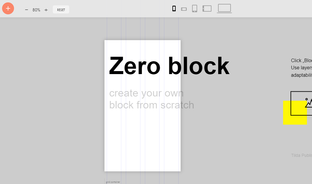
Even in the design of the placeholder, we decided not to bother with adaptive layout. And so it will do!
I must say that 99% of design design on Tilda is done in zero blocks (because the building blocks cut the flight of imagination too much and are used solely for the convenience of editing), and in my experience, in terms of accuracy and attention to detail, they are done exactly as on the picture above.
Mobile friendly
Another of the chronic diseases of Tilda - you cannot make custom menus and navbars, there is simply no such functionality. And ready-made ones very often turn over poorly on mobile screens, forcing them to resort to a particularly cynical crutch - one menu is set to display area from 1200px wide and more, the other 1199 and less. Everything would be fine, in fact, the usual division by @ media-request, but due to the inability to adequately adjust the sizes of mobile fonts and indents, half of the site gradually moves to such duplicate blocks, each of which must be edited separately and made sure that nothing goes. A separate buzz delivers the sequential display of these blocks on the edit page, which increases it by one and a half to two times.
Alternatives
For a predominantly static site, most of the JAMstack tools are perfect. This is a development method that requires the generation of valid HTML at the stage of deployment, excluding rendering as such. It works as fast as possible, but almost eliminates the use of dynamic content.
A great option for posting statics like a blog is to use the Static Site Generator (SSG) in conjunction with GitHub Pages. There are many articles and tutorials, for example .
The headless (or API-driven) CMS is also closely associated with JAMstack. They give more flexibility, approaching in functionality to traditional CMS ( here is an actual comparison with WP), but retain lightness and safety. Suitable for everything from a blog to an online store, but generally require a decent amount of development.
Traditional CMSs are usually slow, generate heavy pages and can be vulnerable. But they are easy to manage and run, they support a bunch of functionality through extensions and generally can do a lot of things out of the box. For those who do not want to code themselves and spend a lot of money on outsourcing.
For the quick launch of online stores there are specialized engines like OpenCart ( site , article ) or Shop-Script ( site , article ). They are best suited for system management and integration with third-party services and backends.
Morality
I understand that Habr is not the most suitable place to broadcast to Tilda's audience. It is not housewives with managers who sit here, but developers and even the same freelancers are few here. But I have an opinion and I want to convey it to all those involved:
- Tilda is evil.
- WYSIWIG site editors are evil.
- The "designers" of visual layout are evil.
- Freelance is good.
- Separation of duties is mandatory.